12 Professional Logos Designed with Inkscape | 2020 Edition
12 Professional Logos Designed with Inkscape | 2020 Edition https://logosbynick.com/wp-content/uploads/2020/04/professional-logos-designed-with-inkscape.jpg 800 470 Nick Saporito Nick Saporito https://secure.gravatar.com/avatar/8e31bf392f0ba8850f29a1a2e833cdd020909bfd44613c7e222072c40e031c34?s=96&d=mm&r=gA couple of years ago I made a post showcasing some of the logos I had designed for my clients using Inkscape over the previous 12 months. I figured I’d make a new post doing something similar where I share some more professional logos designed with Inkscape over the past year. I design logos for a lot of clients every year, and I think it’s important to regularly demonstrate that open source software can be used professionally, so I might make this an annual thing.
Professional Logos Designed with Inkscape
The following are examples of logos that I’ve created for actual paying clients since April of 2019. Each logo was designed with my vector graphics software of choice — Inkscape.
1. CityTour1
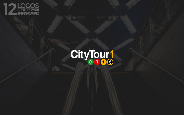
This logo is for a guided walking tour in New York City. The design was inspired by the lettering and style of the signs on the subways. The walking figure in the bottom-right of the icon was inspired by the stop/walk street signals, which is a perfect fit since this is a walking tour.
2. Songs Of War
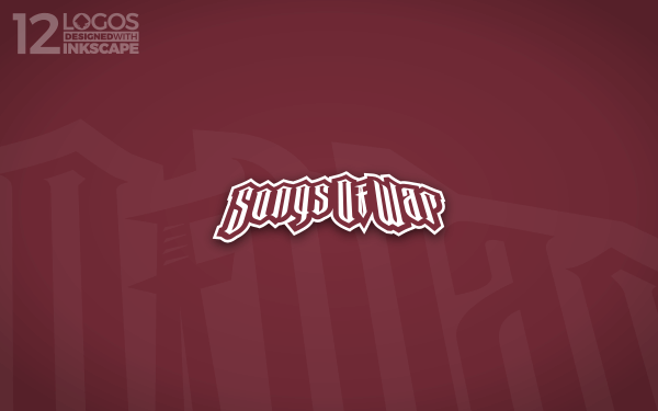
This logo is for a medieval-themed board game. I took medieval-style font and added some character to it with perspective and an arch. And if you look closely, you’ll see that the F in “Of” is a sword. This sword icon was later on used as a standalone icon variation of the logo.
3. Simply Irresistible
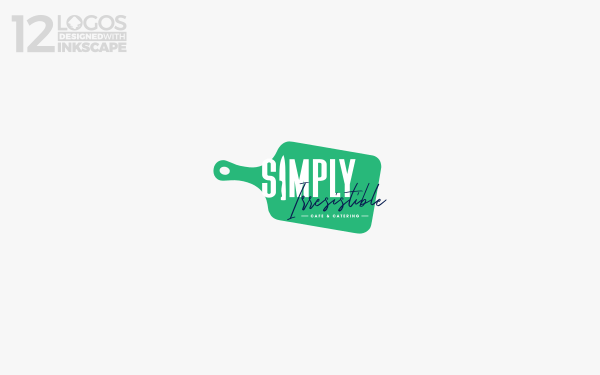
This design was for a healthy cafe that didn’t have a particular theme or type of food they serve. It’s just a general cafe, so it was challenging to come up with a fitting design for it. In the end I went with a simple depiction of a wordmark design over a cutting board, and with the I in “Simply” represented by a knife. I think it has a modern, simple, and casual look that is fitting for a healthy cafe.
4. Sticky Site Content
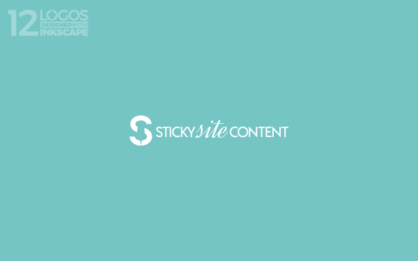
Sticky Site Content is a writing service. The overarching theme of this writing service is that they specialize in writing content for the web that prevents users from bouncing (or leaving the site without clicking on anything else,) so they essentially “stick” around.
My approach for this logo was to place a subtle thumbtack (for “sticking”) within the negative space of the letter S and use that as an icon. For the fonts I used a pairing of Acre and Dynalight — one of my favorite duos that I listed in an article about logo font pairings I wrote last year. I was so happy with how this design came out that I featured it on my portfolio.
5. K5 Logo
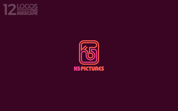
The goal for this logo was to create a retro look, but not just any retro look. It had to be specific to the 60’s. The client wanted it to look like something you would see before an old television show. In the end I went with an iconic mark that combines the K and 5 and extends into a surrounding emblem to make it look unique and distinguished. I had to look at a lot of examples of design from this era to really know how to approach this one.
6. Philadelphia Skyline
This logo was for a local client who wanted something Philadelphia-related. I created an emblem-style design with a text banner going over it and the Philadelphia skyline in the background. The client ended up not using this design, so it’s available for sale if interested.
7. Panda Logo
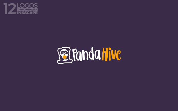
This design was meant for a SAAS business. The name is pretty straightforward in suggesting what should be depicted in the logo — a panda and a beehive, so that’s what I designed. This is a simple panda holding a beehive. I gave it a casual, whimsical style.
8. Assistem
This logo is for an S.O.S. device for the elderly. It’s a single button that when pressed it connects you with a relative or loved one. The name is a play on “assistance” and “stem”, which means voice in Dutch.
The sentiment this client wanted me to communicate with his logo is “the voice that leads you back home,” so I designed an icon that depicts a simple house with sound waves coming from it. I paired it with Michroma — a really nice technological-style font. I added this one to my portfolio as well.
9. Dog Tracing
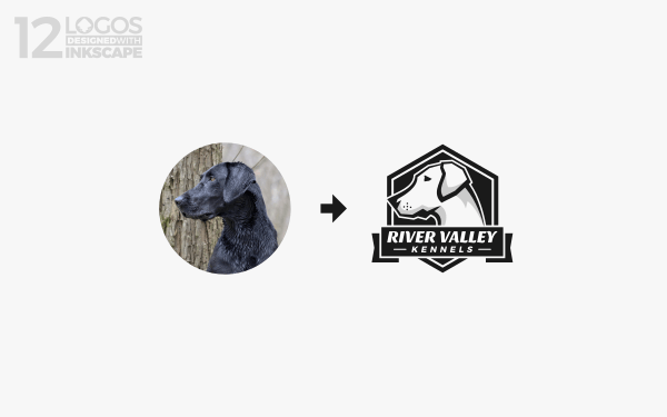
Logos can sometimes start off as a photograph. This client wanted me to use a picture of his dog as inspiration for his logo, which is exactly what I did. I’ve actually gotten a lot of clients wanting me to create logos for them using their photographs ever since I made a tutorial about doing so with GIMP last year.
10. GDQuest
GDQuest is an educational platform for learning about game design with Open Source software. They have a pretty big YouTube channel as well (some of you may be subscribers yourselves!) Last year I had the honor of redesigning their logo. My approach was to depict G and D as gears to represent creating something. I made the typography and colors have a fun, playful style suitable for gaming.
11. Farm Academy
This is one of my favorite professional logos designed with Inkscape because of its use of negative space. I’ve always been a big fan of using negative space within logos, and there was a perfect opportunity for it here. The goal for this logo was to depict something relating to both farming and science, so I went with a microscope that has a chicken sitting in some grass within the negative space. The client ended up selecting a different design, so this one is available for sale if interested.
12. Supply Co
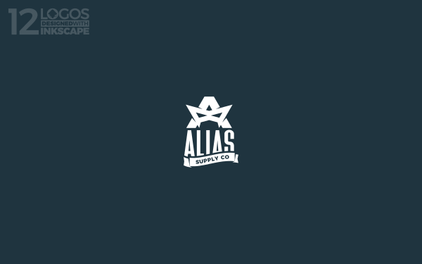
The goal for this design was to depict something industrial and vintage with a super hero-like theme. I ended up creating a simple letter A with a superhero mask overlaying it to represent the arm of the A. Pretty straightforward. The client ended up not using this design, so it’s available if you’re interested.
That should do it for this year’s edition of professional logos designed with Inkscape. Don’t let anyone tell you that open source software can’t produce professional results!
Learn To Master The SoftwareGain a complete understanding of your favorite design apps with my comprehensive collection of video courses. Each course grants access to our private community where you can ask questions and get help when needed.
|
||||||||||||||||||||||||||||||||
Nick Saporito
Hi, I'm Nick— a Philadelphia-based graphic designer with over 10 years of experience. Each year millions of users learn how to use design software to express their creativity using my tutorials here and on YouTube.
All stories by: Nick SaporitoYou might also like
11 comments
-
-
-
inkscape online
Gracias por la información, nos sera de gran utilidad…
-
Muhammad Hamrozi
Hi, Nick . Thank you for making this post.
I’m just curious, is your logo made for business purpose only or it is your personal logo? If it is your personal logo, are you using it for other things like gaming profile? I am trying to develop my own logo but I am little bit confused whether to make a business logo or personal logo. And one more thing, is it a good idea to make a personal logo for business and for personal use like gaming photo profile?
Thank you once again for this post. Looking forward for another inspiration
-
Nick Saporito
Hi Muhammad, I’m not sure what you mean by personal logo and business logo? They both sound the same to me.
-
Oswald
I think he wants to buy a logo that is not for a business but simply for something personal like a youtube channel profile pic or some other social media.
-
-
-
Dominik
Incredible work Nick! I wish You the best for the 2020 and hope to see some of Your work from this year. Keep up the good work!
-
-
Eby
The panda give logo is really beautiful and I’m interested in learning how you made it. Understandable inkscape tutorials are rare to find and you’re doing us a lot of good making them. Thank you.
-
Thiago Abreu
Your logos are great, Nick! Loved Farm Academy logo and how you made using negative spaces to create something different with a chiken. Really awesome!
K5 Pictures is impressive to me, too. Its color pallete and bold shapes are easily recognizable.
Inkscape (and general opensource software) are making my work done and I love how these powerful software are accessible to everyone.
Thanks for this post. Inspiring!
-




Leo
Really nice work. I really enjoy your videos 🙂