

12 Professional Logos Made with Inkscape in 2018
12 Professional Logos Made with Inkscape in 2018 https://logosbynick.com/wp-content/uploads/2018/10/inkscape-logo-examples-1024x602.jpg 1024 602 Nick Saporito https://secure.gravatar.com/avatar/8e31bf392f0ba8850f29a1a2e833cdd020909bfd44613c7e222072c40e031c34?s=96&d=mm&r=gIf you’ve been following my content for any period of time, it’s probably no secret that Inkscape is my preferred vector graphics application, and this includes logo design. I’ve been designing logos professionally with Inkscape for 7 years now, and in this post I’ll be sharing 12 of my Inkscape logo examples that were designed for actual paying clients this year.
Inkscape Logo Examples From 2018
Here’s some of the designs I’ve cooked up for my clients so far in 2018…
1. Ballers In Progress
A simple logo design that depicts a loading bar with a basketball pattern within it.
2. Capsule Smart Homes

A logo that depicts a house within a capsule.
3. A Better Deal
This Inkscape logo example was for a premium domain name for sale. It’s a simple wordmark with “deal” accentuated and placed within the negative space of a price tag.
4. I Migliori Di Fifa
A simple badge-style design for a FIFA video game which depicts a controller and a soccer ball (or football, for my non-US readers 🙂 )
5. Filmotion
This one depicts the letter F as a film reel with lines of motion.
6. Gamers’ Haven

A simple and versatile design that depicts the letters GH within a castle. Just to give some context to this Inkscape logo example, “gaming” refers to board games; not video games. That’s why we went with a castle.
7. Tub Hero

Simple logo design for a hot tub company. Moving water and bubbles are depicted.
8. Snowbooked
A goat standing on a snowy mountain with the sun rising behind it.
9. Crown Of Tresses
A line of organic skincare and hair products. This one uses a line art style of a woman with her arm as a branch with leaves and flowers growing off of it in order to emphasize the organic aspect.
10. Inscryb

A colorful, flat-style logo based on a stingray.
11. El Cheapo Moving Company
A logo design for a moving company in Texas. The client wanted to go with a Tex-Mex style.
12. Righteous Rebels
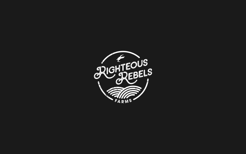
A Star Wars-inspired logo for a farm.
To see more professionally-designed Inkscape logo examples, be sure to check out my portfolio!
Learn To Master The SoftwareGain a complete understanding of your favorite design apps with my comprehensive collection of video courses. Each course grants access to our private community where you can ask questions and get help when needed.
|
||||||||||||||||||||||||||||||||
 81 Videos
 11 Modules

You might also like


19 comments
-
-
-
Adam Szekely
Hi Nick,
I’ve been following your work since you started your YouTube channel and I’m a great fan of yours and Inkscape as well.
In logo design related contents I often hear this principle that the logo itself should not be part of the typeface – in case of the Filmotion logo, it’s heavily incorporated. I was wondering what’s your stance on this point in general and how that logo still came to be.
Thanks a lot and keep up the creative flow!Adam
-
Nick Saporito
Hi Adam, thanks for your support! I don’t know who you heard that from, but it sounds like pretentious gatekeeping to me. Plenty of great logos are wordmark designs — Amazon, Gillette, Disney, FedEx, Google, Netflix. I can go on forever.
-
-
-
-
Luca
Awesome work. I was thinking about switching to Illustrator to obtain better results, but you do and awesome job with Inkscape, so in the end I think I’ll stay with it.
Do you use Inkscape for gradients too?
-
-
Joni Solis
Can you use Inkscape for the whole logo project, start to finish, or do you need Adobe Illustrator for saving the logo to any needed image format that you give to your logo clients? Thanks!
-
Nick Saporito
Yes I use Inkscape for the entire process, unless it’s something I’m designing for print.
-
-
Nick Saporito
It doesn’t allow you to output files with a CMYK color profile, which is required for accurate printing. If you print an RGB document certain shades (like greens and yellows) will look muddy and the general appearance of all the colors will be off.
-
youcef sennoun
what if i design using inkscape for logos and arts that would print on POD platforms like clothes and mugs phone cases ?
-
Nick Saporito
That usually works good enough. I’ve used Inkscape RGB documents on sites like VistaPrint and Spreadshirt. They tend to handle the transfers well.
-
Jens
What is your routine for print then? Do you stille start in inkscape?
-awesome workshop and tutorials! 🙂
-
Nick Saporito
Yes I still design with Inkscape because it’s what I’m most comfortable and familiar with. When something needs to be prepared for print I’ll just design it with Inkscape then open it with Illustrator to get the color profiles set. Fortunately Inkscape files are quite compatible with Illustrator.
-
-
-
-
-
-
-


Josh Stauffer
These all look really cool. El Cheapo and Righteous Rebels are my personal favorites out of the list. Both are similar in design style with the fancy fonts, circular, and rustic look.