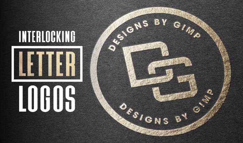
How To Create An Interlocking Letter Logo with GIMP
How To Create An Interlocking Letter Logo with GIMP https://logosbynick.com/wp-content/uploads/2020/04/gimp-letter-logos.jpg 800 470 Nick Saporito https://secure.gravatar.com/avatar/8e31bf392f0ba8850f29a1a2e833cdd020909bfd44613c7e222072c40e031c34?s=96&d=mm&r=gIn today’s tutorial I’ll be demonstrating how to create a logo with GIMP where two letters intersect with each other. This would be a great tutorial for a beginner or first-time user of GIMP who wants to create their own logo using their initials. The brilliance of this sort of logo is in its simplicity and versatility. The type of logo abides by most of the principles of a great logo.
The following is a very brief written overview of the steps taken to create this logo with GIMP. For complete step-by-step instructions I absolutely recommend that you watch the following video tutorial:
Create A Logo with Interlocking Letters in GIMP
The first thing we have to do is download and install the font we’ll be using. For this tutorial I’ll be using Orbitron Medium, which can be downloaded for free here.
It’s important to make sure that you install the font before opening GIMP otherwise it won’t populate in the fonts list. If you already have GIMP opened then restart it after installing the font. You can find instructions for installing fonts in GIMP here.
Once your font is installed, open a new document in GIMP and size it at 1,280 x 1,280 pixels, then use the Text Tool to generate each of your letters separately.
The letters should be created separately so that they’re each on their own layer. Then, you can bring the opacity of each layer down slightly so you can see through them (this is helpful when determining where the letters should intersect,) and use the Move Tool to position them where you’d like them to intersect.

The goal is to make the G look like it’s going over the D at the top right, but under the D on the bottom left. To do this, first create an alpha to selection from the letter G, grow the selection by 25 pixels, fill it with black, and place it on a new layer with reduced opacity.

Again, if any of this is unclear or difficult to follow, please watch the video tutorial. It’s much easier to follow if you’re still a beginner.
The idea is to take this fatter G and subtract it from the letter D, but we only want the top-right portion of it, so we’re going to remove the rest of it.

Here’s how it looks once subtracted.

Now we just need to repeat this process, only we’ll be creating a fatter version of the letter D and subtracting a portion of it from the lower-left port of the letter G.

Once that’s done your logo is pretty much finished!

You can now bring the opacity back up to 100% and color it in using the Colorize feature if you’d like, otherwise you can just leave it black like I did.
![]()
And that is how you can create an interlocking letter logo with GIMP! If you have any questions leave a comment below. As always, thanks for watching!
Learn To Master The SoftwareGain a complete understanding of your favorite design apps with my comprehensive collection of video courses. Each course grants access to our private community where you can ask questions and get help when needed.
|
||||||||||||||||||||||||||||||||


You might also like
6 comments
-
-
Nick Saporito
Hi V, I have a course that is a series of videos where I comb through the software and explain all of the tools: https://logosbynick.com/gimp/
As for which one to learn first — if you’re just editing photos then it sounds like GIMP should be your focus for now.
-
-
-
Dima
Hey Nick,
Do you have a tutorial on how to do this with Inkscape? I am asking because I made my logo with custom interlocking letters.
The way I made it was by adding a stroke, converting the stroke to a path, and then subtracting it from the letter below.
I am wondering if there is an easier way to do this with Inkscape.
Take care,
Dima
-
Nick Saporito
Yes I do, I did an Inkscape tutorial on this a few years ago. It should be on YouTube if you search “inkscape interlocking letters logo”.
-
Dima
Wow. Thanks!!
That is a lot easier than the way I did my logo. I didn’t even think about doing it this way.
Take care,
Dima
-
-
V. Dixit.
Hello, sir.
I am an aspiring lawyer, and I edit photos as a pastime. I used to do this exclusively on mobile, and I have come to enjoy the feel of the mobile editing program Snapseed. It is really powerful in the right hands, but I now out of a phone, and have switched to GIMP.
I would like if there was a way to figure out all these- these options, and all this freedom I suddenly have. Is there just a simple tutorial that tells me what all the buttons are, then just leaves me to explore the software myself.
Also, would it be a good idea to pick up GIMP, Inkscape, and Blender at once, or to master each individually before starting the next?
Thank you in advance, V.