The Complete Guide To Designing App Icons with Adobe Illustrator
The Complete Guide To Designing App Icons with Adobe Illustrator https://logosbynick.com/wp-content/uploads/2020/12/design-app-icons-with-illustrator.png 800 470 Nick Saporito https://secure.gravatar.com/avatar/8e31bf392f0ba8850f29a1a2e833cdd020909bfd44613c7e222072c40e031c34?s=96&d=mm&r=gIn this tutorial I’ll be demonstrating how you can design your own app icons with Adobe Illustrator. I’ll be going over what the design guidelines are for both iOS and Android, setting up the artboard for app icon design, and then exporting your icon in all of the required sizes and formats.
For a more immersive learning experience I would recommend checking out the video tutorial below. Otherwise the written tutorial should serve you well enough.
App Icon Design Guidelines
Before we begin designing app icons with Adobe Illustrator, we first need to comb through the design guidelines for both iOS and Android so that we can abide by them. Both platforms have the capacity to reject designs that fail to meet their specifications, so it’s important to have this information before beginning.
Guidelines for iOS
![]()
Apple has outlined a series of design guidelines for designing app icons for their operating system. It is highly recommended that you read through these guidelines before proceeding so that you can be sure that you’re abiding by them when creating your design.
Best Practices
In summary, here are some best practices for designing app icons for the iOS platform…
- Provide a single focus point. Trying to communicate too much creates confusion. Pick a single idea or concept that you’d like to communicate and focus on that.
- Use a simple background and avoid transparency. Don’t let your background draw too much attention from the focus point.
- Avoid using words unless they’re part of your logo. The name of your app will be displayed within the operating system, below the app icon, so it would be redundant to include the name of the app in the icon.
- Avoid using photos, screenshots, and interface elements. Apple advises against using imagery with lots of details that are difficult to make out at small sizes, as well as interface icons that can be misleading.
This is just a summary of some of the more important guidelines to abide by. Make sure to check the developer guidelines for the complete list!
Rounded Corners
One thing you may have noticed about app icons on the iOS platform is that they all have similarly rounded corners.
All app icons in the iOS operating system have rounded corners.
This is because Apple applies a mask to each icon that gives it a rounded corner.
App icons are to be designed with squared corners. A mask will be applied on the OS end to give the icon rounded corners.
This means that when you are designing your app icon in Adobe Illustrator, you do not need to add rounded corners to your design. It is required that your icon be submitted with squared corners. Apple will apply the mask to give your icon rounded corners once you’ve uploaded your artwork.
Icon Sizes
Because your app icon is going to be used in various different contexts — including the home screen, the app store, in notifications, and so on — you’re going to need numerous different sizes. This is also to accommodate different devices and screen resolutions (iPhones, iPads, etc.)
App icons are used in a variety of sizes and contexts, meaning you’ll have to provide size variations of your design.
The sizes specified by Apple’s developer guidelines are as follows.
Dimensions (in pixels)
- 40 x 40
- 58 x 58
- 60 x 60
- 80 x 80
- 87 x 87
- 120 x 120
- 152 x 152
- 167 x 167
- 180 x 180
- 1024 x 1024
It should be noted that these sizes may change over time, so it would be wise to check the developer guidelines page just to be sure.
Guidelines for Android/Google Play
![]()
Much like Apple, Android has also produced guidelines that should be followed when designing app icons for the Android operating system. These guidelines aren’t too different from Apple’s, but there are some differences worth noting.
Rounded Corners
Android used to be a little more accommodating to those of us who like to get creative with app icon designs — mainly as it pertains to the shape. There was once a time when your app icon could be designed in any shape you’d like.
In the past, Android allowed app icons with custom shapes.
Unfortunately, Android has since adopted an Apple-like policy in requiring that app icons have square corners so that a rounded mask can be applied on their end. Their reasoning is as follows…
Uniformed shapes are visually more appealing and easier to digest. They help users focus on the artwork, as opposed to the shape. They fix alignment issues caused by random open space to better present surrounding information, such as the title, rating, and price.
The good news for us, as designers, is that we no longer need to make different icon designs for both the Android and iOS operating systems. If your design abides one set of guidelines, chances are it abides by the other as well.
The bad news is that our creativity has been a little more restricted.
Sizing
Although your app icon will be used in just as many sizes on the Android platform as it will on iOS, you won’t have to produce nearly as many sizes. In fact, there’s only 1 size required.
Dimensions (in pixels)
- 512 x 512
And that’s it! Smaller copies will be rendered by the operating system as needed.
Keyline Grids
The Android developer guidelines recommend using the provided keyline grid for reference when designing your app icon.
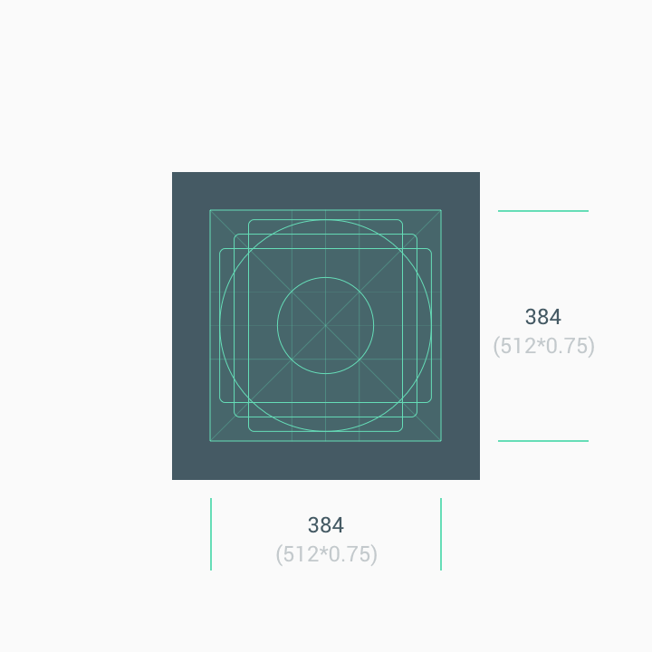
Credit: Google Play icon design specifications
The keyline grid can be downloaded and imported into Adobe Illustrator, and is intended to be referenced when determining the size and position of your logo, icon, or artwork.
To be safe, it is recommended that you keep the primary artwork (excluding the background) within the 384 x 384 pixel area centered within the icon. If your logo is a circle, try to make the circle the same size and position as the circle in the keyline grid. And the same goes for all of the other shapes.
Other Best Practices
Finally, here are some miscellaneous best practices for designing your Android app icon, according to Android.
- Don’t force your artwork to the full bleed. Use the keyline grid as a reference.
- Don’t scale backgrounds and full frame illustrations to fit the keylines.
- Don’t add drop shadows to your icons. They will be applied on the OS end.
- Avoid adding tags and badges to your icon. This includes labels, text, logos, sales and promotions.
These are just a few. Be sure to check out the Android and Google Play Store developer guidelines to ensure that your design abides by their specifications.
Design an App Icon with Adobe Illustrator
Now that we’ve gone over some critical specifications and best practices for designing app icons for the two major mobile operating systems, we can begin the process of designing app icons with Adobe Illustrator.
The following is just a summarized overview of the steps we’ll be taking to design our app icon in Illustrator. For a more detailed explanation, it is advised that you watch the video tutorial at the top of the page.
Step 1: Set Up The Artboard
The first thing we need to do is create a new document and set up the artboard to be sized at 1,024 x 1,024 pixels. This is the largest size required of either operating system, so it makes sense to design it at its largest so it can be scaled down as needed.
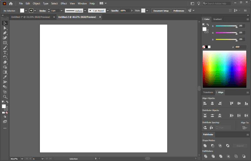
The artboard should be sized for the largest icon, which is 1,024 x 1,024 pixels.
Because of how powerful Illustrator’s Export for Screens feature is, we won’t have to manually reproduce all of the needed sizes. We can simply design it at a single size and then render variations at scale later on.
Step 2: Set A Background
Now we’re going to create a background for the app icon. This can be a pattern, a gradient, or a solid fill. For this demonstration I’ll be using a blue gradient.
Simply create a rectangle and size it to fit your artboard. You can do this with the Alignment Tool or by enabling Smart Guides (control + u) so that it snaps to the corners of the page. Make sure the rectangle doesn’t have a stroke applied.
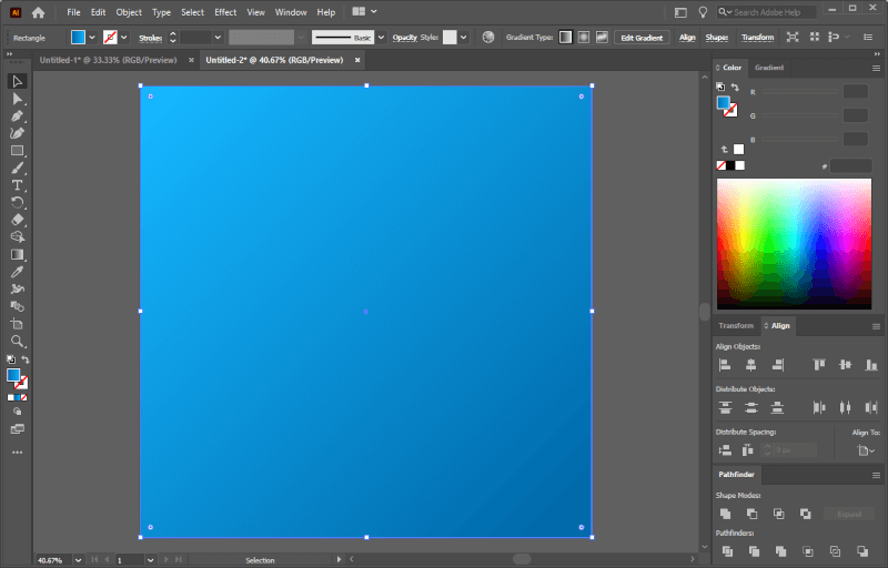
For this demonstration, a background with a blue gradient is used.
Go ahead and fill in your rectangle with whatever you’d like. Please refer to the video tutorial for instructions on how to apply a gradient to the background of your app icon.
Step 3: Import Your Logo/Design
Next, we’re going to import a logo, icon, or some other kind of graphic for use as the focal point of the app icon. Ideally, this should be a vector file (files that end in .ai, .eps, .svg and sometimes .pdf) for compatibility and scaling reasons.
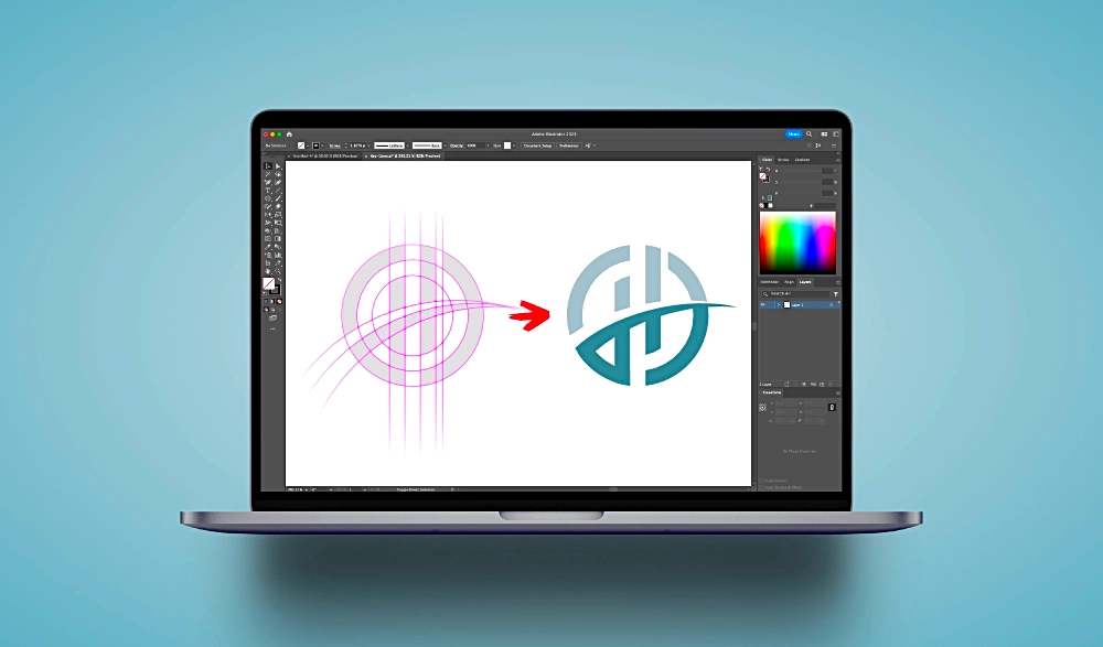
If you don’t have a graphic to import then you can use a letter, number, symbol, or create a logo of your own using one of my logo design tutorials for Illustrator. For this demonstration I’ll be using a sample logo design. This is an unused concept from a past client project. It’s an abstract depiction of a letter W.
To import your artwork, navigate to File > Place and then choose the file you’d like to import. Then, center it up on your document and scale it so that it fits nicely within your background, with modest padding around the edges. Refer to the previously mentioned keyline grid if you plan to use this design for the Android operating system.
Center your artwork over the background, then scale it as needed.
At this point you can proceed to style the focal point of your app icon however you’d like. For this demonstration I have applied a long shadow to the logo, just to give it a little pop.
For this demonstration I’ve applied a long shadow to the logo.
This isn’t a necessary part of the lesson, but I have included instructions for how to do this in the video tutorial at the top of the page.
Step 4: Export Your Work
Once you have finished styling your app icon design with Adobe Illustrator, it’s time to save your work and then prepare for it to be exported to all of the different sizes required.
First, save a vector copy of your work (in .ai format) so that you’ll always have an editable master file on hand. To do this, navigate to File > Save As and choose a place to save your work.
Now, we’re going to open the Export for Screens menu by navigating to File > Export > Export for Screens, or by pressing control + alt + e on your keyboard.
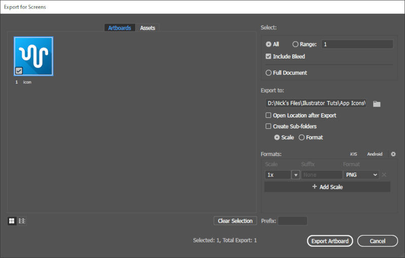
The Export for Screens menu allows you to export your app icon in a variety of sizes with a single click.
From the menu, we want to designate a location for the app icons to be rendered in, and then define the file format and scale.
For each size that we need to render for our app icon, we want to add a new scale and use the following presets for each size…
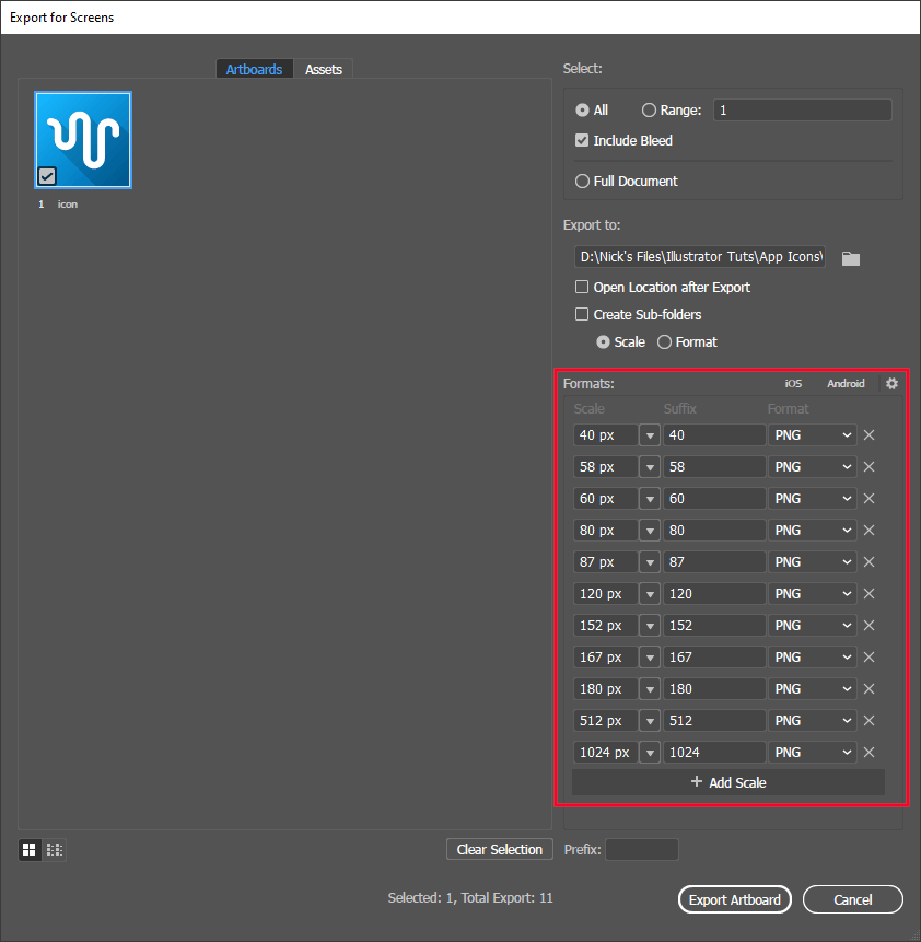
Add a scale for each size needed for your app icon.
Important to note…
- Beneath the thumbnail preview of the icon design, make sure to define the name of the file to be exported. For this demonstration I am simply naming the icon “icon”.
- From the Scale dropdown, make sure to choose Width so that you can manually define the size.
- In the Suffix field, type in the size so that each app icon will have its size added to its name so that they’re easy to distinguish.
- PNG format is what’s required for use at the app icon design, so that needs to be the export format for each size.
Once you have your scales and presets defined, go ahead and click the Export Artboard button to render your app icons.
All of the app icon sizes have been rendered and are ready to be uploaded.
Your newly-designed app icons are now finished and ready for submission to Apple and/or Android!
Conclusion
Designing app icons with Adobe Illustrator is a simple and enjoyable process thanks to some of its more useful features, like the Export for Screens menu. In other applications you’d have to manually create duplicate copies of each app icon, resize them, then export them one by one. Luckily Illustrator makes this process easy.
If you have any questions, or if any part of these instructions were unclear, simply leave a comment below. As always, thanks for visiting!
Learn To Master The SoftwareGain a complete understanding of your favorite design apps with my comprehensive collection of video courses. Each course grants access to our private community where you can ask questions and get help when needed.
|
||||||||||||||||||||||||||||||||


Hi Nick,
This is a great tutorial to learn and understand basics of creating app icons using which i created one app icon . Do you have any tutorial or if you can refer to any tutorial which explains the process of designing & creating icons like font awesome.
I know how to convert a .svg file to font file and then use that font file one a web page as a font, however I wish to learn the design basics of creating icons like font awesome or materials design.
I have learned a lot from your videos on youtube and really appreciate the great work you are doing. Cheers!
Hi Raghav, glad you’re finding the lessons useful. I don’t have any tutorials on that subject in particular, sorry.