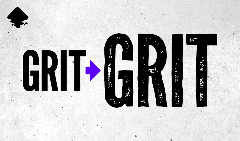
How To Create A Distressed Effect with Inkscape
How To Create A Distressed Effect with Inkscape https://logosbynick.com/wp-content/uploads/2020/12/inkscape-distressed-effect.png 800 470 Nick Saporito https://secure.gravatar.com/avatar/8e31bf392f0ba8850f29a1a2e833cdd020909bfd44613c7e222072c40e031c34?s=96&d=mm&r=gIn this tutorial I’ll be demonstrating how you can create a distressed effect with Inkscape. Once applied, the effect will make your subject look worn, gritty, and rough around the edges. To accomplish this, we’ll be using the Jitter Nodes extension and then applying a vector grunge texture. For this demonstration we’ll be applying the effect to some text, although this can work with any vector object you’d like, so don’t feel obliged to only use text.
The following is a written overview of the steps taken to apply our distressed effect with Inkscape. For a more in-depth and immersive learning experience, I would recommend watching the video tutorial below. However, the written instructions should suffice for most intermediate users.
Create A Distressed Effect with Inkscape
The following is an overview of how you can apply a distressed effect with Inkscape. Before you get started, you’ll need to download some resources in order to follow along.
Resources
The following resources are needed to follow along with this tutorial.
Grunge Texture
To apply a distressed effect, we’re going to need a vector texture. For this tutorial I’ll be using the follow scratch texture: scratch.zip
If you’d like to try out some different textures then feel free to browse through my free collection of 15 grunge textures. Personally, I think the scratched texture works best for this effect, but maybe your tastes differ.
League Gothic Font
If you’d like to follow along with the tutorial then you’ll need to download and install the League Gothic font. It should be noted that you do not need to use this font if you don’t want to. This effect will work with virtually any font. In fact, you don’t even have to apply this to text; you can use any vector object you’d like!
Step 1: Add New Nodes
To get started, the first thing we’ll have to do is generate some text, and then convert it to a path and ungroup it. This will change the letter from a text object to a vector path that we can alter further. It would be wise to reduce the opacity of the letter to 50% as well so that you can see how objects intersect with it in later steps.

Reducing the opacity of the letter will help us visualize how it interacts with other objects in later steps.
Using the Edit Paths By Nodes tool, add some new nodes to your letter by double-clicking the edge of the letter. The idea is to add enough nodes so that there’s a consistent amount of nodes outlining the letter.
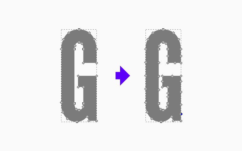
It’s important to ensure that there’s a consistent amount of nodes around the edges of the letter because these nodes will be shifted in order to roughen the edges of the letter.
In the next step these nodes will be shifted at random to make the edges of the letter look rough and distressed.
Step 2: Jitter Nodes
Next, we’ll use the Jitter Nodes extension to shift the positions of the different nodes. This will roughen the edges of the letter to make it look more distressed.
To do this, select your letter then navigate to Extensions > Modify Path > Jitter Nodes. The following menu should populate:
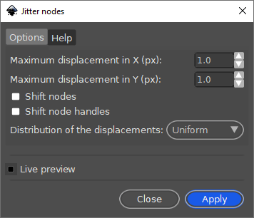
The Jitter Nodes feature allows you to displace the nodes of a given path. You may have to adjust your values based on the size of your letter/subject.
Use the same presets that you see in my screenshot above, then toggle on the Preview to see how it looks. Depending on the size of your letter, you may need to increase or decrease the displacement values for the X and Y axis. It is recommended that you experiment with it a bit to see what looks best.
The effect should look something like this:

When used correctly, the Jitter Nodes extension can roughen the edges of your subject, which enhances the distressed look we’re going for.
Once you’ve found the presets that work for you, go ahead and press Apply and then close out of the menu.
Step 3: Create An Offset
Now we will apply a vector texture to the letter in order to give it more of a distressed appearance. However, we don’t want to apply the texture to the entire letter. Instead, we want to apply it to the inner portion of the letter so that there’s still some padding around the edges. This will help the finished design look more refined and personalized.
To do this, we’ll need to create an offset of the original.
Duplicate the letter, make it a different color so that you can differentiate it from the original letter, and then simplify it by navigating to Path > Simplify. This will remove some of the nodes we previously added.
The reason why we’re removing these nodes is to ensure that the Dynamic Offset feature (which we’ll be using next) works as intended. Sometimes you’ll get mixed results with objects that have lots of nodes. The same can be said for path operations as well, which we’ll also be using. Complex objects with lots of nodes can sometimes corrupt a path operation, so it’s best to reduce the number of nodes as much as possible.

Create a duplicate of your letter and change the color so that you can easily differentiate it.
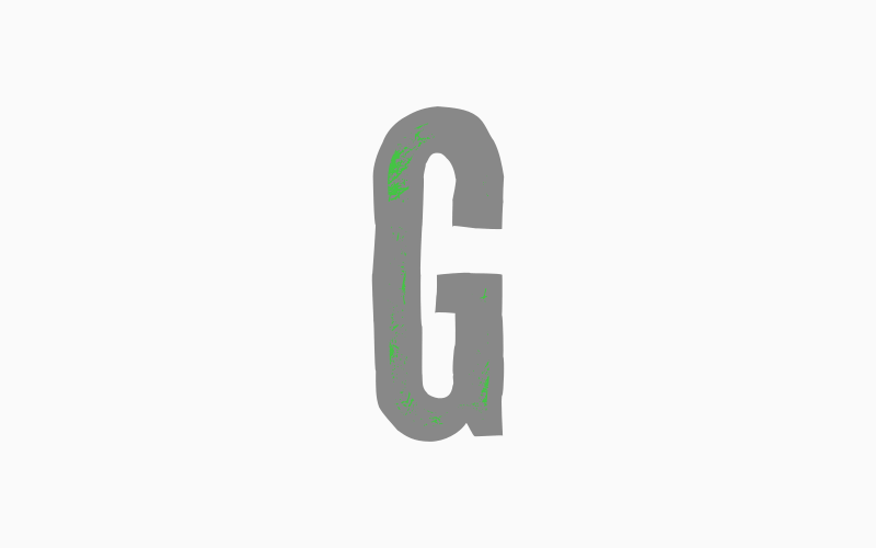
Select the duplicated letter and navigate to Path > Dynamic Offset. A little white node should appear at the top of the letter. Click and drag the node downwards to offset the letter.

The Dynamic Offset feature will allow you to offset the duplicate letter. This area represents where the texture will be applied.
This offset section represents the area where the texture will be applied to the letter.
Once you’ve resized the offset letter accordingly, you can then finalize it by converting it to a path. Select the letter and navigate to Path > Object To Path.
Step 4: Apply The Texture
To put the finishing touches on our distressed effect with Inkscape, we simply have to apply the texture. No distressed effect would be complete without a worn, gritty texture!
Import the texture into your document by navigating to File > Import and locating the SVG file on your hard drive. Use the default presets and click OK when prompted by the import menu.
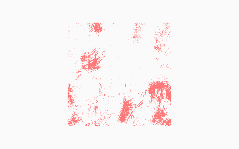
For this tutorial we will be applying the scratch texture depicted above. It can be downloaded using the link under the Resources section.
Position the texture over the offset letter and pay close attention to where the two intersect with each other. This will represent the texture area of the finished design, so make sure that you have enough of the gritty bits of the texture inside of the letter. You may need to resize the texture to make it just right.
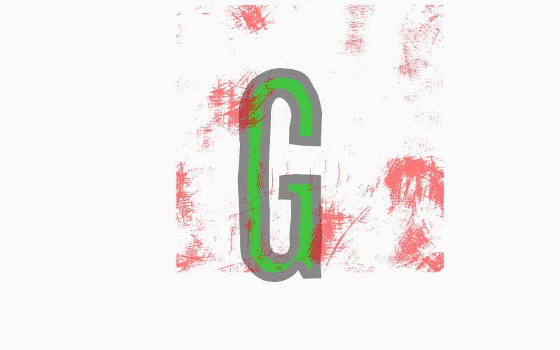
Make sure to position your texture in such a way that enough of it intersects with the offset letter.
Once you’re happy with the position, select both the texture and the offset letter, then navigate to Path > Intersection. The result should look something like this:
When done correctly, you should have a separate path within the offset portion of your letter.
All we have to do now is select both objects (the letter and the texture) and navigate to Path > Difference. This will subtract the texture from the letter, turning it into negative space.
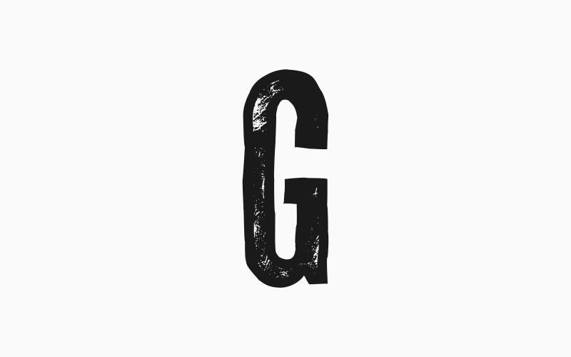
Your distressed effect is complete!
And now our distressed effect is complete! Just bring the opacity of the letter back up to 100% and you’re finished!
Here’s how the effect looks applied to an entire word…
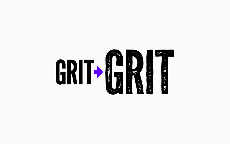
Here’s how the effect looks when applied to an entire word.
Conclusion
That should do it for today’s tutorial on adding a distressed effect with Inkscape! You can use this neat little trick to personalize your designs and give them some character. Of course, if you’re applying this to an entire word instead of a single letter, you’ll have to apply it to each individual letter. This can be time-consuming. If you plan on using these same letters again down the line then it may be a good idea to create a document with this effect applied to every letter of the alphabet so that you have it on hand for use at any time.
If you have any questions, or if any part of these instructions were unclear, simply leave a comment below. As always, thanks for visiting!
Learn To Master The SoftwareGain a complete understanding of your favorite design apps with my comprehensive collection of video courses. Each course grants access to our private community where you can ask questions and get help when needed.
|
||||||||||||||||||||||||||||||||


This doesn’t work. Maybe because your texture files are PNG, not SVG? Maybe because something has changed? Maybe because you didn’t include all the steps?
Are you sure you downloaded the correct file? The vector texture is in the zip folder. Just double checked it.
Thanks so much! This is a great tutorial and the results look so good.
Where can I find texture (s) to import into inkscape?
If you make a video about poster design
Where is a distressed font best for use?
It can be used for logos, headers, posters, etc.