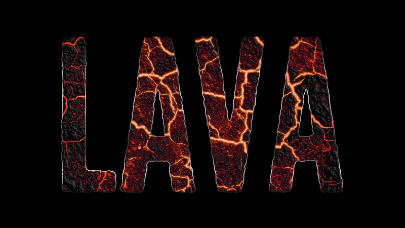
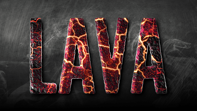
Create A Molten Lava Text Effect with GIMP
Create A Molten Lava Text Effect with GIMP https://logosbynick.com/wp-content/uploads/2019/07/gimp-lava-text-1024x602.jpg 1024 602 Nick Saporito https://secure.gravatar.com/avatar/8e31bf392f0ba8850f29a1a2e833cdd020909bfd44613c7e222072c40e031c34?s=96&d=mm&r=gIn this tutorial I’ll be demonstrating how to create a molten lava text effect with GIMP where it appears as if the letters are made of smoldering magma. This tutorial is a little on the advanced side. You can follow along if you’re a beginner, but I have to warn that you may find it a bit overwhelming.
The following is a brief overview of the steps taken to achieve this effect. Please watch the video tutorial at the top of the page for the complete step-by-step instructions.
Design Elements
You’ll need the following design elements in order to follow along with this tutorial, so please make sure to download them before getting started.
Lava Texture
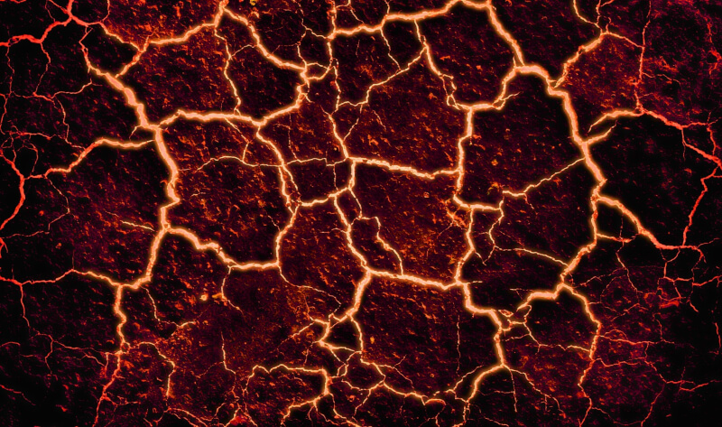
We’ll be using this lava texture several times throughout the tutorial.
Scratched Steel Texture
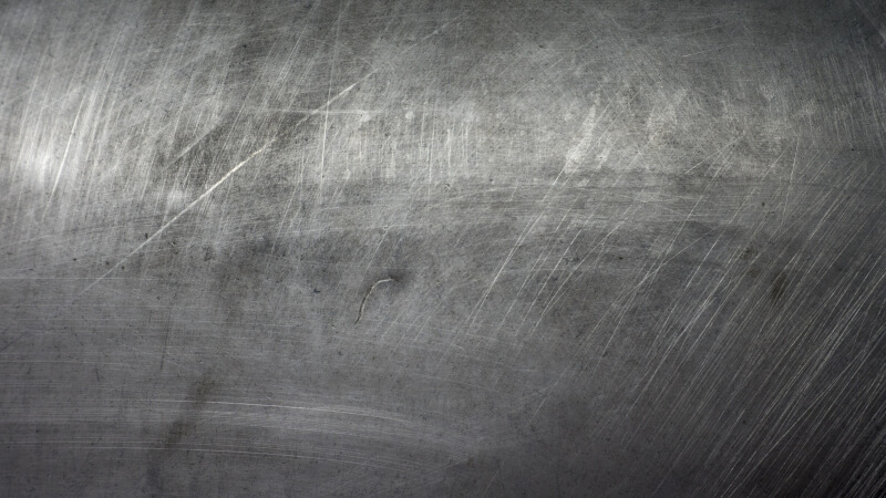
This texture will be used as the background image. It is optional but recommended because it does add a nice overall touch.
Smoke Brushes
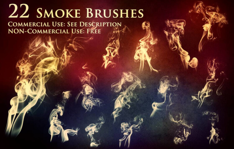
These smoke brushes are completely optional. I just added a touch of smoke in order to help sell the design more. The effect looks fine without them though, so you can skip this step if you’d like. Please refer to the tutorial I made about installing GIMP brushes if you need instructions for how to do so.
How To Create A Lava Text Effect
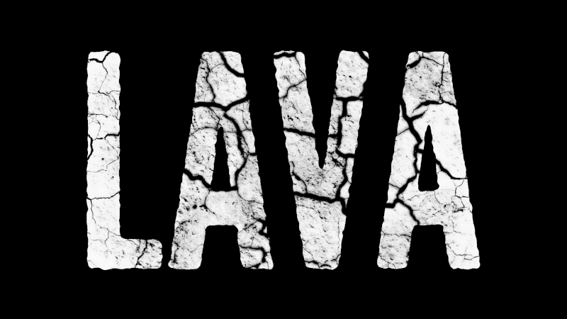
The first thing we’re going to do is create a new document with a black background and add some white text.
Next we’ll distort the edges of the text using the Distort Selection feature in GIMP.

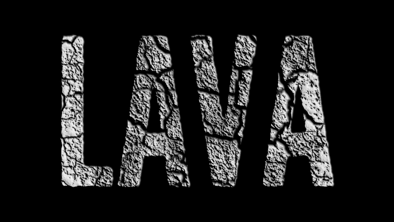
Now we’ll use the lava texture to create a black and white mask over the text.
Then we’ll create a 3D map of the texture using the Emboss filter.
Now we’ll create another copy of the text and mask it with another copy of the lava texture.
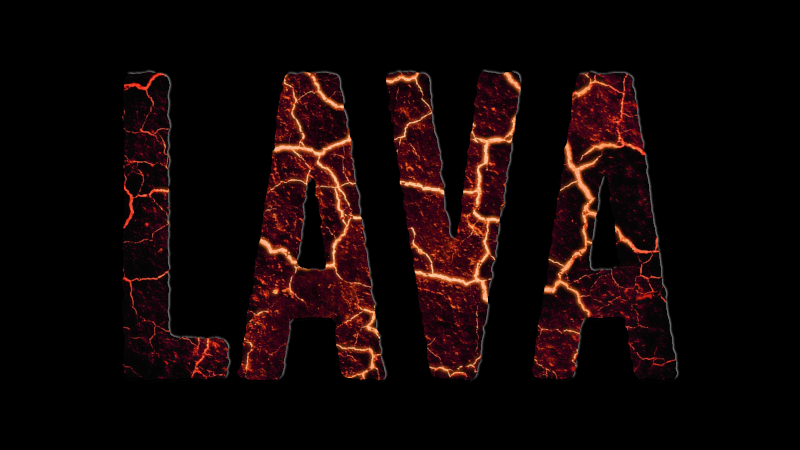
Now we’ll place the embossed layer on top of the newly created lava texture layer, set the blend mode to Lighten Only and adjust the color curves so that the molten lava has more of a raised 3D sort of look.
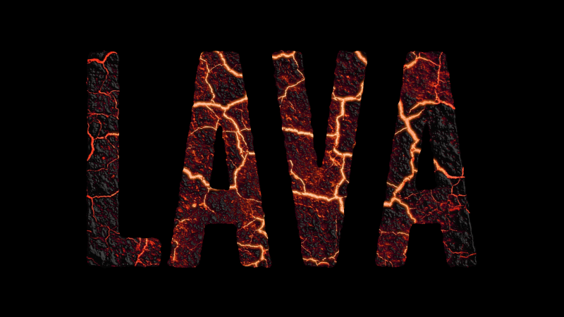
Next we’ll create a border around the edges of the text, layer it beneath the text, and fill it in with a gradient.
Now let’s lighten up the background a bit by adjusting the color curves, then add a drop shadow beneath the text.
Next we’ll add a white glow to the top left edges of the text in order to give the design a little more dimension. This is achieved by create another white copy of the text, then using a slightly displaced black copy of the text to subtract from it.
Once subtracted, give it a slight Gaussian blue, set the blend mode to Soft Light and duplicate the layer to help enhance the effect a bit.
Now we’ll use our smoke brushes to add some subtle white strokes of smoke across the design. Set the blend mode to Overlay so it’ll have a nice, integrated effect.
The final step is to create a new layer from visible and adjust the color curves and levels in order to give the entire design a polished, uniform look. Again, refer to the video tutorial to see exactly how this is done.
And with that our lava text effect is complete! If you have any questions simply leave a comment below, and as always, thanks for watching!
Learn To Master The SoftwareGain a complete understanding of your favorite design apps with my comprehensive collection of video courses. Each course grants access to our private community where you can ask questions and get help when needed.
|
||||||||||||||||||||||||||||||||


Erica Lynn Sallee
Thank you for your tutorial and generous resources. 😊 I’m sort of odd, as I love to learn, but normally hate tutorials. But, yours was not only tolerable, but a pleasant experience. Clear, concise, direct. Thank you so much! (I also learned a new trick, as well, which may be no “trick” to other users, but the workarounds I’ve done to select a layer… Ugh. 🤦♀️ Long story short: I gasped, shook my head at myself, but felt thankful that if all else failed I was now fully made aware of the “Alpha to Selection” option.) My text turned out and now I’m excited to check out other tutorials you may have available. Many sincere thanks!