Create Isometric Carved Letters with Inkscape
Create Isometric Carved Letters with Inkscape https://logosbynick.com/wp-content/uploads/2019/04/vector-isometric-letters-1024x602.png 1024 602 Nick Saporito https://secure.gravatar.com/avatar/8e31bf392f0ba8850f29a1a2e833cdd020909bfd44613c7e222072c40e031c34?s=96&d=mm&r=gIn today’s tutorial I’ll be demonstrating how to create isometric carved letters with Inkscape, where it appears as if the letters have been carved into the surface.
I made a similar tutorial back in 2016, but my approach will be different this time. In the previous tutorial we set up an isometric grid and drew each letter/number freehand. This time, we’ll be using a stock font and distorting the desired word/lettering to fit an isometric grid.
The following is just a brief overview of the steps taken to achieve this effect. Please refer to the video tutorial at the top of the page for complete step-by-step instructions.
Fonts
First we’ll need to download and install the font being used in the tutorial, which is 8 Bit Wonder. I chose this font because it’s a nice, square font with sharp corners and no round edges. This technique can theoretically work on a font with rounded edges, but it’ll be a little more tricky and should only be approached by advanced users.
The font can be downloaded here: 8 Bit Wonder. Check my tutorial for installing fonts in Inkscape and GIMP if you need help getting the font installed.
Creating Isometric Letters
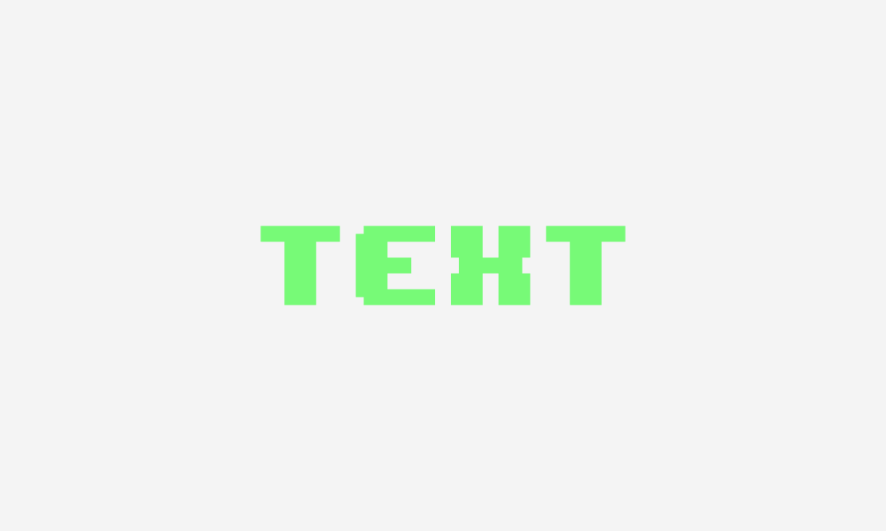
Once we have our font installed, we’ll write out the word we want to apply the effect to. For the sake of this tutorial I’ll just be used the word “TEXT” for example. Then convert the text to a path, ungroup it into individual letters, make everything green, and bring to opacity down to roughly 50%.
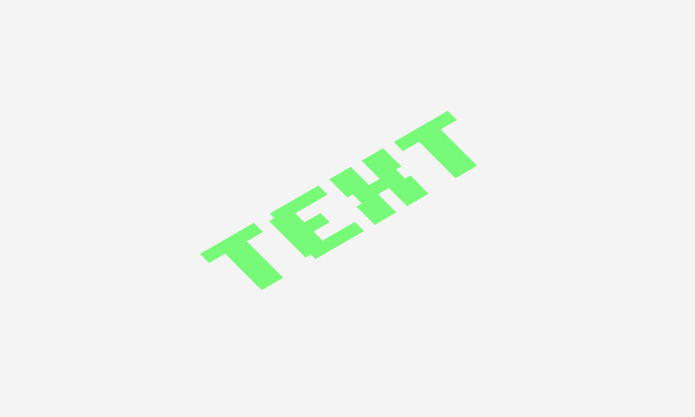
Next we’re going to use the Select tool to shear the text one step to the left, then rotate it two steps counter-clockwise.
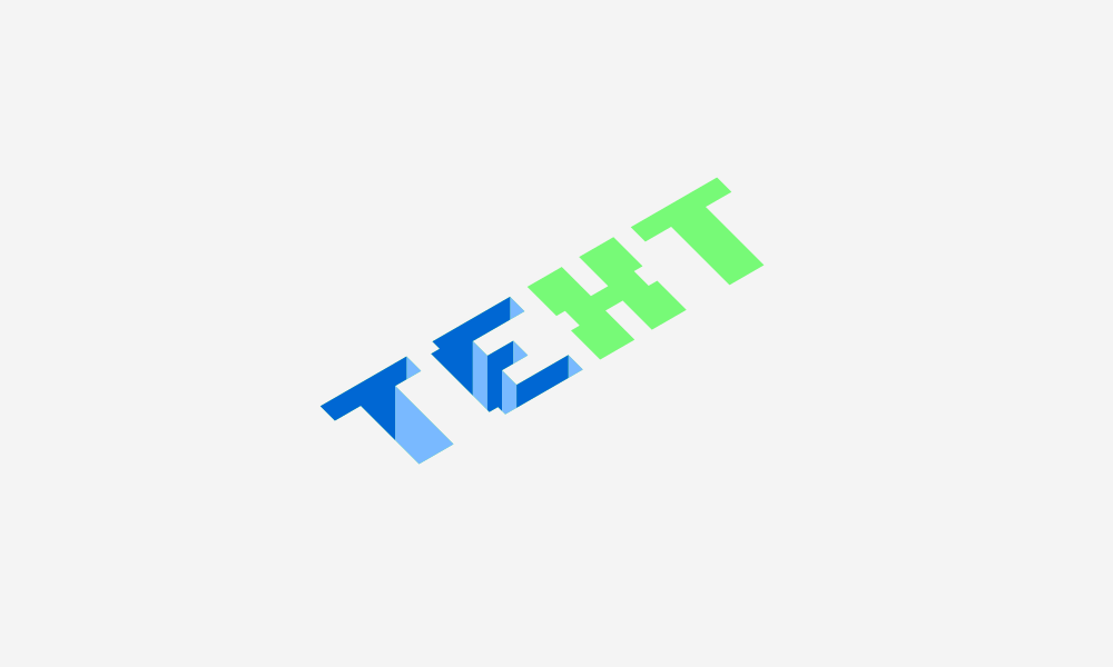
Now we’re going to enable snapping (in the toolbar) and use the Bezier Pen to manually draw shapes within the letters that start at the corners and come straight down vertically. The shapes will alternate between two different shades of the same color. For this example I used blue, but you can use whatever you’d like.
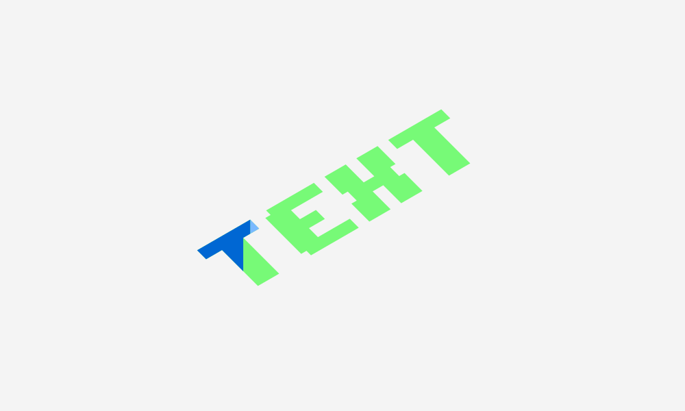
One trick for determining which color which shape should be is to identify the angle of the top of that shape. In my example, each shape which has an angle going down and to the right at the top was colored in with light blue. Each shape which has an angle going down and to the left is colored with dark blue.
It may seem a little tricky at first, but it’s much simpler than it appears once you get the hang of it. I would really recommend watching the video tutorial at the top of the page for this one. It might help you grasp it better.
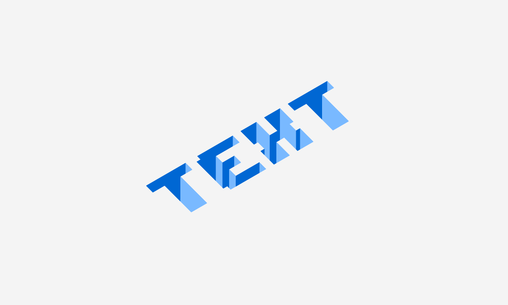
Once you’ve gone through and created shapes over each of the letters you can go ahead and delete the original green letters beneath them. And with that, our isometric carved text is finished!
Learn To Master The SoftwareGain a complete understanding of your favorite design apps with my comprehensive collection of video courses. Each course grants access to our private community where you can ask questions and get help when needed.
|
||||||||||||||||||||||||||||||||


This is very nice and it helped me a lot, but I didn’t grasp how to do the other letters in the alphabet other then T, E, and X. I need to learn how to do an H, A, and a N. If someone could help me it would be gladly appreciated. tnx 🙂
Hi Nick,
I love your site! The articles are very inspirational and helpful.
which version of Inkscape do you use?
Hey Nick! I really liked your red dragon sports logo! What was the first thing you did when you were making it?
Is it better to watch videos here or YouTube or is monetization low enough it doesn’t matter?
Whatever is most convenient for you 🙂 I put these videos here as a backup for my YouTube channel in case something ever happens to it, and because they bring in Google search traffic here as well. If you’re on the mailing list then you’ll get an email every time a new video is posted.
YouTube’s ad revenue pales in comparison to what I make from selling courses and templates on these posts, so I always try to encourage people to watch tutorials here, and I incentivize it with ad-free videos.
Looks great Nick! Your tutorials on Inkscape and gimp have really helped me develop my skill! I have to point out on the “E” in “TEXT” you’ve left out one shape!! On the left upper corner there is one spot that needs an object created. Where the top drops down and left! I only notice these things when it’s not my work and I know I appreciate when somebody had pointed it out!
Thanks Cory. That corner actually remains the same color though because of its angle at the top.