Create A Painted Letter Logo with GIMP
Create A Painted Letter Logo with GIMP https://logosbynick.com/wp-content/uploads/2017/11/letter-logo-gimp-tutorial-1024x602.png 1024 602 Nick Saporito https://secure.gravatar.com/avatar/8e31bf392f0ba8850f29a1a2e833cdd020909bfd44613c7e222072c40e031c34?s=96&d=mm&r=gIn today’s tutorial I’ll be demonstrating how you can use GIMP to design a logo comprised of a single letter with a dripping paint appearance.
Upon first impression, creating a design like this seems quite intricate and time-consuming considering the color composition. It’s actually quite simple, though!
Step 1: Find A Colorful Sunset Image
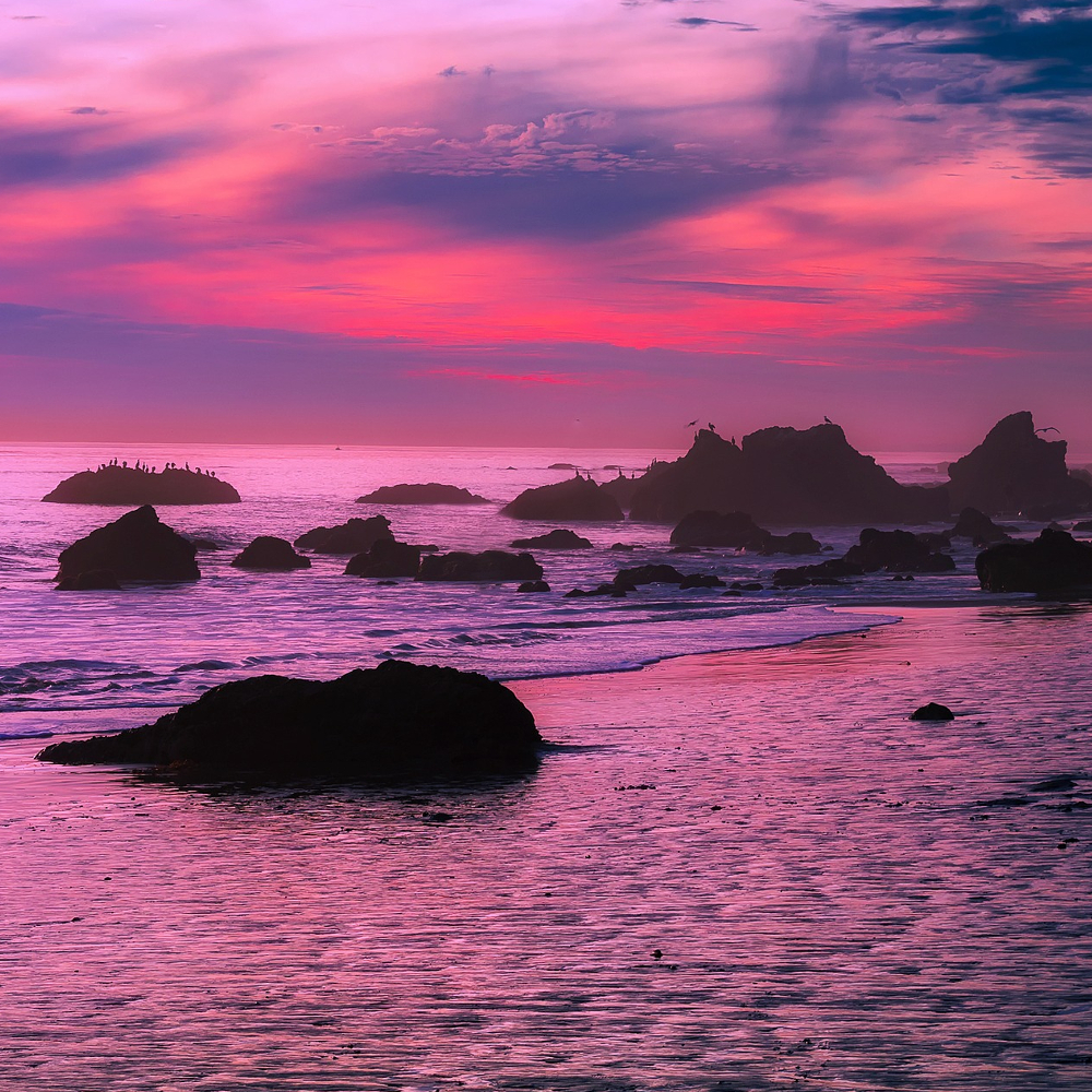
This is the secret ingredient of the design.
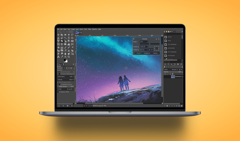
Find a picture of a nice sunset that utilizes an array of colors from a similar spectrum. I chose this particular image because the spectrum of pinks, purples and violets make for a nice touch. I would advise avoiding images that contain color combinations that contrast a bit too much, like blues and oranges. You’re better off using an image that has a fluid gradient of red and orange, or purple and blue.
If you’d like to use the image I used in this tutorial, it can be downloaded here. I suggest downloading the highest resolution that Pixabay offers. You’re going to need it!
Once we have our image chosen, we’re going to use it as the basis of our makeshift paint.
Step 2: Place Your Text Over The Image

Simply grab the text tool and type out your letter/word in your chosen font. The color doesn’t matter, but as far as font choice goes, I would recommend using a cursive or hand-drawn style of font. That seems to work best in emulating a brush stroke.
Place the text over an area of the image where there’s a nice selection of colors, as you see in the above example. I placed the letter L over the sky portion of the image where there’s a good variety of colors.
Once you’ve done that, create a selection from the letter, turn off the visibility of that layer, then invert the selection and delete the selection from the image layer so that only your letter with the sunset image within it remains as depicted below. Make sure your image layer has an alpha channel.

Step 3: Use The iWarp Tool To Distort The Image
Move your letter/word towards the center of the page, then go to Filters -> Distorts -> iWarp.
In GIMP, the iWarp extension is somewhat similar to the Liquify tool in Adobe Photoshop. We’re going to use this tool to create some smudges along the contours of the letter. This is going to distort the sunset image so that it appears as if it’s comprised of paint.
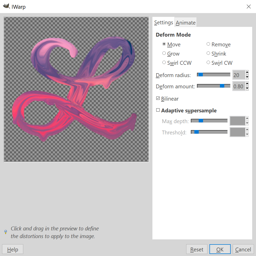
This may take some practice before you get a good feel for it. There’s obviously a freehand element involved with this. I would recommend adjusting the Deform Radius to suit your particular image. The deform radius represents the size of the area that gets distorted when you click and drag on the selection.
I would also recommend bumping the Deform Amount up pretty high, like 0.80 as you see in my example. The deform amount basically represents the length that the paint streaks will be, and since we’re trying to emulate dripping paint, we’re going to want long streaks.
The Finished Product
![]()
Once you’re finished tweaking the design within the iWarp window, go ahead and click OK to finalize it, then add a background of your choosing.
Video Tutorial
For complete step-by-step instructions along with voice-over narration, check out the video tutorial…
Learn To Master The SoftwareGain a complete understanding of your favorite design apps with my comprehensive collection of video courses. Each course grants access to our private community where you can ask questions and get help when needed.
|
||||||||||||||||||||||||||||||||


Thank you for the tutorial. However, GIMP 2.10 users will not have access to the method described. It seems a similar outcome could be achieved through the Warp Transform option found on the main tool panel of the program or through Tools > Transform Tools > Warp Transform on the main program menu. Within the Release Notes of 2.10, GIMP states: “The new Warp Transform tool allows localized transforms like growing or shifting pixels with a soft brush and undo support. Such tools are commonly used in fashion photography for retouching. As such, the new tool retires the old iWarp filter.” I hope the information helps. It’s still a wonderful idea and I hope the same effect you’ve presented can be done! 😊 It appears so as the settings are quite similar but time will tell with completion. 🎨
Yes this video is a bit dated. I’m going to redo this with a more recent installation of GIMP.