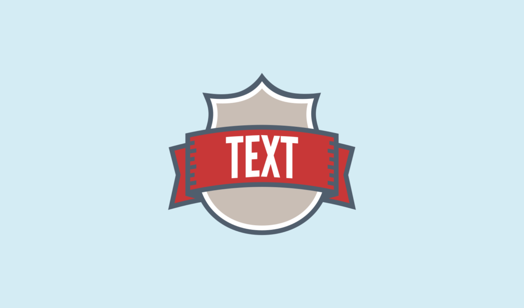
Inkscape Tutorial: Shield Logo Design
Inkscape Tutorial: Shield Logo Design https://logosbynick.com/wp-content/uploads/2017/11/shield-logo-tutorial-inkscape-1024x602.png 1024 602 Nick Saporito Nick Saporito https://secure.gravatar.com/avatar/8e31bf392f0ba8850f29a1a2e833cdd020909bfd44613c7e222072c40e031c34?s=96&d=mm&r=gIn today’s tutorial I’ll be demonstrating how you can use Inkscape to design a shield logo with a banner wrapping around it. The following is a brief overview of how we’ll go about creating this design, for those of you who may be more advanced users and would like to save some time. Otherwise you can simply scroll to the bottom of the page to watch the step-by-step video tutorial with voice narration.
Step 1: Drawing The Shield
First, we’ll be using the Bezier Pen to manually draw a freehand shape that represents one half of the shield. Then, we’ll duplicate that, flip it horizontally and unify it with the original in order to form the entirety of the shield. The reason we’re drawing it in halves is so we can ensure symmetry.
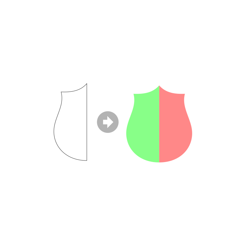
Next, we’ll use strokes and convert them to paths in order to create additional shapes with added padding around them. The converted strokes will each be broken apart and unified together to form solid shapes. After that, the shield portion is complete.
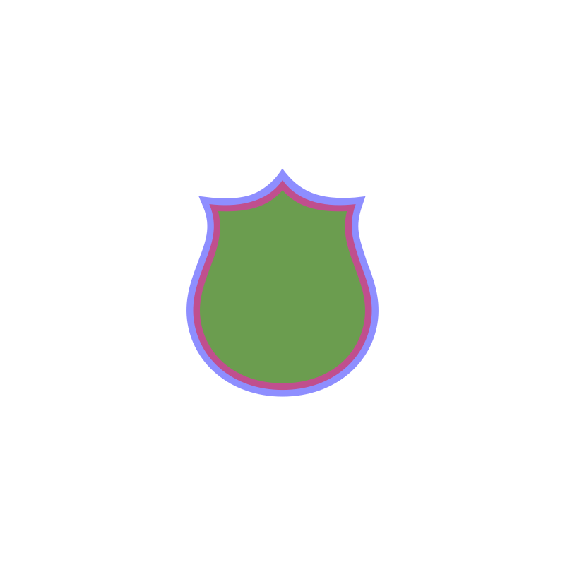
Step 2: Creating A Banner
In this step we’ll be using rectangles and ellipses to create a couple of shapes going over the shield. These shapes will represent the banner, and the foremost layered shape will be shorter in width than the other.
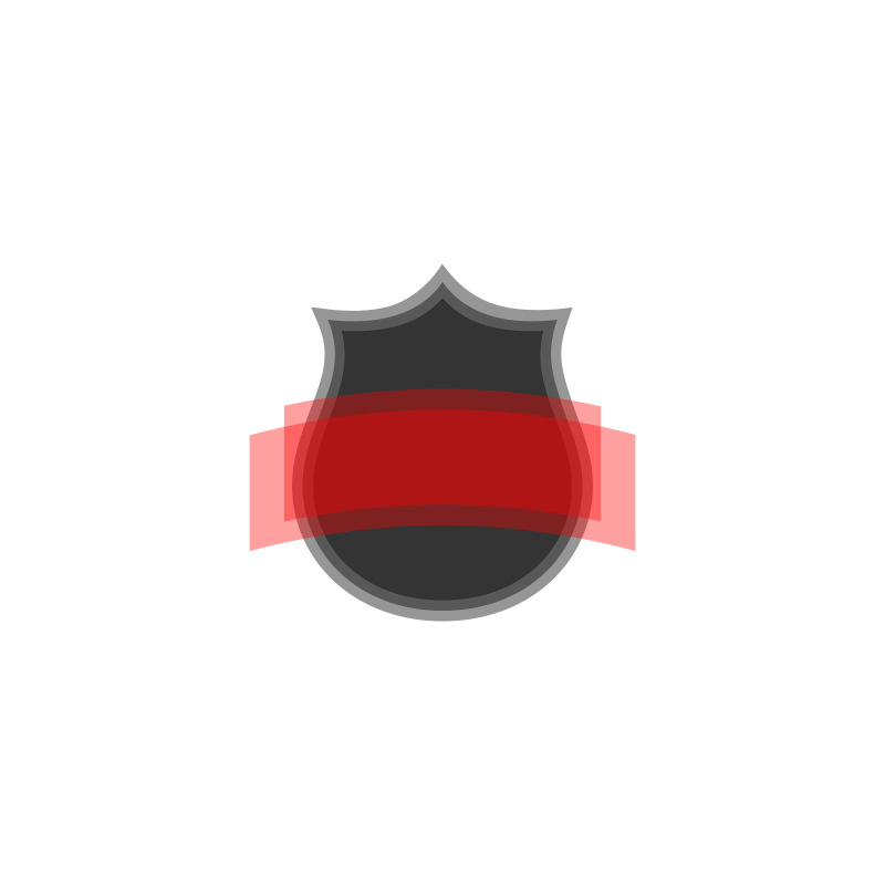
Next, we’ll add indentations to the larger banner, lower it beneath the entire design, then create copies of each and use strokes to add some padding around them.

Step 3: Custom Text and Finishing Touches
Now we’re going to create some text for our logo and use the Envelope extension within Inkscape to place it along curvature of the banner.
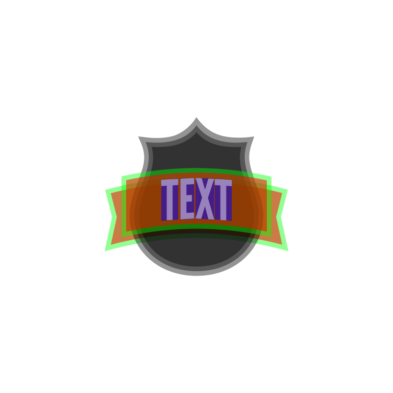
After that we’ll color everything in and add some additional minor details to wrap up the design.

Video Tutorial
If the process outlined above was a bit too vague for you then you can watch the following video tutorial. In this video I go over each and every individual step in order to make learning Inkscape easy and understandable for even a first-time user.
The font that I used for this design is called League Gothic. It’s a free font (for both personal and commercial use) and it can be downloaded here: https://www.fontsquirrel.com/fonts/league-gothic
League Gothic is one of my favorite fonts to use when designing logos. I hope it serves you as well as it has served me!
Finally, if you’d like to know how you can make Inkscape appear dark, as it does on my screen, feel free to check out my post about making Inkscape dark. Enjoy!
If you have any questions, comments or concerns, just leave a comment below and I’ll be glad to help you out. If you’d like me to design a customized logo for you business, brand, produce or service, feel free to reach out via my contact page and I’ll be in touch to discuss your design needs shortly!
- Posted In:
- Inkscape
- Open Source
- Tutorials
Nick Saporito
Hi, I'm Nick— a Philadelphia-based graphic designer with over 10 years of experience. Each year millions of users learn how to use design software to express their creativity using my tutorials here and on YouTube.
All stories by: Nick SaporitoYou might also like
9 comments
-
-
Olesya
and it happens only with the latest version of Inkscape, I tried old version and everything works fine.
-
Logos By Nick
It’s because of a change in the way newer versions of Inkscape handle this function. Update video here: https://youtu.be/Sy0nUkUt9CA
-
-
-
-
-
Jarek
Only precise hard working craftman with sold of artist could make something beautiful and usuful in one thing, and this turtorial and article is example of that. 🙂 Nick you are wonderful person, wish you best and a huge fountain of energy, passion and happines in creating, doing what you love most and in with you are master and you are master of design 🙂 Wish you projects like Massimo Vigneli had
-
-
Jarek
Only precise hard working craftman with sold of artist could make something beautiful and usuful in one thing, and this turtorial and article is example of that. 🙂 Nick you are wonderful person, wish you best and a huge fountain of energy, passion and happines in creating, doing what you love most and in with you are master and you are master of design 🙂 Wish you projects like Massimo Vigneli had
-


Olesya
Hi, Nick! Thank you very much for your tutorials! Right now I am working on this and I am stuck on 03:52min Path=>Stroke to Path
I see on your video something changing but in my case it stays the same visually after Stroke to Path(though I see there were two path layers created) and then when I try Break Apart it says: “No path to break apart in selection”. What could be wrong? I am using the latest version of Inkscape.