Inkscape Tutorial: Mountain Logo Design
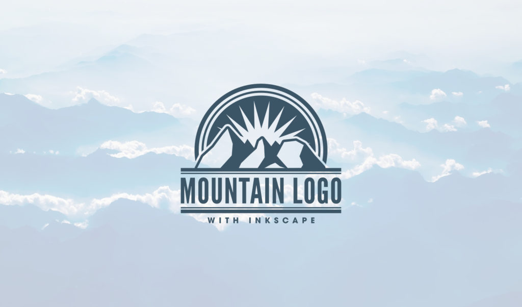
Inkscape Tutorial: Mountain Logo Design https://logosbynick.com/wp-content/uploads/2017/11/inkscape-mountain-logo-tutorial-1024x602.jpg 1024 602 Nick Saporito Nick Saporito https://secure.gravatar.com/avatar/8e31bf392f0ba8850f29a1a2e833cdd020909bfd44613c7e222072c40e031c34?s=96&d=mm&r=gIn this tutorial I’ll be demonstrating how to design a vector mountain range logo using Inkscape. This tutorial makes effective use of the Bezier Pen in regards to freehand drawing. It’s still a pretty simple task though, so don’t let the freehand aspect intimidate you.
The font I used for this tutorial is called League Gothic and it can be downloaded here: League Gothic
Scroll down to the bottom of the page for a step-by-step video tutorial with voice narration.
Step 1: Creating The Mountains
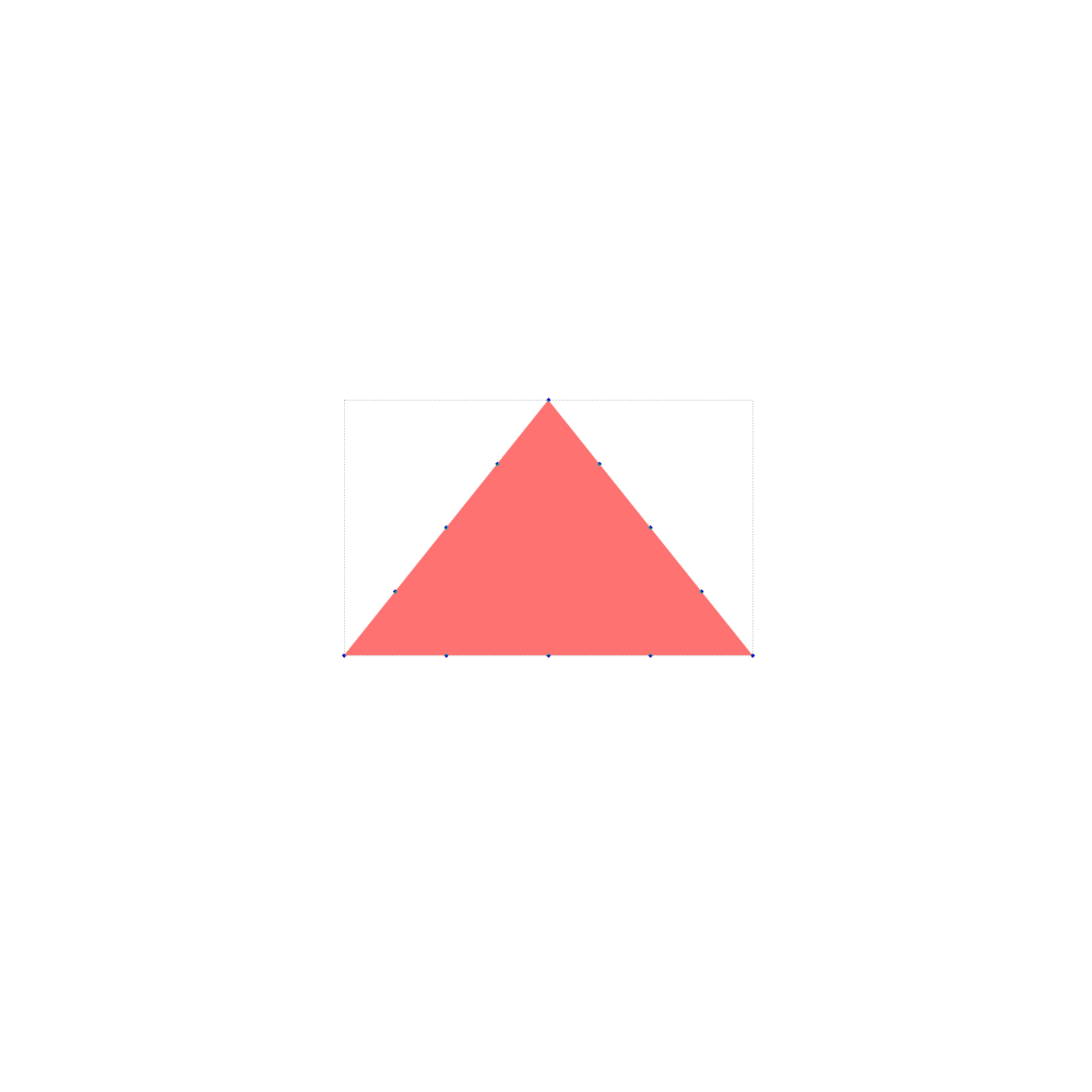
The first step is to create a red triangle and bring the opacity down to 50%, then insert some additional nodes into it as depicted below.

Next, we’ll use the Jitter Nodes extension to shift some of those nodes around, giving it a whimsical, rugged appearance.

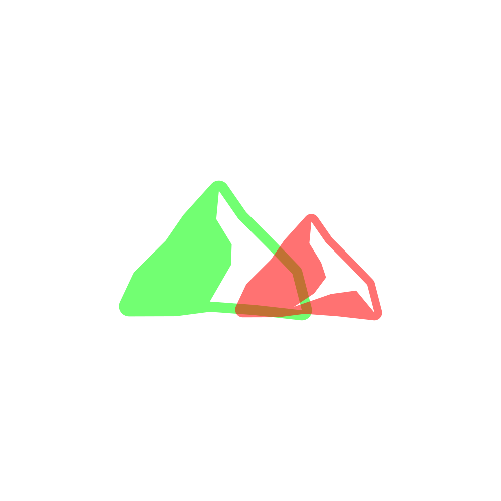
Select the shape and then used the Linked Offset function to create another shape behind it with a slightly more padding around the edges. Convert that shape to a path and then make it green.

Next, use the Bezier Pen to create a freehand rugged shape going through the center of the red object and wrapping around the outside of the right-hand side of the entire graphic. Perform an Intersection on the newly drawn shape and the red object.

Execute a Difference between the red shape and the green shape, resulting in a single mountain icon with makeshift shading on it.

Duplicate the mountain icon, make it red, shift it over to the right then use the Edit Paths by Nodes tool to manually shift some of those nodes around. This ensures that this mountain won’t be too similar to the other mountain, which helps in maintaining a natural appeal.

Repeat the previous step, only make this new mountain blue, bring it to the far right side of the red mountain and make it bigger than the red mountain, but smaller than the green mountain. Again, use the Edit Paths by Nodes tool to manually shift some of the nodes around.

Next, use the Bezier Pen to create a shape going through the red mountain where the green and blue mountains intersect with it, then Duplicate that shape and use each copy to perform a Difference on both the green and blue mountains. Finally, Unify the three mountains and make them black.

The mountains are now complete.
Step 2: Creating The Emblem
Next, we’re going to create a red circle going over the mountains, as depicted below. Duplicate the red circle twice and use each copy to create a couple of red strokes, then convert them to paths. Make sure the inner stroke is somewhat smaller in size than the outer stroke. After that’s done, unify the three red shapes together.

Use the Star tool to create a multi-pronged star, align it in the center of the red circle then perform a Difference between it and the red circle.

Select the mountains icon and raise it to the top of the page, then use the Linked Offset function to create a slightly larger copy of the mountains. After that, convert it to a path and perform a Difference between it and the red circle.

Use the Bezier Pen to create a freehand shape going through the mountains icon and around the bottom portion of the red circle, then use it to perform a Difference on the red circle. This will eliminate the lower area of the red shape, leaving us with our completed emblem. After that you can unify the leftover shape with the mountains and turn it black.

Step 3: Completing The Logo & Adding Text
Create a red rectangle that is wider than the entire emblem and has a height similar to the thickness of the outer band around the emblem. Place it over the lower portion of the mountains, then use the rectangle as a reference point to trim off the bottom portion of the mountains. Duplicate the red rectangle, make it a similar thickness as the inner band of the emblem, then place it slightly below the original rectangle.

Add your text beneath it, ensuring that it is the same width as the entire design, then Duplicate the red rectangles, flip them vertically and place them beneath your text.

At this point, your logo is completed! You can bring the opacity of everything back up to 100%, color it as you please, and add some subtext beneath it.

Video Tutorial
Please refrain from using this design commercially once completed. If you’d like to have a custom, professionally-designed logo created for your own business, feel free to reach out and tell me a little more about your design needs and I’ll be in touch shortly to discuss your project.
- Posted In:
- Inkscape
- Open Source
- Tutorials
Nick Saporito
Hi, I'm Nick— a Philadelphia-based graphic designer with over 10 years of experience. Each year millions of users learn how to use design software to express their creativity using my tutorials here and on YouTube.
All stories by: Nick SaporitoYou might also like
2 comments
-
-
Logos By Nick
Hi Chae, I have pricing information about my logo design services here: https://logosbynick.com/logo-design-service/
-


Chae Jaynes
Hello Nick, How much would your charge to create a logo for my research lab? The logo I am imagining will be relatively simple and similar to this mountain logo. If you are interested, please email me at [REDACTED]