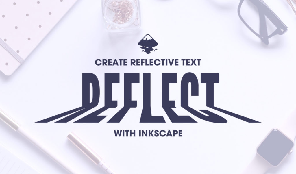
Inkscape Beginner Tutorial: Reflective Text Effect
Inkscape Beginner Tutorial: Reflective Text Effect https://logosbynick.com/wp-content/uploads/2018/05/reflective-text-inkscape-1024x602.jpg 1024 602 Nick Saporito https://secure.gravatar.com/avatar/8e31bf392f0ba8850f29a1a2e833cdd020909bfd44613c7e222072c40e031c34?s=96&d=mm&r=gIn today’s tutorial I’ll be demonstrating how you can use Inkscape to create a reflective text effect where it appears that the top half of the text is reflecting — or casting a shadow of — the bottom half. The two main processes of note in this lesson are the division function and the perspective live path effect. This is a simple, easy-to-follow lesson that would be perfect for a beginner or first-time user of Inkscape.
The following is a brief overview of the steps that will be taken. Proceed to the bottom of the page to watch the video tutorial with complete step-by-step instructions and voice narration.
League Gothic Font
The first thing I would recommend doing is downloading and installing the League Gothic font (it’s free) before you open Inkscape. If you install the font while Inkscape is already open, it won’t be picked up in the font registry. You’ll need to restart the application.
Download the League Gothic font for free here: https://www.fontsquirrel.com/fonts/league-gothic
Reflective Text Effect with Inkscape
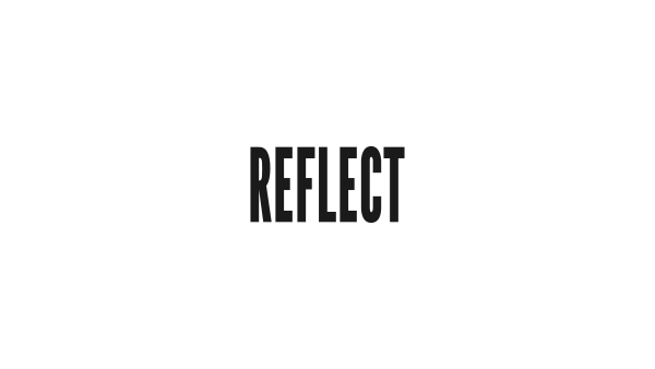
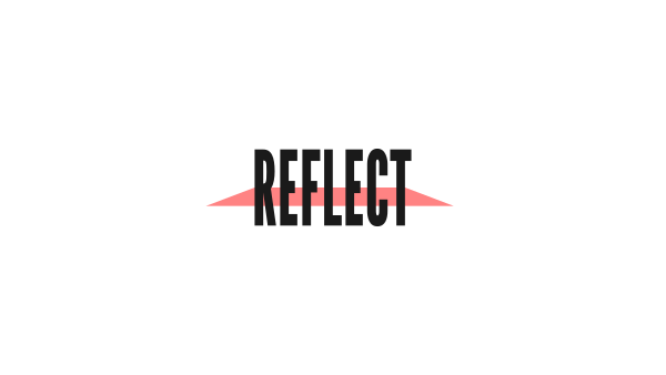
The first (and obvious) step is to simply generate some text. For the sake of this tutorial, I’ll be using the word “REFLECT” in all caps. It’s important that you use all caps when doing this.
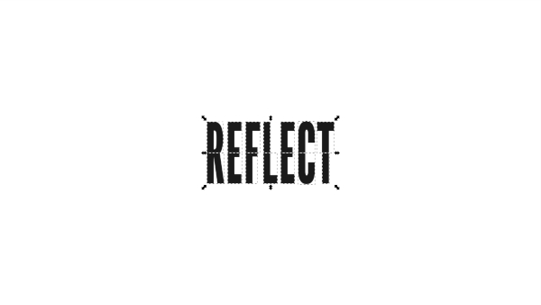
Next, we’re going to create a rectangle half the height of the text and use it as a reference point to perform a division path effect. This will split the text in half horizontally, as depicted below…
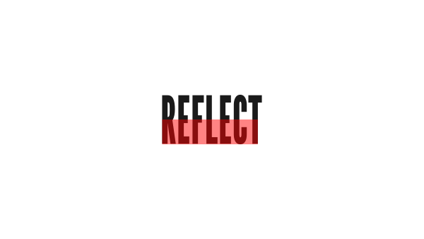
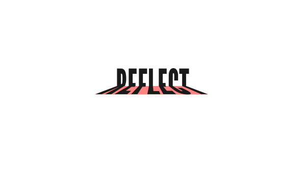
Once that’s done, we’re going to create another rectangle that matches the size of the lower half of the text. This rectangle will be the reference point for applying a perspective to the bottom half of the text.
Now we’re going to grab the edit paths by nodes tool and use it to bring the bottom two nodes of the rectangle up further, then scale them outward to form the following shape…
Finally, we’ll use the perspective live path effect to make the bottom half of the text take the shape of our rectangle.
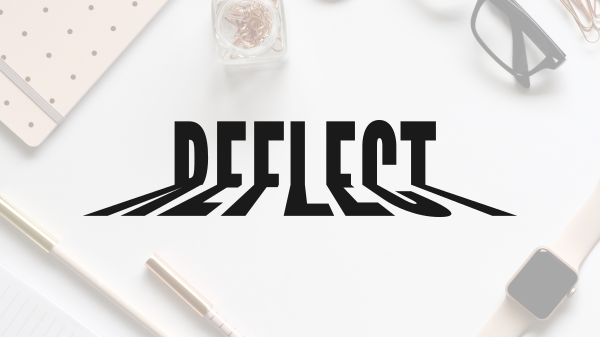
And with that, our design is complete!
Video Tutorial
For complete step-by-step instructions with voice narration, watch the following video tutorial. If you have any questions, comments or concerns, do not hesitate to post them below. As always, thanks for watching!
Learn To Master The SoftwareGain a complete understanding of your favorite design apps with my comprehensive collection of video courses. Each course grants access to our private community where you can ask questions and get help when needed.
|
||||||||||||||||||||||||||||||||


You might also like


2 comments
-
-
DistaBamba
Thanks Nick! Looks cute
I will be glad to see more tutorials, and practice, practice, practice )))
Its funny
DistaBamba
Hi! I did! Element in YouTube channel logo.
( At the time of writing this comment – I like it.
Maybe someday I’ll change to something else. )
I use cyrilic font – Tsarevich.
See – is[dot]gd/ididlogo
Thank you for a good idea and tutorial.
Reflective – nice effect