22 Best Logo Color Combinations for Inspiration
22 Best Logo Color Combinations for Inspiration https://logosbynick.com/wp-content/uploads/2018/03/best-logo-color-combinations-1024x602.jpg 1024 602 Nick Saporito Nick Saporito https://secure.gravatar.com/avatar/8e31bf392f0ba8850f29a1a2e833cdd020909bfd44613c7e222072c40e031c34?s=96&d=mm&r=gChoosing the right colors for you logo can be somewhat tricky, especially when you consider the psychology of color and branding. However, if you’re just looking for some suggestions for color palettes, I’ve compiled a list of the 22 best logo color combinations from designs that I found while browsing Instagram.
Generally speaking, logos work best when you include no more than 3 colors, and that’s reflected in the choices I made for this post.
Best Logo Color Combinations
Each design links back to the originator in effort to give them their due credit.
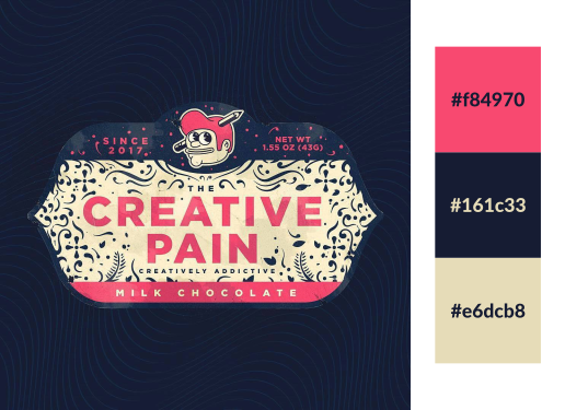
Sometimes you’ll look at two colors and think nothing of them until a nice piece of design ties them together like this one.
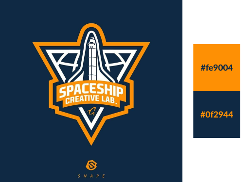
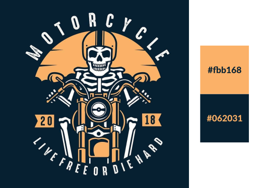
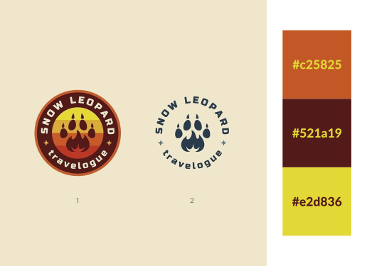
Navy blue and yellow with a splash of orange. I’ve always liked how well these shade contrast with each other.
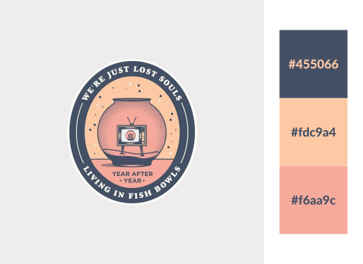
I love these muted pastel tones. They have a soft, calming effect.
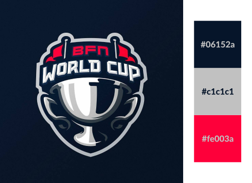
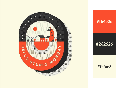
A sharp red with a deep navy blue always work well together, especially when you accent it with some white or gray.
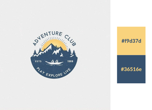
Blue and yellow always contrast nicely, but these particular shades just look stunning.
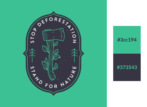
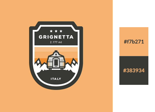
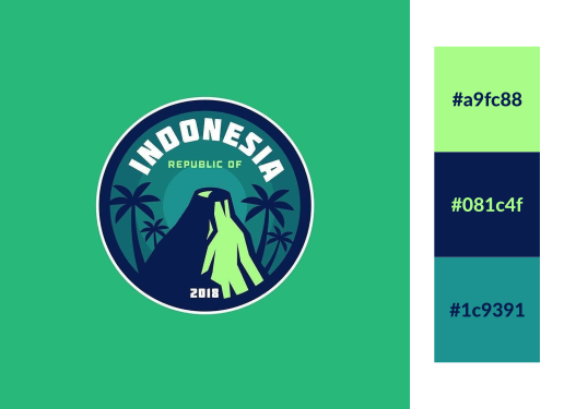
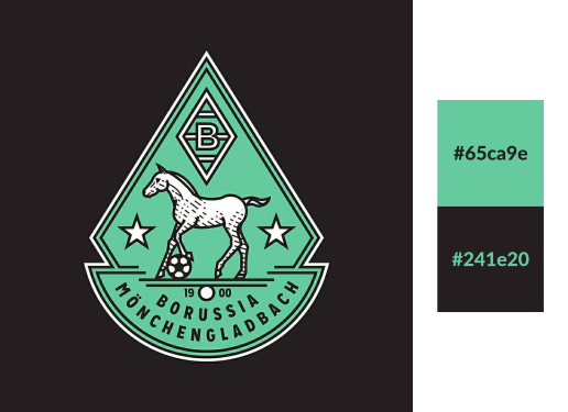
One of the things I love about browsing other designs for color inspiration is that it causes you to notice shades you otherwise never would’ve considered. This really deep, dull green would be one of then. It contrasts very nicely with light shades of orange.
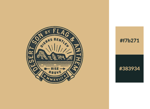
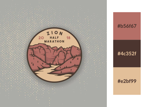
A dull forest green paired up with a muted shade of tan. Makes for a nice aged look.
This is probably one of the best logo color combinations I’ve seen yet. This is sharp and it just pops.
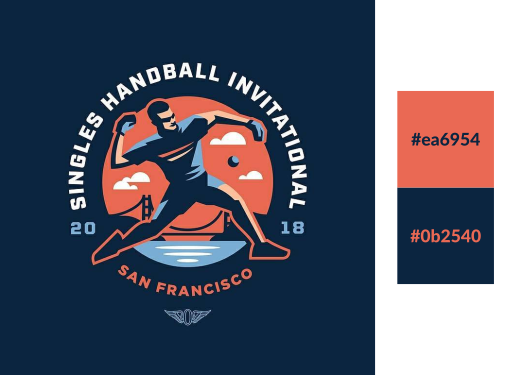
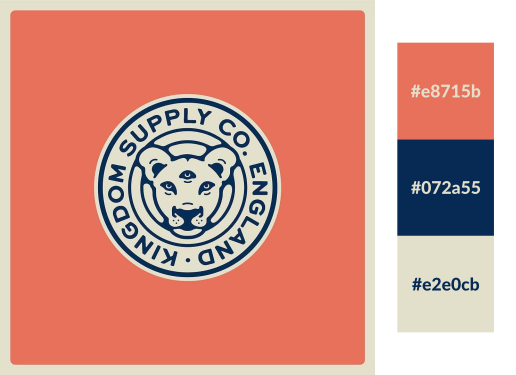
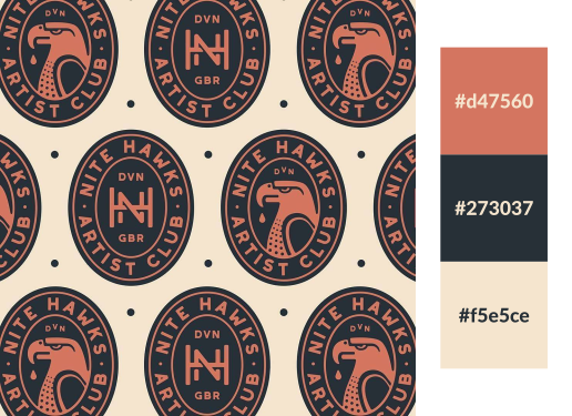
Much like navy blue and red, navy blue and orange also works. This looks like orange with a splash of pink though… peach?
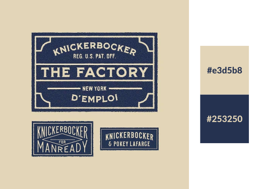
I’ve always loved how tan and navy blue look together, and this design just reinforces my feelings about that.
Here’s one that caught me by surprise. I never would’ve thought these three shades could interact so nicely together.
This one immediately makes me think of ice cream for some reason.
I love the stark contrast of these three shades. They’re so different, yet so similar. And when combined it makes the design have a striking appeal.
Here’s another brown and green logo color pairing. I think the white accent really helps sell it.
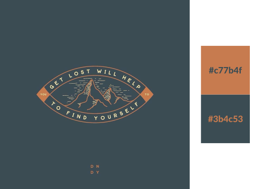
Faded orange, navy blue, tan. Another nice pairing.
Another blue and yellow pairing, but with different shades. These two really jump off the page.
This is almost like a faded, pastel-like version of the UPS branding.
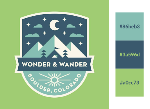
This would be one of my top picks of the entire lot. Out of context it immediately reminds me of ice cream.
Yet again we find ourselves with blue and orange/yellow, only in different shades. It’s amazing how different shades of the same general colors can offer such variety.
This is one sharp color combo. I’ll have to save this for future reference.
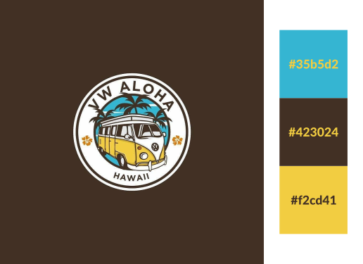
Brown, blue and yellow is something I never would’ve thought of on my own, but now that I see it, it looks sharp. It has a real laid back sort of vibe.
This medley reminds me of a hot summer day.
Learn To Master The SoftwareGain a complete understanding of your favorite design apps with my comprehensive collection of video courses. Each course grants access to our private community where you can ask questions and get help when needed.
|
||||||||||||||||||||||||||||||||
- Post Tags:
- Branding
- Posted In:
- Articles
- Branding
- Color Palettes
Nick Saporito
Hi, I'm Nick— a Philadelphia-based graphic designer with over 10 years of experience. Each year millions of users learn how to use design software to express their creativity using my tutorials here and on YouTube.
All stories by: Nick Saporito





I have been using this page for years, very useful, Thank you so much Nick 🙂
Currently creating my logo and branding for my run for public office! This has been super helpful as I don’t want to go the “traditional” red white blue combo.
Awesome, best of luck!
On the color combo Navy and Orange what is the light blue color used to pop?
This was really helpful! I’m in the process of rebranding my business, so thank you so much for posting this!
Sure, glad to help!
Just bought your e-book on how to build a logo and looking forward to a good read 🙂 Learning CSS at the moment, while trying to expand my knowledge and design skills in both Ps and Illustrator CC. Today I bought my first domain/webhotel and I feel very motivated to start something new in my life. I saw your site earlier today and really enjoyed the feel and all the interesting articles!
Cheers!
That’s great to hear! Thanks Espen, good luck with the new site. It’s a lot of fun creating and managing a content site.
These are great examples. I’m trying to come up with a color scheme and logo for my personal brand and I think I’m going to go with some gradients in my web design. Like Ultra Violet -> Blue with yellow accent colors. I think it is going to look best on a dark theme on wordpress. Would you recommend keeping my logo white in that case?
If it’ll be used on a dark background? Yeah I would recommend white or any light shade. I’d recommend having multiple variations of your logo for use on both light and dark backgrounds though.
can I share some your article/posts with indonesian translation? i want to share it in my blog. thanks.
can I share some your article/posts with indonesian translation? i want to share it in my blog. thanks.