πŸŽ‰ Black Friday πŸŽ‰ Use coupon code BLACKFRIDAY24 for 50% off courses & templates! πŸ‘ˆΒ 
Logo files for clients

The Complete Guide to Preparing Logo Files for Clients

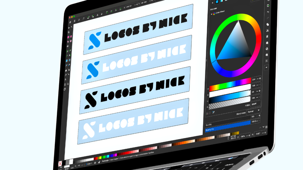
The Complete Guide to Preparing Logo Files for Clients 1024 602 Nick Saporito

I originallyΒ wrote about preparing and generating logo files for clientsΒ back in 2015, but I’ve sinceΒ improved my process and formatting, and this time around I’d like to do a better job of breaking down the process and giving you a more in-depth look at things in order to help you better understand. In this post I’ll be going over all of the file formats, variations, and sizes that a completed logo design should be rendered in, and how toΒ delegate everythingΒ into a neat, organized folder system as well. This is the same approach that I’ve used for thousands of logo clients over my 7 years of experience.

If you’re a designer,Β this post will help you know exactly what you should be providing to your clients, and if you’re a client, you’ll know exactly what to expect from your designer in terms of logo files.

Logo Files for Clients

I’ve included a video tutorial below demonstrating how to prepare logo files for clients using Adobe Illustrator. Otherwise, you can continue on for the written instructions.

Let’s say you’ve been working with your client for a while — presenting ideas and going back and forth with revisions — and this is the final design that they’ve agreed on and would like to finalize…

Example logo design

When a client hires us to design a logo for them, it’s our job to make sure that we’ve provided them with everything they need for any possible way they may ever use their logo — this includes use on a website, as social media avatars, blown up to fit a billboard, stripped down to be embroidered onto a shirt, used in a strictly black & white context, or whatever else.

Structures

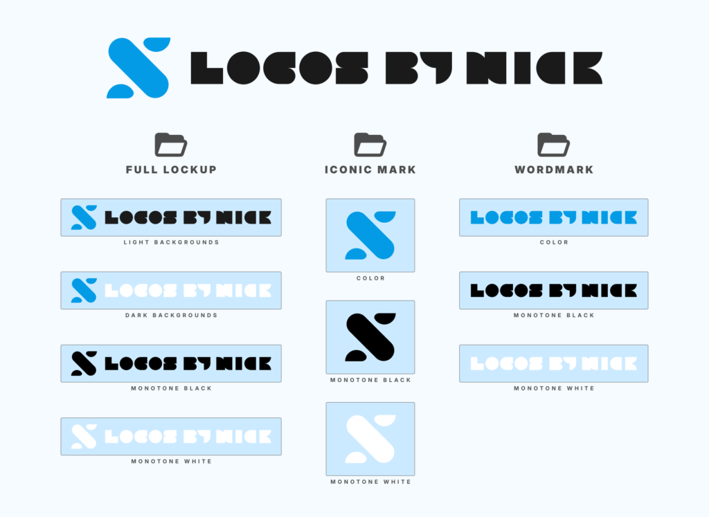
The first thing we need to do is break the logo down into three different structures…

Three different logo structures

1. Full Lockup

This is the complete logo design, with both the icon and the text next to it. This will be the most commonly-used file by your client.

A good example ofΒ how it’s used would be in their website’s header section.Β This format won’t always work in every context though, which is why we need to render some more variations.

2. Iconic Mark

This is the standalone icon, and it’s important that your client has a copy of it because there will very often be times when they need to use just the icon without the text.

A good example of this would be for use as an avatar on Facebook, Instagram, or Twitter. The profile pictures on most social platforms are formatted to be a symmetrical square, meaning a horizontally-oriented logo design (like our example) won’t fit very well. The dimensions will force it into a compact size that’ll hardly be legible (especially on a mobile device) and there will be unsightly blank space on the top and bottom.

3. Wordmark

The standalone text will probably be the least used variation of a logo, but it’s still useful to have copies of it regardless. Sometimes a logo needs to fit a very stealthy design context where it is present, but tucked away so some other design element can stand out and take priority. Using a simple wordmark variation of the logo can help achieve this.

Favicon (optional)

A website favicon is the little icon that appears on the browser tab of a website. It’s 16 x 16 pixels in size and rendered in .ico format (GIMP does a great job of exporting to this format.)

Favicon example

An example of the favicon used for my website

It’s not necessary to include a favicon with the logo files for clients as well, but it’s a nice thing to do if you’re feeling generous. I like to include it with my more expensive pricing packages as an incentive.

It’s important to note though that the favicon, as we know it (the 16 x 16 .icoΒ file,) is slowly becoming irrelevant for most of us casual web creators. These days, most WordPress themes (and I imagine this is the case with Shopify, Weebly, and other popular website creation platforms) allow you to upload a crisp 512 x 512 .png file for use as a site’s icon, which also displays as a favicon in the browser’s tab. In this instance, the client’s iconic mark variation will work just fine.

Please bear in mind that this 3-part structure breakdown won’t always apply to every logo project. Some types of logos — like badges and emblems — have all three elements combined. In cases like this, you won’t have to render separate files for the wordmark and iconic mark because it’s an all-in-one deal.

Color Variations

The next area we need to pay attention to is the colors used for the logo. For each for the 3 structures, we’ll have to produce files in the following color variations…

Four different logo color variations

Full Color

This is the standard variation in full color, and it will probably be the most used variation as well. It’s intended to sit on white/lighter backgrounds.

Inverted

This is another full color variation, but inverted. It’s intended to be used on black/darker backgrounds.

A good example of this is the header section of the very website you’re reading right now. I mostly use the standard on-white variation, but I also use the inverted (white copy) on pages where the navigation header sits on a darker backdrop.

Monotone

The final color variationΒ is monotone — both all black and all white.

These won’t be used as often as the full color variations, but it’s important to have copies of these on hand regardless. If you’re using your logo in a very simplified context — like on a black & white fax printout, orΒ cut into a steel sign — these monotone copies will offer the versatility needed to accomplish that.

Based on the style ofΒ the logo, you may need to create an entirely separate design with negative space to accomplish this, as depicted below.

Monotone logo example

Taking structure and color variations into consideration, the files we’ll be producing for our example logo are as follows…

Full lot of structures and color variations

Logo File Extensions

For each structure and each color variation, we’ll have to produceΒ a variety of file formats in order to accommodate an infinite plethora of possible uses.

Editable Formats

All of the editable logo formats

Most importantly, your client is going to need editable source files, sometimes referred to as the “master file”. Ideally, a logo should be created in vector format so that it can be scaled up infinitely without quality loss. Editable source files to include are as follows…

  • SVG – A true vector format that can be edited with Inkscape, Illustrator, CorelDraw, or any other vector graphics application.
  • AI – Another true vector format, only it is proprietary to Adobe, so it can really only used with Illustrator. It’s good to have a copy of this though because print shops will often request Illustrator files to work with when prepping something for print.
  • EPS – This is another editable format. It’s not necessarily a true vector format, but it is editable with any vector graphics application, and some people prefer to work with it, so I like to include an EPS copy with my logo files for clients as well.
  • PDF – Another editable file that works very similarly to Adobe Illustrator format. The benefit with PDF though is that it’s not proprietary, meaning it can work with any vector graphics software.
  • PSD (Optional) – This is a layered Photoshop file. I don’t normally include PSD copies, but sometimes clients request them because they’re very familiar with Photoshop (or GIMP) and would rather use that to alter the designs when needed.

You don’t need to provide every one of these formats. I usually like to provide SVG, EPS and PDF. That’s typically more than enough to cover all bases.

Although PSD is a raster graphic format (not vector,) you don’t need to re-create the logo in order to generate a layered PSD file. What I like to do is open the vector copy with Illustrator, and in the Layers menu, click the options icon in the top-right corner and select Release to Layers (either sequence or build.) This will give each individual element of the design its own individual layer, and from there you can export it as a PSD file.

Release to layers before exporting a PSD of the logo

Ready-to-Use Formats

Ready to use logo formats

The other category of logo files for clients that you should provide are ready-to-use formats. These are files that can be uploaded directly to the web.

  • PNG – First and foremost, you’ll want to provide PNG file with a transparent background. This will likely be the file that your client uses the most. PNGs can be directly uploaded to a website for use as a logo, and since they have a transparent background, they’ll lay nicely on top of whatever color, pattern, image or video is being used as the background. You can see this in action on my professional logo design portfolio page, where the background image at the top of the page shows through the negative space of the logo.
  • JPG – This is somewhat of a useless format in my opinion, because it doesn’t provide support for alpha channels, meaning no transparent backgrounds. The background will usually default to white (unless you specify a color or some other fill.) However, sometimes your client will need to upload their logo someplace where they (for whatever reason) accept JPG files, but not PNGs, so it’s still a good logo file for clients to have copies of. There’s also an added benefit in that JPG files tend to be more compressed and take up less disk space than their PNG counterparts.
  • ICO (Optional) – The final format is ICO, used primarily for favicons, as discussed earlier. Again, this optional.

Logo Sizes

Before you start rendering all of the necessary logo files for clients to use, you should make sure you have it sized correctly first. If you give the client a logo that’s too small, they’ll have to scale it up to use it in larger contexts, which will make it look pixelated. Inversely, if you give them a logo that’s too large, it’ll take up an incredible amount of disk space, and they may have trouble uploading it to places that have file size limits.

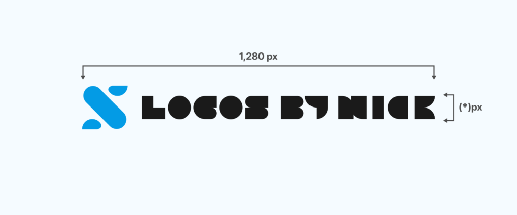
Ideally, a logo should be sized with its largest dimension being 1920 pixels. This means that if the logo is wider than it is tall, make it 1920 pixels wide, and let the height fall where it may. Likewise, if the logo is taller than it is wide, make it 1920 pixels tall and (*)Β pixels wide.

A 1920 pixel logo

Why 1920 Pixels?

This is completely subjective and just my own opinion, of course. Considering where we are today technology-wise, 1920 pixels is just the right size. It’s big enough to fit across the entire width of a full HD (1080p) monitor, but no so big that it’ll take up an incredible amount of disc space.

This recommendation has a shelf life though. As of 2018, the overwhelming majority of people visiting my site are still doing so on 720p displays. As time goes on and 4K continues to quickly become the norm, this will likely change.

This is all negligible though. Like I mentioned earlier, one of the reasons we provide vector files is so the logo can be sized to whatever specifications necessary. If you’d rather render the files at 1280 pixels (or some other size in that range) instead, go right ahead. It’s not going to make a significant difference in most contexts.

For Icons

One little piece of advice I’d like to give you, based on my own experience working with many clients, is to leave some padding around the edges of the iconic mark. This is because when your client inevitably uploads this file to their Facebook or Instagram page, the platform is going to display the logo running all the way to the very edges of the design, which will look odd. Leaving some padding around the edges means it’ll fit nicely.

Demonstration of the padding around a logo uploaded to Facebook

If the design runs all the way to the edges, your client is most likely going to come back and ask for copies of the design with some padding added. To avoid wasting both yours and the client’s time, what I like to do is make the document size 1920 pixels, but the icon size 1700 pixels. This leaves plenty of empty space around the edges.

Logo padding

If you’d like to do the same for the full lockup and the wordmark variations, go right ahead. It isn’t necessary though.

Logo FormatΒ Guide

Logo format guide

Since your client likely isn’t well-versed in file formats, extensions, and how they can best be used, it would be very helpful to provide them with a guide that briefly outlines such. Otherwise they won’t have much of a clue of how they can best use their new logo.

I have a copy of my logo format guide in PDF format and what I do is simply click and drop a copy of it into every batch of logo files that I send to a client. There’s no need to create an individual guide for each client — you can use the same file over and over again. Here’s a copy of the guide I created: LogoFormatGuide.pdf

I would suggest creating a copy that you can send your own clients. Or, if you enroll in my Logo Design Academy you’ll be given access to a blank copy that you can place your own branding on.

Folder Organization

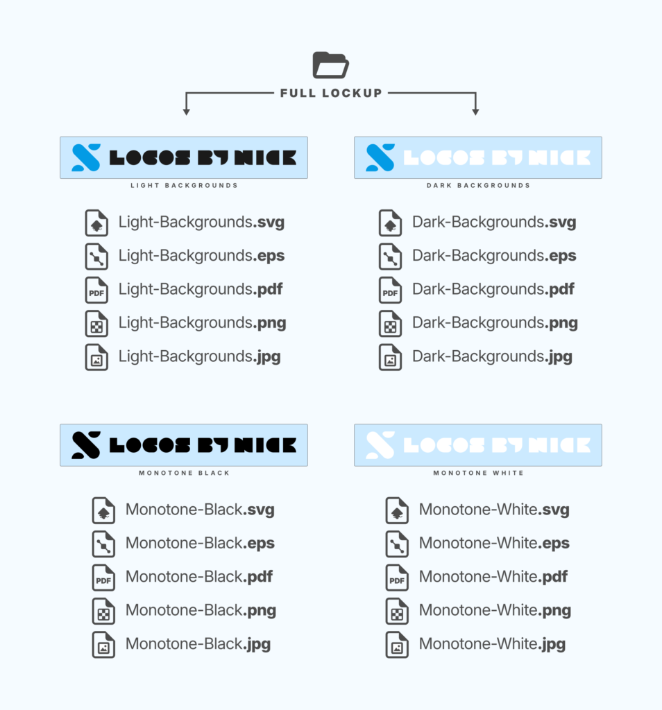
For every logo design project, I like to create a dedicated folder for all of the files. Within that folder there’s more folders that neatly break down and organize all of the files. Here’s a graphic to demonstrate how I like to structure logo files…

Click to enlarge

Once I’ve rendered all of the necessary logo files and have delegated them to their corresponding folders, the final product that I like to sendΒ my clients is a zipped folder (.zip) of everything. To create ZIP folders (when using Windows) I like to use a free application called 7Zip.

7Zip is a very simple (but useful) free tool. Click the image to download it.

If you’re using Ubuntu or some other Linux-based operating system, you can simply right-click the folder and choose “compress” I think it is, but don’t quote me on that. For Mac users, I’m not sure. I haven’t used the Mac OS personally, but I imagine it wouldn’t be very difficult to figure out how to create ZIP folders.

Precautions

Here’s some things you should be cautious of when creating logo files for clients…

NeverΒ Include Font Files

If you used a stock font in the logo, do not send your client a copy of it. You are breaking the law and risking a potential legal headache if you do.

Although the design of letters cannot be copyrighted, the software that generates them (meaning the .TTF or .OTF font file) can be, andΒ I haven’t come across many font files that allow you to transfer them between other users — even fonts that are free for commercial use. They still have very strict guidelines about transferring them.

If a client asks you to send over the font file that you used, politely explain that you’re not allowed to under law, and instead, give them a link to where they can download the font and install it themselves.

Convert Text to Paths/Curves

Speaking of fonts, make sure that you’re not sending over design files that have the font software embedded in them. This means converting the text to curves (if using Illustrator) or to paths (if using Inkscape) before you save them. Failing to do so is not just a potential legal problem, but it also means that the design of the text will be lost whenever someone tries opening it using a machine that doesn’t have that specific font already installed.

Prepare toΒ Explain PNG and Transparent Backgrounds

Sometimes clients will open one of the PNG files for their logo and think something went horribly wrong.

For example, if they open the white monotone copy, it’s possible that they will think it’s a blank document. That’s because the device they’re using to view the document automatically defaults to displaying a white background behind an image that has a transparent background. With a white logo on top of a white background, it creates the illusion of a giant blank canvas. You’ll have to explain to them that the document isn’t actually blank — it just looks like it is — and if they lay the file onto a dark backdrop (or open it with Photoshop or GIMP,) they’ll see that the design is clearly there.

The same thing goes for Windows 10’s new image viewer, which defaults to black as a background when viewing PNGs that use transparency. I’ve had a few clients ask me to give them copies of the logo without a black background, but had to explain to them that it doesn’t actually have a black background.

Managing Large File Sizes

Preparing and generating logo files for clients is a monumental task, and the resulting files sometimes take up an enormous amount of space. If you’re working on a platform like Upwork or Fiverr, then uploading large file sizes probably won’t be much of a concern for you. If you’re like me and use email to conduct business though, you may have trouble trying to attach and send 10+ MB files over email. Not only is it a hassle, but it takes up unnecessaryΒ server space.

To avoid this, I like to use a file hosting service like DropBox or Google Drive. I personally like DropBox because the site is very simple to navigate and use, and they make it very easy to create links that you can share with your client once the upload is complete. This is not a paid promotion and I’m not using any affiliate links — I just genuinely like their service and would recommend it.

Example Logo Files

I know this was a very long and extensive post, and if you skipped over large portions of it, I don’t blame you. To help you better understand how I like to prepare and render logo files for clients, here’sΒ all of the bundled of files for the example logo used in this post. Have a look through it for a better understanding: ExampleLogoFiles.zip.

Enjoy!

Disclaimer: this website doesn't track you, serve ads, or contain affiliate links 🀘

Learn To Master The Software

Gain a complete understanding of your favorite design apps with my comprehensive collection of video courses. Each course grants access to our private community where you can ask questions and get help when needed.

Β  81 Videos
Β  11 Modules

The Inkscape Master Class

Tutorials, quizzes and practice exercises for learning every tool & feature in Inkscape.

Price: $17
Β  77 Videos
Β  7 Modules

Affinity Designer Master Class

Tutorials, quizzes and practice exercises for learning every tool & feature in Affinity Designer.

Price: $17
Β  98 Videos
Β  7 Modules

Illustrator Master Class

Tutorials, quizzes and practice exercises for learning every tool & feature in Illustrator.

Price: $17
Β  70 Videos
Β  9 Modules

GIMP Master Class

Learn how to use all of the primary tools and features in the GIMP application.

Price: $17

View All Courses

Nick Saporito

Hi, I'm Nickβ€” a Philadelphia-based graphic designer with over 10 years of experience. Each year millions of users learn how to use design software to express their creativity using my tutorials here and on YouTube.

All stories by: Nick Saporito
123 comments

Leave a Reply

Your email address will not be published.