Drone Logo Design for Aerial Photography Service
Drone Logo Design for Aerial Photography Service https://logosbynick.com/wp-content/uploads/2016/10/drone-aerial-logo-design-1024x602.png 1024 602 Nick Saporito https://secure.gravatar.com/avatar/8e31bf392f0ba8850f29a1a2e833cdd020909bfd44613c7e222072c40e031c34?s=96&d=mm&r=gOverview
Aerial photography is the process of photographing the ground and/or objects on the ground from above. Images are usually taken using drones, and since drones are becoming more accessible and affordable to the public, an entire industry is arising from it. Aerial photography particularly serves construction sites, land surveys, environmental research, surveillance, commercial advertising and various artistic cinematography uses. In this post I’ll be outlining the drone logo design process for an aerial photography service.
I find this to be absolutely fascinating, so I’m always excited to take on branding projects for these sorts of services.
Objective
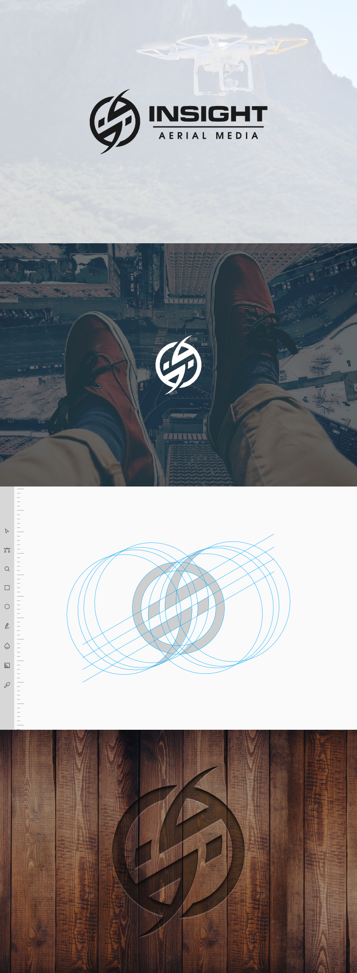
Insight Aerial Media, an FFA authorized commercial drone company, reached out to me to develop their logo. The goal was to create something simple and conceptual, in a single monotone shade, and without depicting literal drones or anything else that would be similarly cliche. With that information in mind, I took to the lab to begin exploring some possible design ideas.
Creative Approach
After much experimenting, we examined various possible design ideas and arrived at a conceptualization of the letters I and S (for insight) within the shape of a circular drone blade.


The curvature of the blades and the negative space of the ring area just outside of them assisted in not only establishing a letter S, but suggesting that the blade was in motion as well. I think it worked out nicely.
For the “Insight” typeface, we went with Michroma, a technical-style font that fits the entire concept nicely. Since the font is somewhat lightweight out-of-the-box — which ruins a logo’s ability to scale to small sizes — I altered it to a heavier weight. For “Aerial Media” I used the more generic Tex Gyre Adventor shrunken down and sprawled out beneath “Insight” to give it secondary precedence.
And with that, the design was completed…
Learn To Master The SoftwareGain a complete understanding of your favorite design apps with my comprehensive collection of video courses. Each course grants access to our private community where you can ask questions and get help when needed.
|
||||||||||||||||||||||||||||||||


Stencildesign
Hello, Nick!
The symbol you created is fantastic!
I use to read critiques on logo critique sites and there is an element in your design that I suppose would be assaulted with critique.
The horizontal bar that separate the words is not aligned on the left with something. With I or N on INSIGHT. At the right also is not aligned very well with T.
Is that designed deliberate? What’s the idea behind it?
Thank you for sharing with us you experience!
Best wishes!