
10K Analytics Brand Identity
10K Analytics Brand Identity https://logosbynick.com/wp-content/uploads/2018/02/10k-analytics-header-3-1024x602.jpg 1024 602 Nick Saporito https://secure.gravatar.com/avatar/8e31bf392f0ba8850f29a1a2e833cdd020909bfd44613c7e222072c40e031c34?s=96&d=mm&r=g10K Analytics is an advanced advisory firm that specializes in helping businesses apply and integrate artificial intelligence and machine learning to risk management and compliance problems. The firm uses existing data to help find insightful solutions to complex problems a company may be facing. Their target audience is business-to-business — specifically risk management and compliance departments.
After trying their hand with Fiverr and being less than impressed with what they got, 10K Analytics reached out to to me to see if I could help in creating something a little more professional.
Objective
To create a logo mark reflective of the firm’s technological, data-driven approach to problem solving. I think the scientific aspect is what makes them stand out from their competition, so I wanted to create something edgy, sharp and clever that really drives home just how advanced and forward-thinking this firm is. That’s the seed we want to plant in the heads of potential clients who may come across them.
Prep Work
Before I start creating and exploring design ideas, I usually like to get a sense of which direction to take things first. It’s always best to have a known destination before you get in the car, otherwise you’re just driving around aimlessly and wasting time. The way I go about contemplating possible ideas differs for each project, but in this instance I decided to do a classic word association exercise.
Basically, what I do is come up with a list of nouns and verbs associated with what I want to communicate about this particular company in regards to a logo. Here’s what I came up with…
![]()
Based on this, I was able to brainstorm a handful of concepts that may be worth exploring…
- The 10K acronym with some kind of line chart or bar graph going through it
- Some kind of technological depiction of the letter K
- Something that communicates moving forward and progressing towards an endpoint in some unique, abstract kind of way
Design Exploration
The next step was to open up a fresh canvas and begin experimenting with some design ideas.
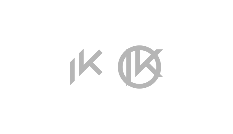
The first thing I did was create some letter K’s to see if there’s anything there worth building on.
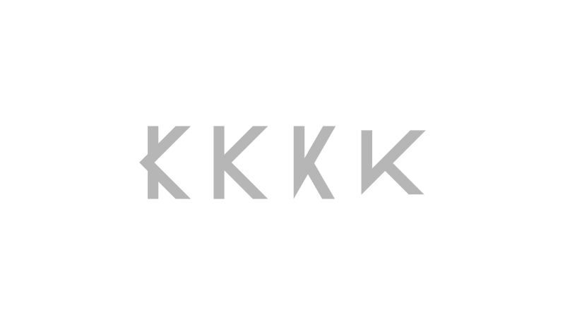
I also came up with some additional letter K designs that could possibly communicate a techy sort of idea. The design on the far right is certainly a possibility.
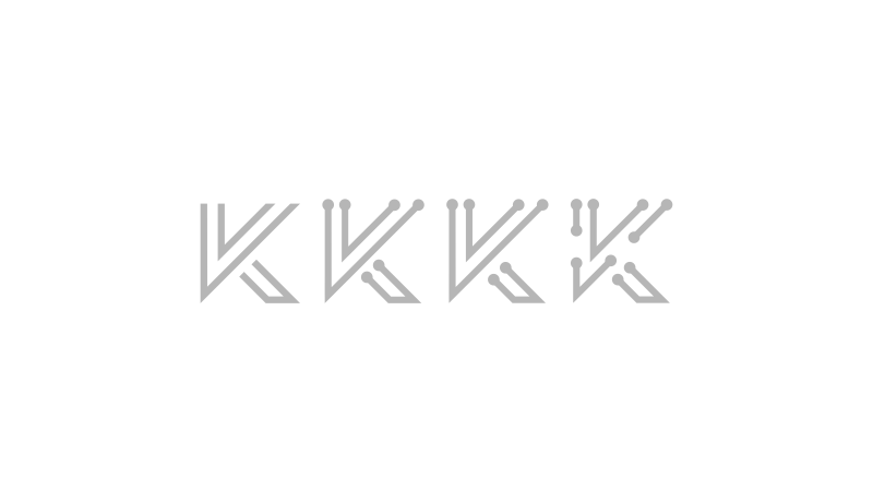
In an effort to communicate a sense of direction and progress, I played around with the possibility of creating motion swooshes through some of these K’s I designed.
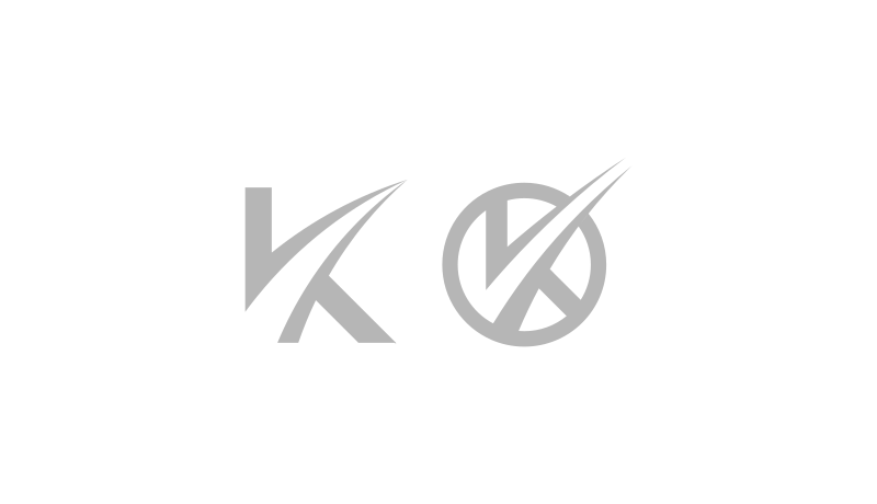
Next, I wanted to see if these ideas could tie together nicely with the 10K acronym, so I experimented with some different ways to pair them up.
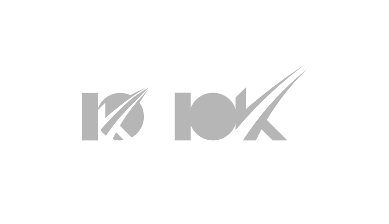
I wasn’t quite happy with how this turned out. The designs looked inconsistent and unbalanced, and most of all, they didn’t do enough to communicate that cutting-edge scientific feel I’m going for, so I grabbed another one of the K’s that I designed earlier in order to see what I could do with that.
I like the clean, sharp appeal of these design, but for whatever reason I just couldn’t get the 1 and K to play nicely with the number 0. After tinkering with it a little more, I was finally able to break some ground…
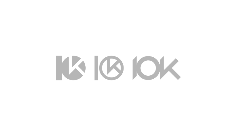
The design on the left looks nice, but I felt like it was missing something, and it didn’t seem to fit the concept of this project for some inexplicable reason. The middle design feels unbalanced, so that’s out of the question. However, the design on the right, I felt, looked great! It has a nice, clean, sharp and balanced look. Notice how I trimmed off the top and the bottom of the 1 to match the angles of the letter K.
The next step now would be adding another layer of design — some kind of subtle depiction of either science, tech or analytics, but without disrupting the delicate balance and clean appeal that the design already has.
I tried out some bar graphs and line chart ideas, but the weight of them wasn’t consistent with the weight of the name, so it ended up having an unbalanced look. Making the bars/lines thicker proved to be challenging because it didn’t fit well within the 0. Keep trying.
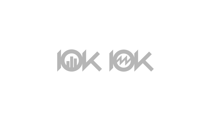
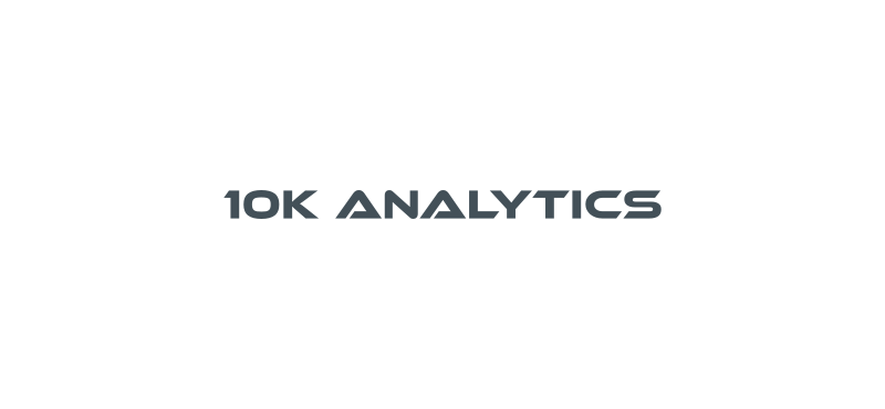
Finally, I made it work and came up with a design that would end up becoming the official logo of 10K Analytics…
What I did was fill in the 0 with a solid fill, then have a line chart (with the same weight as the numbers and letters) cut through both the 1 and the 0 as the negative space, then have it be continued on as the K.
![]()
It worked out great! Everything fit nicely and all of the edges and angles lined up perfectly with each other. And most importantly, the client loved it as well. What we had was a simple, sharp, edgy depiction of the 10K acronym that subtly communicates data without being blatant and literal (nothing makes a logo look amateur more than literal depictions.)
Finishing Touches
Once the foundation of the logo was built, we moved on to putting the finishing touches on it, like text and colors. It’s always best to design a logo in a single color (like black & white) first, then add color later. In order for a design to be versatile enough to be used as a logo, it needs to work just as well in monotone as it does in full color. Otherwise, you might not be able to embroider it onto a shirt or print it out from a black and white fax.
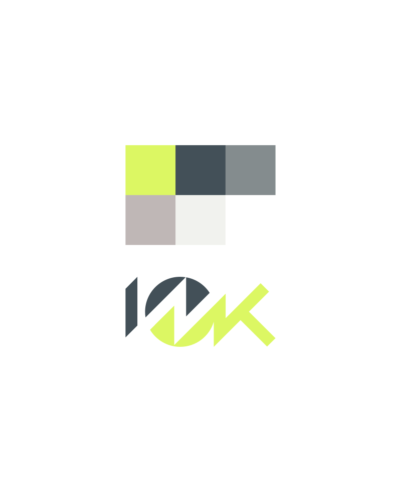
Colors
We initially intended to go with startup blue and light gray for the color scheme, but after some consideration we decided to do something a little more original. The tech, data and science industries are often represented with blue color schemes and we decided not to fall in line with them.
After browsing around on Coolors.co for a little while, we found a pairing that we fell in love with…
Once that was set, we moved on to the wordmark.
Typography
Type can be tricky when it comes to branding and logo design. The amateur move would be to go with a “futuristic” science-like font.
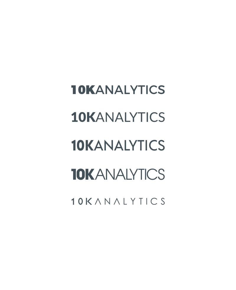
This sort of font would work great as the headline on a postcard, but if you were to pair it up with the 10K icon I came up with, it would clash. Not only is it inconsistent from a design standpoint, but it fights for attention with the icon. Instead, we needed to come up with something that matches the style of the 10K icon and can sit idly next to it as a secondary item that doesn’t draw attention away from it. Here’s what I came up with…
We eventually decided on a custom typeface inspired by the Acre font, then sprawled out the tagline beneath it.
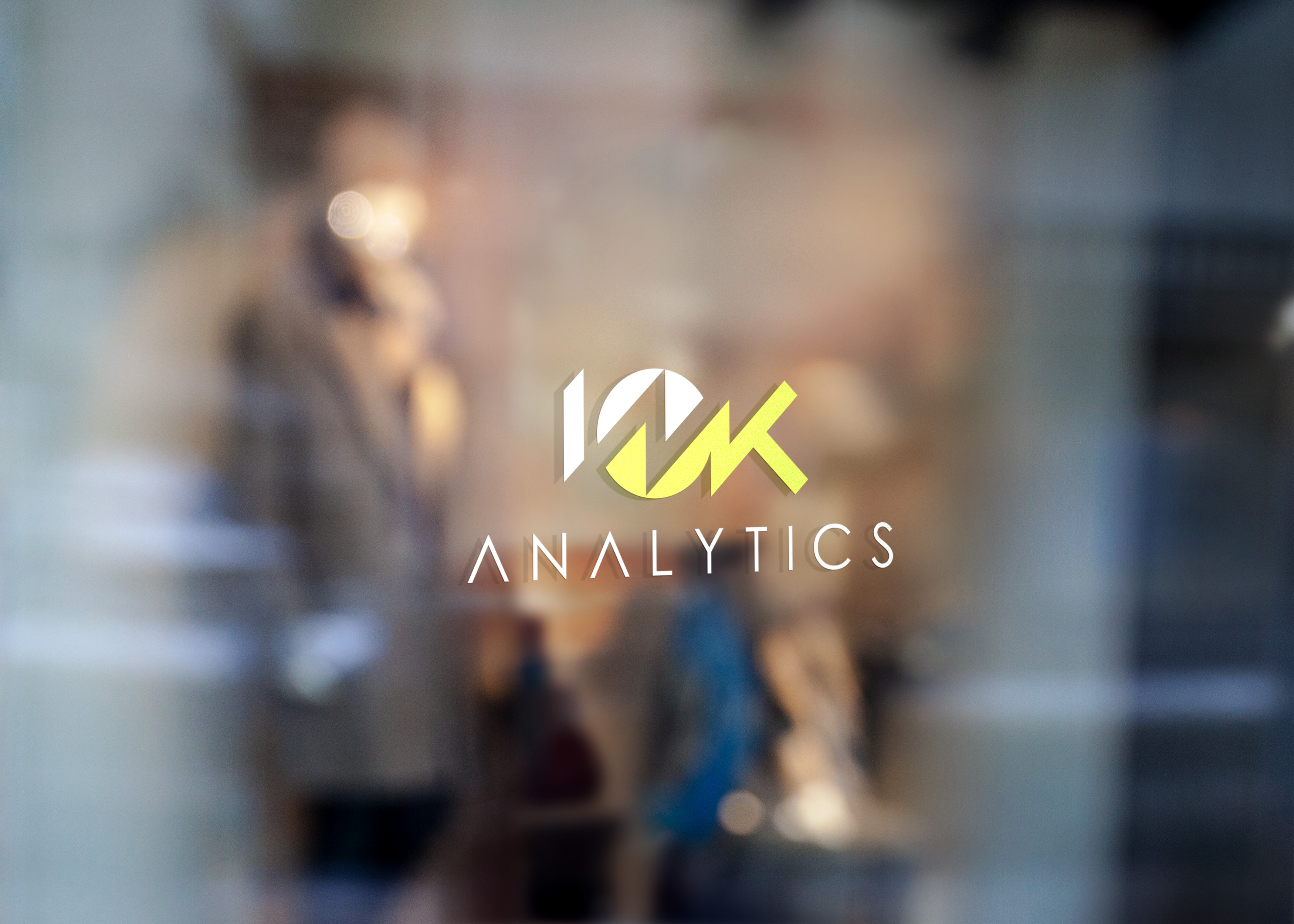
The Finished Product
With that said, our design was complete and our objective to provide 10K Analytics with a sharp, cutting-edge design that they could brand themselves with was met. Here’s how the final lockup came out in full color, inverted, and monotone variations…
![]()
Learn To Master The SoftwareGain a complete understanding of your favorite design apps with my comprehensive collection of video courses. Each course grants access to our private community where you can ask questions and get help when needed.
|
||||||||||||||||||||||||||||||||


Love the result!
Clever, sharp and bold! I like how you think out of the box when creating a logo.
This logo has a great result. Congratulations, Nick!
Excellent and inspiring
Excellent and inspiring
Thanks!
Love the result!
Clever, sharp and bold! I like how you think out of the box when creating a logo.
This logo has a great result. Congratulations, Nick!
Thanks Thiago!