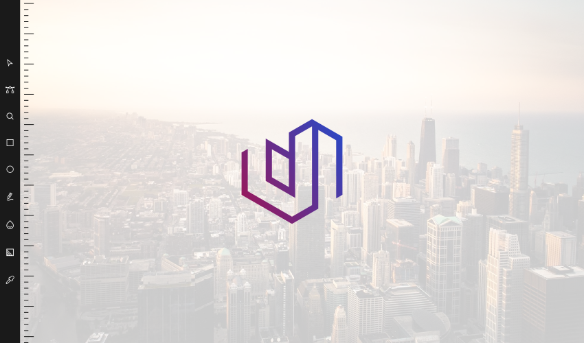
Letter U Logo Design: Uptown Suites Case Study
Letter U Logo Design: Uptown Suites Case Study https://logosbynick.com/wp-content/uploads/2016/12/u-logo-header.png 850 500 Nick Saporito Nick Saporito https://secure.gravatar.com/avatar/8e31bf392f0ba8850f29a1a2e833cdd020909bfd44613c7e222072c40e031c34?s=96&d=mm&r=g- Nick Saporito
- no comments
Objective
To create a letter U logo design for Uptown Suites — a tourism destination offering traveling professionals temporary residence in luxurious, high-end suites in a handful of large metropolitan areas across the US.
Naturally, these are people who are looking to pay extra for comfort and amenities, and because of that, the design has to emanate a sense of luxury and status.
Letter U Logo Design
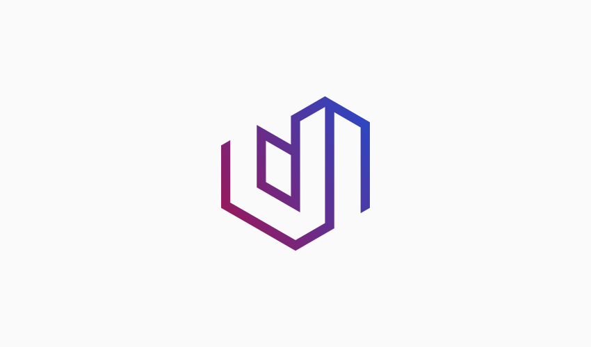
The idea the client and I immediately wanted to explore was the concept of using the letter U for the iconic mark in a sleek, creative style. After various rounds of ideas and revisions, we arrived at a concept that we felt best personified the brand.
The design, in theory, is a conceptualization of the letter U with city architecture, and put at an angle for perspective in order to further complement the abstract visualization of a metropolitan skyline.
The challenge was accomplishing this without it being overtly obvious, for example putting windows and spires on the buildings. That would’ve made the design look amateurish and a bit too literal when logos should really be conceptual and have a touch of abstract. This would’ve been an enormous mistake considering that the target audience is intended to be traveling professionals seeking high-end, luxurious residence.

An example of a similar design that would be a bit too literal for this particular project. Source: logoarena.com
Gradients are Back in Style
For the colors we went with a gradient comprised of an electric red-ish pink transitioning to a sharp blue. This adds a modern touch, which I think works in this brand’s favor. Someone looking for a high-end residence is looking for something with modern amenities.
But as we all know, design trends come and go. So I made sure this design didn’t rely on its colors so it can function and maintain brand recognition, as should always be done when designing a logo. The design, at its core, can stand the test of time. We can always go back and make minor adjustments to accommodate new trends.
A good example of a brand that has handled the change of design trends of the years has been Apple…
The trends come and go, but the iconic mark remains recognizable.
Typography
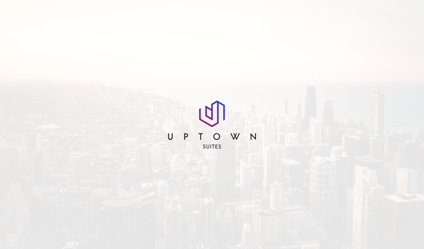
The letter U logo design came out so well that we decided to make it the primary focal point of the entire lockup, and just use a simple, sleek and timeless font for the wordmark. We went with Acre by Jonathan Ball — a font I recently discovered and have really been enjoying since.
The Finished Product…
Learn To Master The SoftwareGain a complete understanding of your favorite design apps with my comprehensive collection of video courses. Each course grants access to our private community where you can ask questions and get help when needed.
|
||||||||||||||||||||||||||||||||
- Post Tags:
- Case Studies
- Posted In:
- Case Studies
Nick Saporito
Hi, I'm Nick— a Philadelphia-based graphic designer with over 10 years of experience. Each year millions of users learn how to use design software to express their creativity using my tutorials here and on YouTube.
All stories by: Nick Saporito







Leave a Reply