How To Add Shading To Vector Illustrations with Inkscape
How To Add Shading To Vector Illustrations with Inkscape https://logosbynick.com/wp-content/uploads/2020/07/character-shading.png 800 470 Nick Saporito https://secure.gravatar.com/avatar/8e31bf392f0ba8850f29a1a2e833cdd020909bfd44613c7e222072c40e031c34?s=96&d=mm&r=gIn this tutorial I’ll be demonstrating how you can use Inkscape to add a simulated shading effect to your vector illustrations that makes the design pop and look more lively. This technique assumes the position of a hypothetical light source, and uses manually-drawn shapes with the Bezier Pen to simulate shadows and highlights.
The following is just a brief overview of the steps taken to achieve the desired result. The complete video tutorial can be watched at the top of the page.
Add Shading To Illustrations
For this tutorial I’ll be using the following example design…

You can download a vector copy of this illustration here: vector-illustration.zip
Before determining where to apply the shadows and highlights to the character, we first have to assume a light source.
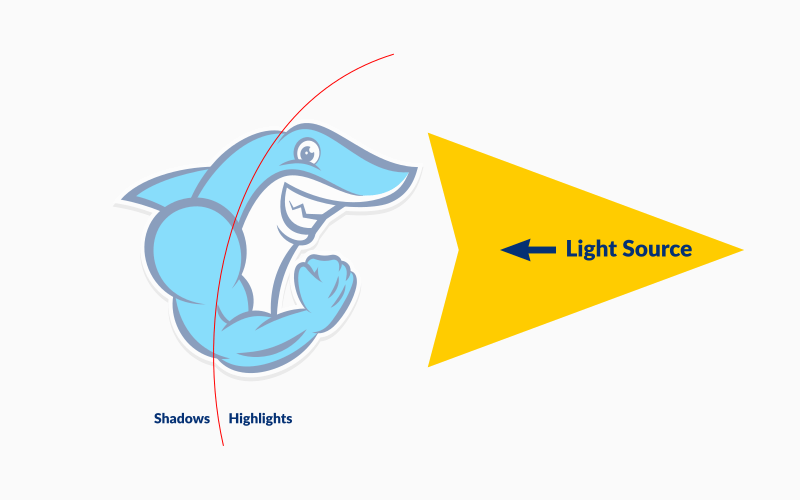
As illustrated above, the hypothetical light source is positioned to the right of the subject, and shining towards him. Because of this, we’ll be adding shadows to the left side of the design and highlights to the right, as indicated by the red line.
To add shadows and highlights to the design, we’ll be using the Bezier Pen to manually draw some strategically-placed objects.
For this sort of design it will help to enable snapping and memorize some of the keyboard shortcuts, because we’ll be using a small handful of tools repeatedly.
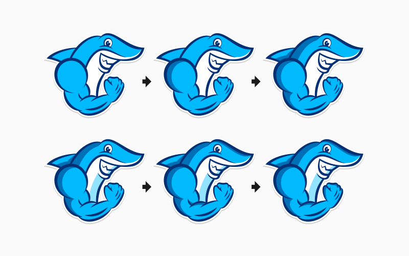
You can see the progression of the shading and highlights that are added to the design below…
I’d just like to reiterate that this is a simulated shading effect. This probably isn’t exactly how light would interact with the subject, but it’s close enough, and it’s certainly enough to bring the design to life.
Here’s a before and after of the design once the shading is complete…
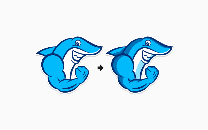
As you can see, the shading makes a huge difference! It just makes the design pop and look more lively. It’s a great effect to use when creating illustrations for esports logos.
Be sure to watch the full tutorial video at the top of the page. If you have any questions let me know. Finally, be sure to check out a tutorial by Davies media Design where he demonstrates how to create vector characters with Inkscape and also goes over some shading techniques.
Learn To Master The SoftwareGain a complete understanding of your favorite design apps with my comprehensive collection of video courses. Each course grants access to our private community where you can ask questions and get help when needed.
|
||||||||||||||||||||||||||||||||


Gary Stanullwich
What about “softening” the lines where the shading begins ?