Create 3D Pixel Text with Inkscape
Create 3D Pixel Text with Inkscape https://logosbynick.com/wp-content/uploads/2017/12/inkscape-pixel-text-tutorial-1024x602.png 1024 602 Nick Saporito https://secure.gravatar.com/avatar/8e31bf392f0ba8850f29a1a2e833cdd020909bfd44613c7e222072c40e031c34?s=96&d=mm&r=gToday I’ll be demonstrating a very simple technique that you can use to create 3D-style pixel text using Inkscape. This tutorial will require use of grids, the Bezier Pen, an eye for perspective and a touch of creativity. Scroll to the bottom of the page for the video tutorial.
If you’d like to update Inkscape’s appearance with a dark theme as you seen on my installation, be sure to check out my tutorial on making Inkscape dark. You can also update Inkscape’s icons to the new icon set that I designed last year.
Step 1: Setting Up The Grid
First, we’ll go to File > Document Properties in order to render a grid on the canvas.
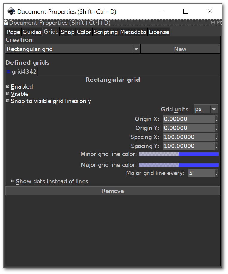
Once in the Document Properties window, go to the Grids tab and click New in order to generate a grid on the canvas. After that, change Spacing X and Spacing Y each to 75 px. If you’re working with a monitor resolution greater than 1080p, I would recommend setting those values to 100 px instead. This is not overly important though, it’ll just make your workflow a little easier.
Once you’ve done that, go ahead and close of the window and you should now have a blue rectangular grid on your canvas.
Step 2: Creating The Letters
We’ll be creating out letters manually by constructing them out of squares that fit each unit of the grid. Use the Rectangles tool to create a square within the space between two grid lines, as depicted below.
![]()
Create duplicate copies of the box and use them to construct a lowercase letter T as depicted below, while making sure to snap them according to their respective grid lines.
![]()
Working in similar fashion, go ahead and create a lowercase E, but make sure to leave at least 2 grid units of space between the two letters.
![]()
You can use this same technique to go ahead and finish up creating the rest of the text…
![]()
As you probably noticed, you won’t have to construct the same letter twice if you’ve already constructed it once. You can simply create a duplicate copy of it and shift it over, just make sure the letter remains on the same horizontal place as the rest of the letters.
Step 3: Adding 3D Perspective
Now it’s time to add a makeshift 3D perspective to each letter. We’ll be doing this manually with the Bezier Pen and it will require a touch of intuitiveness, but if you can follow my diagrams step-by-step, you should be able to catch on well enough to create any of the letters, numbers or symbols you’d like to use in your own design work.
First, make sure you have snapping to cusp nodes enabled at the top toolbar. This will ensure that your mouse clicks land precisely on the corner of each object.
Using the Bezier Pen, manually draw a four-point shape that starts at the top-right corner of the letter T, cuts diagonally to the left, then finishes back at the starting point as depicted below. Use this same method to create similar shapes for each edge of the letter.
![]()
After that, fill in each new shape with two different alternating shades in order to simulate a 3D appearance where light is reflecting differently off of each edge.
![]()
Go ahead and follow suit for each of the remaining letters. Catching the hang of this may be tricky at first, so you may need to play around with it a bit in order to get it right. You can refer to my images as a reference if it helps.
![]()
Step 4: Isometric Perspective
Once our text is created and stylized, it’s time to add some finishing touches. In order to give the text more perspective, we’re going to shear it so that it appears to be sitting on an isometric plane.
Using the Select tool, select everything and group it all together. Then, click on the object once or twice in order to bring up the rotation handles, hold Control on your keyboard and grab hold of the shearing arrow on the right side of the object and click and drag it up one step. This will shear your text, as depicted below.
![]()
After that’s done, you can go ahead and alter colors and add any finishing touches you’d like, and we’re finished! Our fully vector 3D pixel-style text is complete.
Video Tutorial
If these steps were a bit too vague for you to understand and follow along with, I would advise watching the video tutorial at the top of the page. The video contains complete step-by-step instructions and voice narration that even a first-time user of Inkscape could follow.
If you have any questions or suggestions feel free to post a comment below. Thanks!
Learn To Master The SoftwareGain a complete understanding of your favorite design apps with my comprehensive collection of video courses. Each course grants access to our private community where you can ask questions and get help when needed.
|
||||||||||||||||||||||||||||||||


Leave a Reply