
3 Color Combinations for Logos | Best Practices for 2018
3 Color Combinations for Logos | Best Practices for 2018 https://logosbynick.com/wp-content/uploads/2018/08/3-color-combinations-for-logos-1024x602.png 1024 602 Nick Saporito https://secure.gravatar.com/avatar/8e31bf392f0ba8850f29a1a2e833cdd020909bfd44613c7e222072c40e031c34?s=96&d=mm&r=gEarlier this year I wrote a post outlining some examples of good logo color combinations as it relates to pairing 2 colors. When pairing 2 colors, choosing contrasting shades usually works well. But when it comes to 3 color combinations for logos, it’s a little trickier.
Usually what works best is to use the 2 contrasting colors you’d normally use, then use an off shade of one or the other. Or if you’re feeling up for the challenge, you can try comparing 3 totally different colors.
In this post I’m going to share 8 examples of logo designs that made a 3-color system work quite well. Credit along with a link will be attributed to each design.
3 Color Combinations for Logos
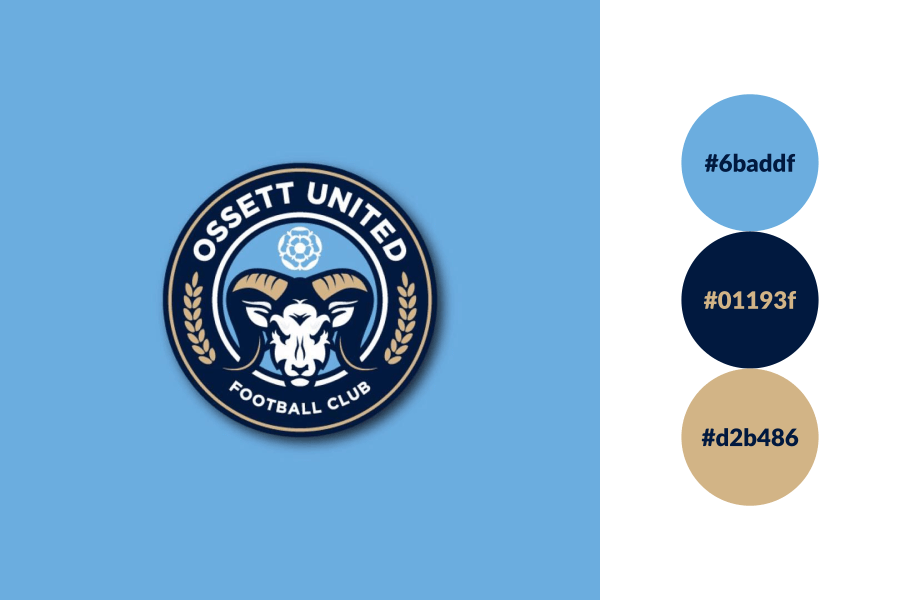
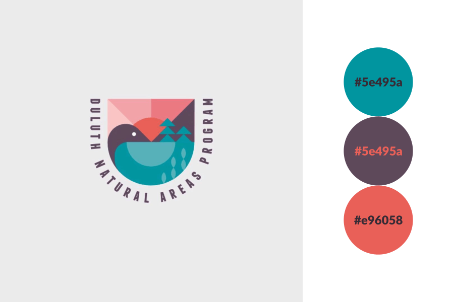
@nickbud_design on Instagram
As mentioned earlier, 2 contrasting colors along with an off shade of one or the other usually works well. This design is a great example of such. The dark blue and tan contrast nicely with each other, and the lighter blue just fits right in.
@logoinspirations on Instagram
Here’s another example. The orange and purple contrast nicely, then the much lighter shade of purple — nearly blue — adds another dimension of contrast. A beautiful design all around.
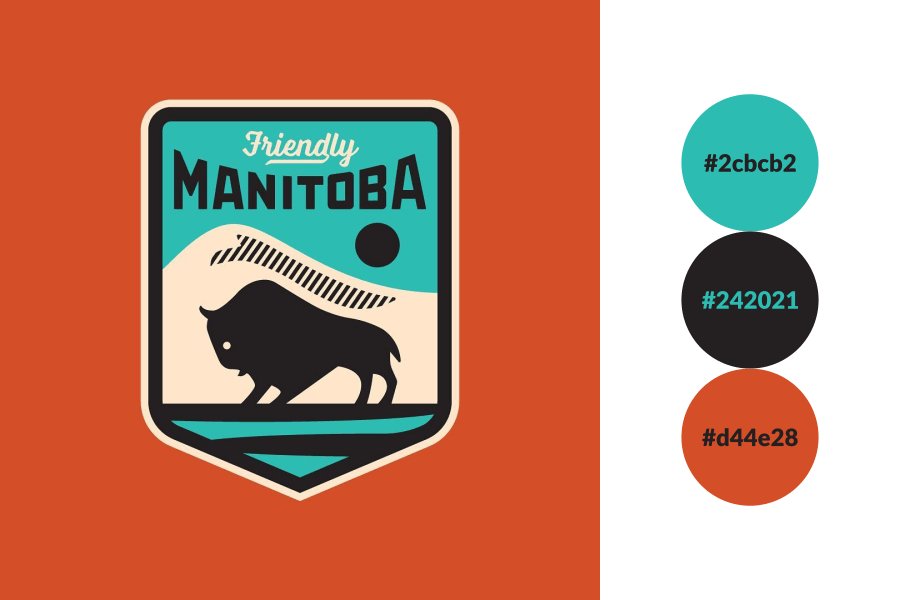
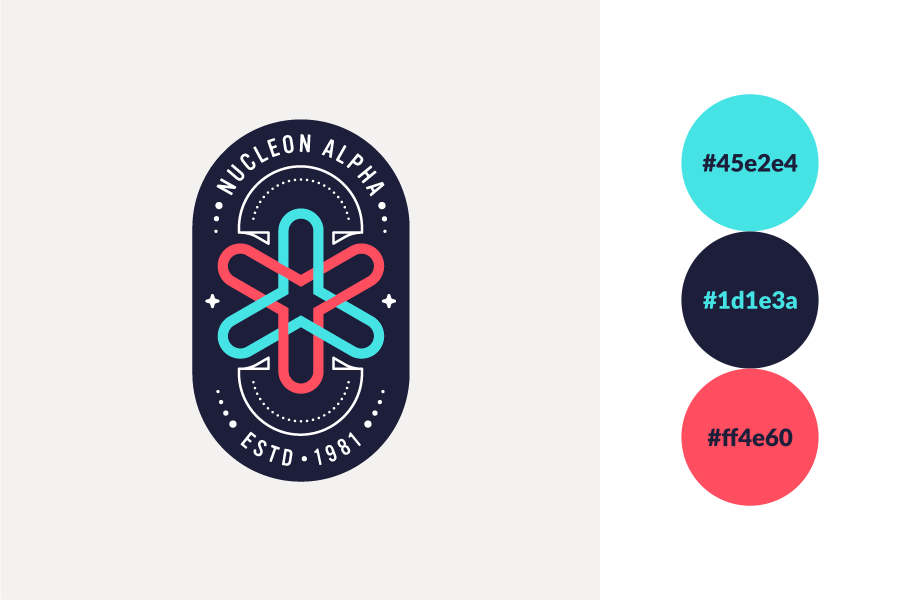
@howesdesignservice on Instagram
This one is more bold in that it uses 3 completely different colors. Somehow it just works!
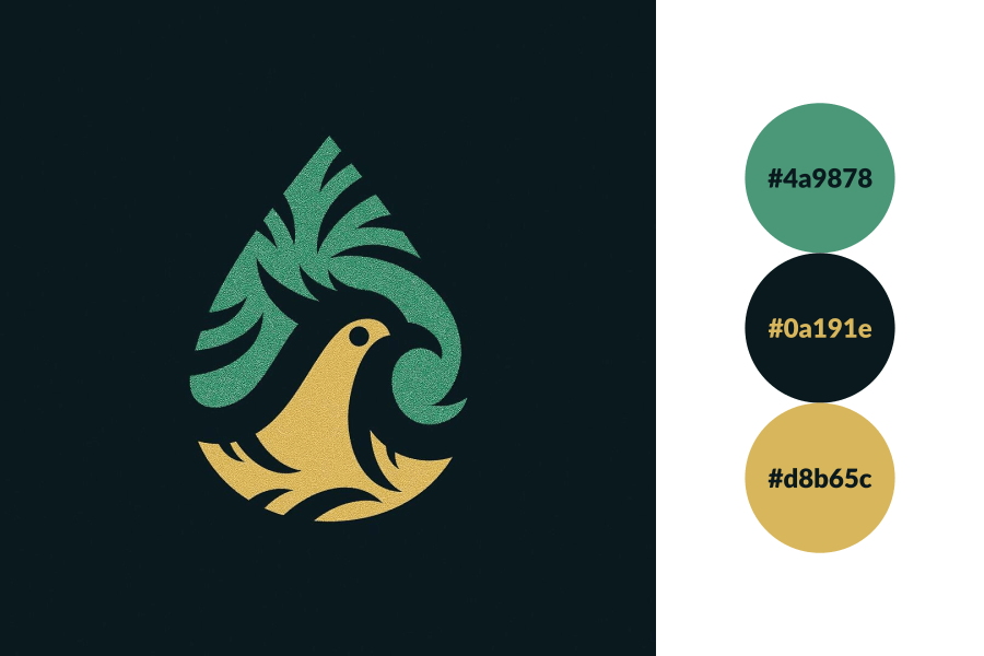
@mono.trix on Instagram
Here’s a great example of a 3 color combination for logos utilizing a green and yellow palette. The very dark green adds more contrast to the design and overall looks fantastic.
@timbr_design on Instagram
There’s a lot going on in this design, but it all works and fits together nicely. Sometimes the key to finding the right 3-color system is making sure they’re all in a similar tone, as is the case with this logo. They all have that soft, pastel-like shade.
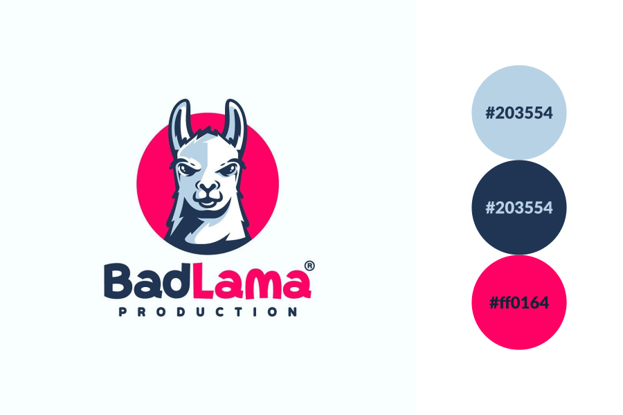
@kudos_design on Instagram
I’ve always loved how well blue and pink work together (especially as a gradient,) and adding a splash of light blue looks even better. The use of that 3rd color makes the shading on the lama’s face possible.
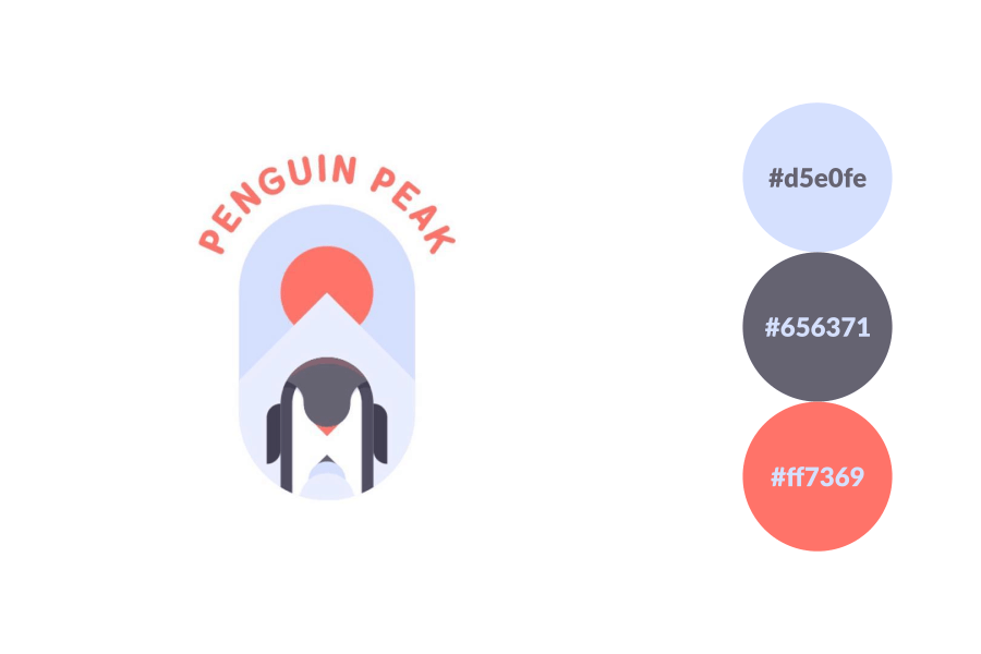
@srioz on Instagram
One thing I’ve noticed about using 2 shades of the same color is that it works best when they contrast within themselves. For example, a really light blue paired with a really dark blue, as done in this design.
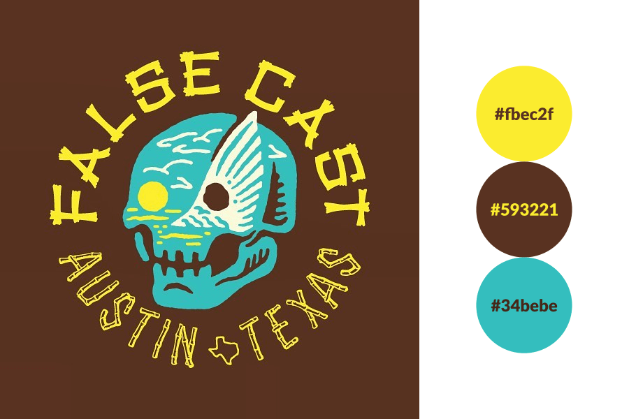
@alanalouise_ on Instagram
This logo is just screaming with creativity, and not just because of the colors. Yellow, brown and blue is quite a bold mix, but Alana makes it work!
Learn To Master The SoftwareGain a complete understanding of your favorite design apps with my comprehensive collection of video courses. Each course grants access to our private community where you can ask questions and get help when needed.
|
||||||||||||||||||||||||||||||||


You might also like
9 comments
-
-
-
Tista
There is a mistake in your color codes for the “BadLama” logo . The same color codes appeared for two different colors.
-
-
-
-
-
Thiago Abreu
This kind of post is really great. The first logo reminds me Manchester City FC and New York City FC too. A lot of designers are using this pallete.
I recognize it’s a bit difficult to me to create logos using 3 colours combinations, but I’ll try to grow up as a designer to create them.
Arnel
Will it be possible for you to share your file of friendly manitoba?