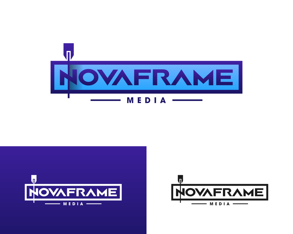
Novaframe is a video editing service that I was recently hired to design a logo for. We wanted to convey something having to do with video editing in the logo.
After a bit of design exploration I came up with the idea of depicting the logo’s name within a video clip, as if it were placed in the timeline of a video editing application. I placed the play head — the indicator of a particular location on the timeline — over the letter N. The result is as follows…
![]()
When thinking of logos and designs that represent video editing, you would typically think of filmstrips, video cameras of some kind, or maybe even some scissors to indicate slicing and editing. I felt that this approach is a fresh take though. It’s not something that I’ve seen anywhere else, and I was excited to share it on my portfolio because of that.
Video Editing Logo
If you’ve ever used video editing software before, you’re probably familiar with the concept of the timeline. It depicts each video and audio clip in a sequence that you can manually alter. Adobe Premiere Pro is a great example of this. Here’s how the timeline looks…
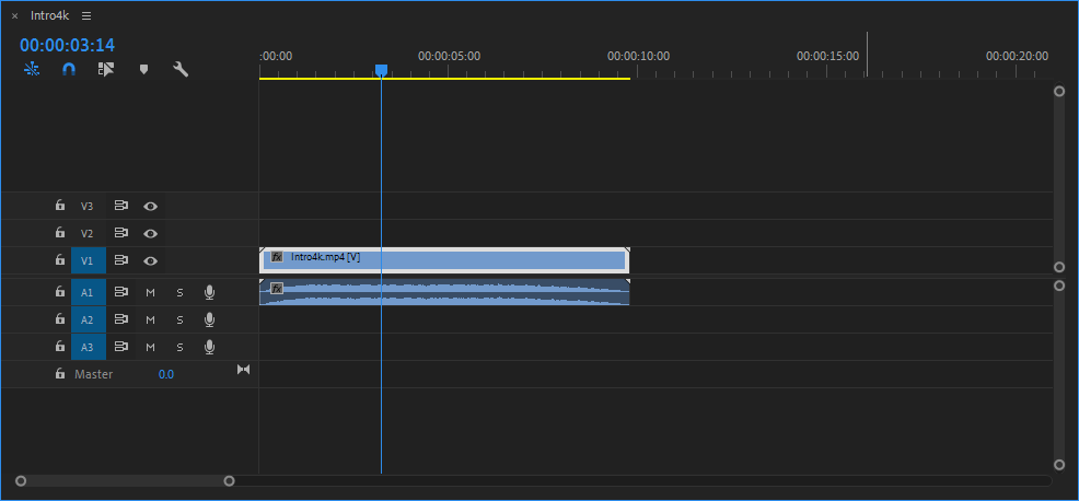
Click to enlarge
Notice the blue box titled “intro.mp4” and the blue line going over it vertically. This is what I wanted to conceptualize in the logo.
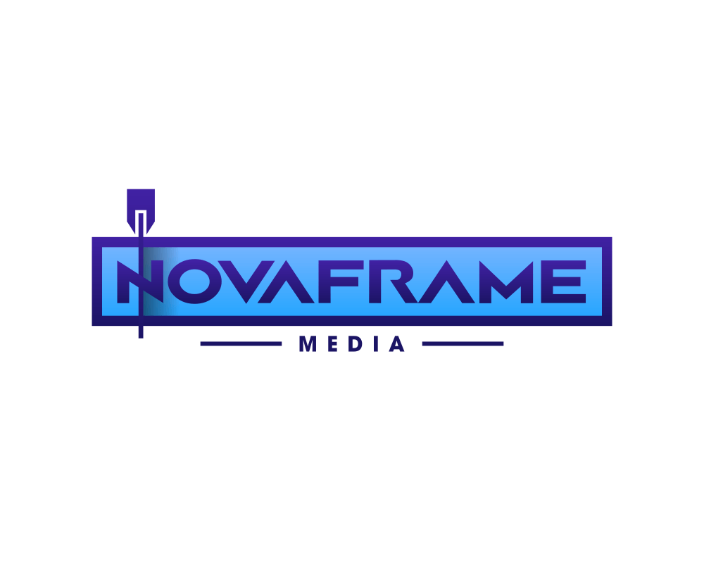
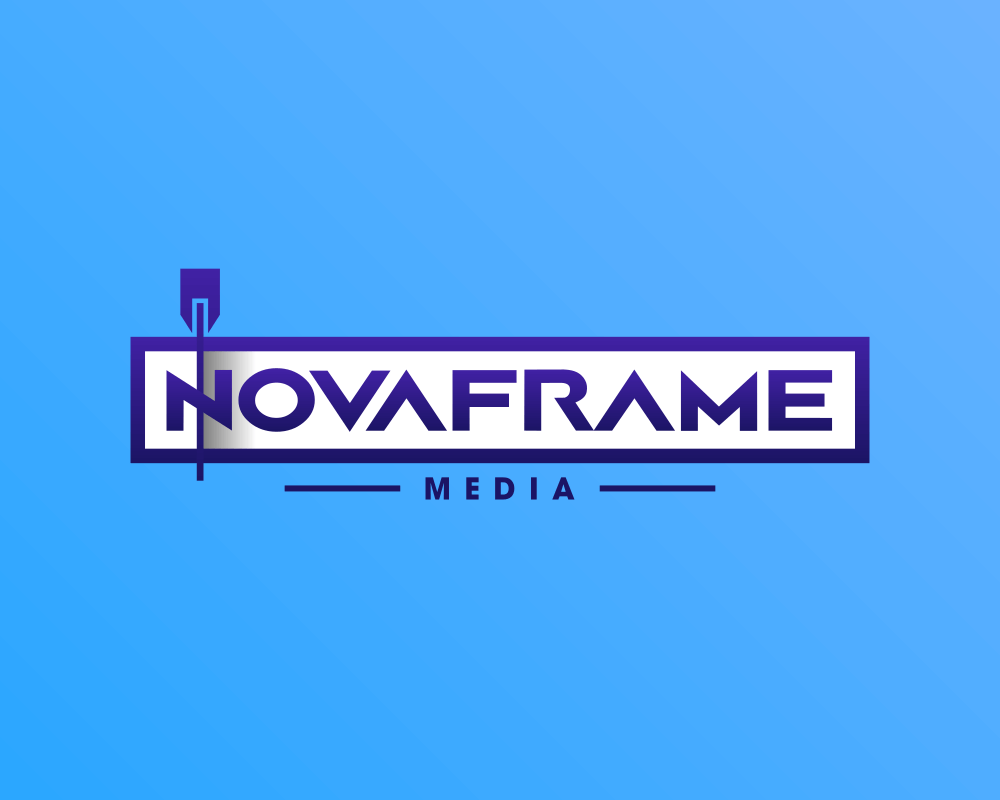
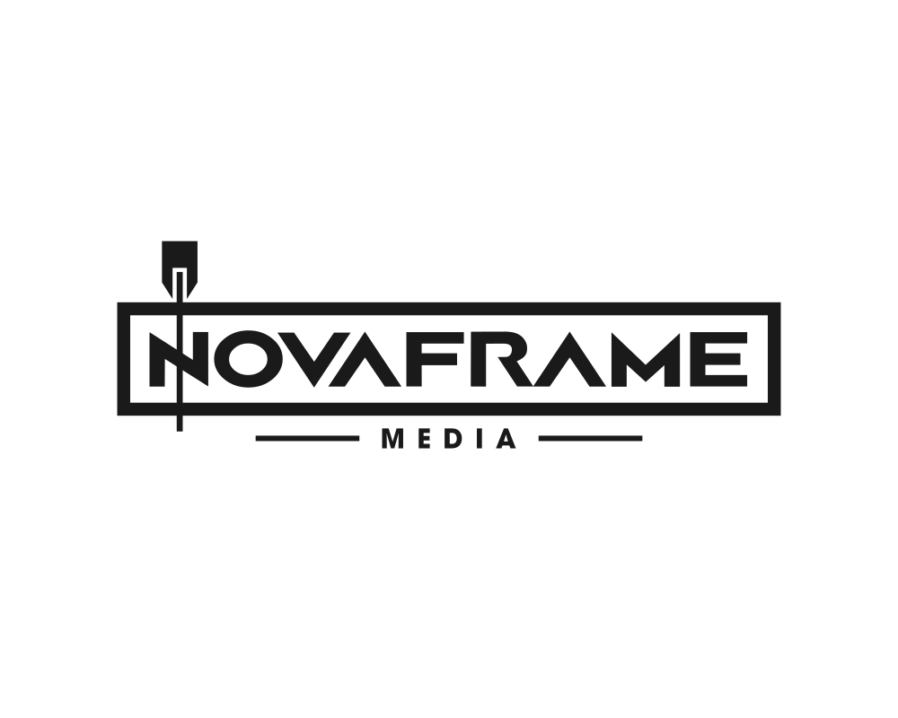
Here’s how the logo looks in all of its color variations…
Click to enlarge
The font used for the name is Airborne GP at the client’s request. For the subtext (“MEDIA”) I used Tex Gyre Adventor.
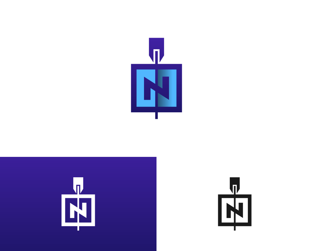
In addition to the wordmark design, I also created an independent iconic mark where the concept was applied solely to the letter N:

It’s important to have an icon-based variation of your logo for use as a favicon, profile picture, avatar, etc. Wordmark logos are great, but they don’t fit every application.
Here’s how the logo’s icon looks in all of its variations…
Final Thoughts
The thing I love most about this logo is its uniqueness and creativity. If you Google “video editing logos” you’ll see a lot of different cliches — filmstrips, scissors, reels, etc. — but nothing like this.
I also like how the logo has a bit of subtly. It’s not immediately obvious that this logo represents video editing, and that’s okay. I tend to prefer logos that are more conceptual than literal.
Leave a Reply