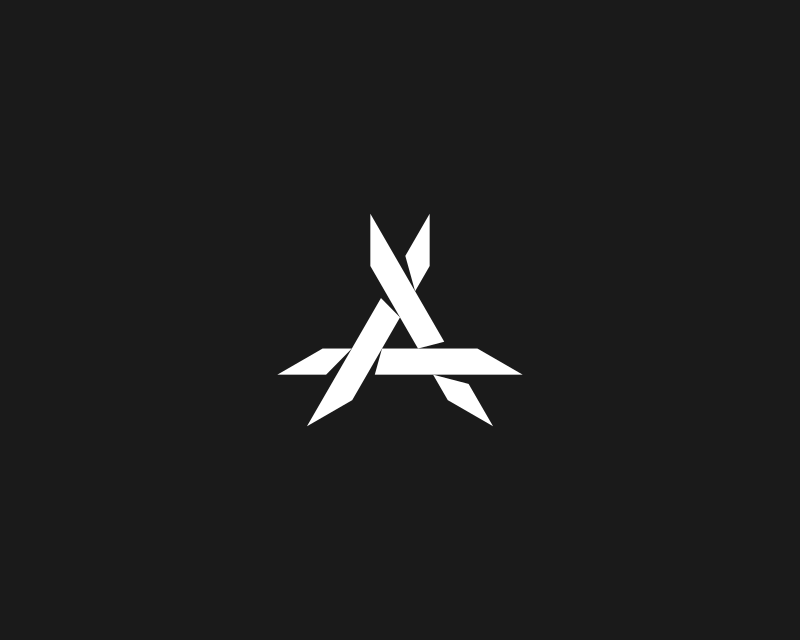
“Antydote” is a Switzerland-based DJ who recently hired me to design his logo for him. He already had a logo that he was relatively happy with, but he wanted to see if I could improve it by adding my own touch. His main concern was that it didn’t look edgy enough. Here’s his original logo…
This is not my design. I was hired to make some improvements to it.
After some initial design exploration and back-and-forth revisions, we ended up with this finished logo design…
Refined letter A logo design for DJ Antydote
He was quite happy with the results and so was I. Let’s take a closer look at what I did here to give this logo the makeover it needed.
Logo Design for a DJ
I started out with the basic triangular shape of the original design, removed the bits from the corners, and added some style to it by making each of the three legs look like they’re overlapping each other. I did this by creating makeshift drop shadows out of the negative space around each leg…
The design is a letter A to represent the name
Next I added a bit of depth by placing a triangle in the background pointing the opposite direction. I made the weight of this triangle significantly less than the weight of the letter A legs because I didn’t want to draw too much attention away from it…
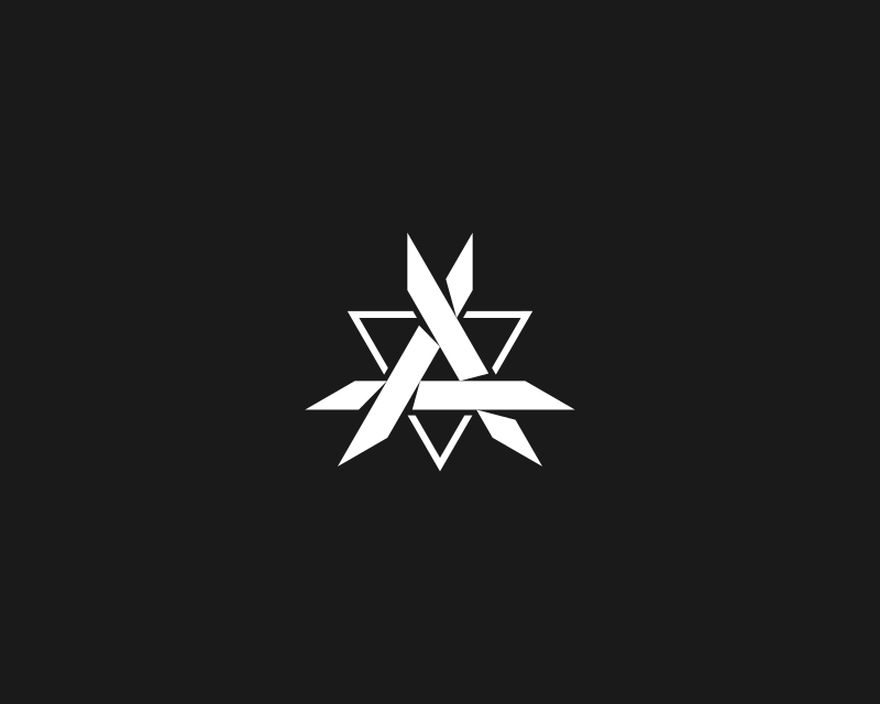
The triangle brings an added layer to the design
Already the design is looking more edgy, but it wasn’t quite there yet, so I added a grunge texture to dirty it up a bit. I used the following texture…
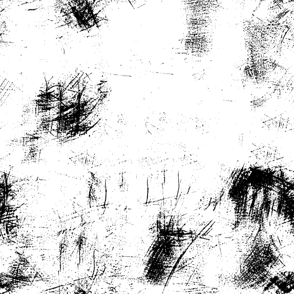
You can download this texture and various other textures for free if you want to check out a post I made about grunge textures and how to apply them with Inkscape.
Here’s how the design looks with the texture applied…
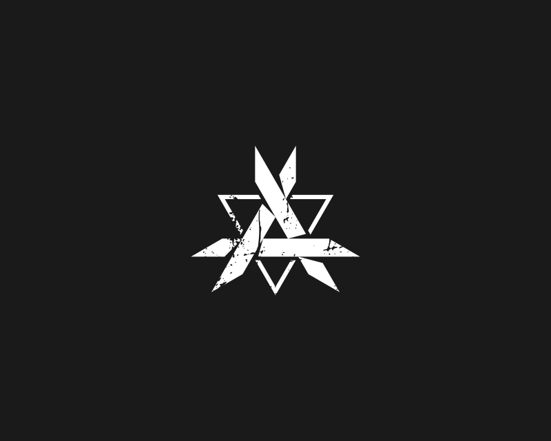
The texture adds to the edginess of the logo
Wordmark Design
With the logo set in place it was time to design an accommodating wordmark to pair with it. After exploring some font options a bit, the client decided that he wanted to go with the Motor Block font, but with some minor alterations and a border going around it.
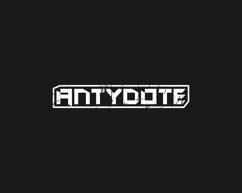
The Motor Block font with some minor alterations
I made sure the wordmark was consistent with the logo by applying the grunge texture and making the disparity between the weight of the letters and the weight of the border consistent with that of the letter A logo.
And with that, DJ Antydote’s new logo was complete!
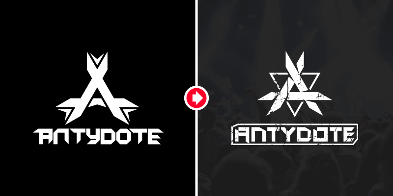
Complete logo makeover
Similar to the original and identifiable as such, but with some refinements and added edge.
Final Thoughts
I don’t always design logos, sometimes I just improve them. This project is a great example of what a logo makeover can do for your branding, and I’m proud to have it on my portfolio.
Leave a Reply