
16 Examples Of Negative Space Typography
16 Examples Of Negative Space Typography https://logosbynick.com/wp-content/uploads/2018/12/negative-space-typography-1024x602.png 1024 602 Nick Saporito https://secure.gravatar.com/avatar/8e31bf392f0ba8850f29a1a2e833cdd020909bfd44613c7e222072c40e031c34?s=96&d=mm&r=gUtilizing the negative space of a subject to communicate something in addition to what the subject already communicates is a clever technique and something I’ve always been a fan of personally. In this post I’ll be sharing 16 of my favorite negative space typography examples that I found on the internet, in addition to a couple I made myself.
Negative Space Typography
Credit and links are attributed to each example shown.
1. Shift
![]()
This design depicts two arrows within the word “shift” with the negative space between the arrows forming the letter H. Quite clever in several regards, considering how arrows are associated with the shift key on a keyboard.
2. A Tack
![]()
A simple thumbtack cut out of the middle of a blocky letter A.
3. Bottle
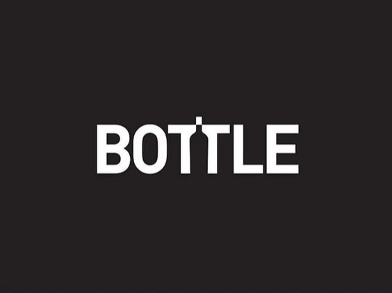
A literal bottle placed in the negative space between the two T’s of the word “bottle”. The cork on top really helps in emphasizing it. I think it wouldn’t be so readily noticeable without it.
4. Dog
![]()
A little side profile of a dog cut into the lower portion of a letter G. Simple and subtle, but not so much that it could be easily overlooked. Negative space typography at its best.
5. Do It
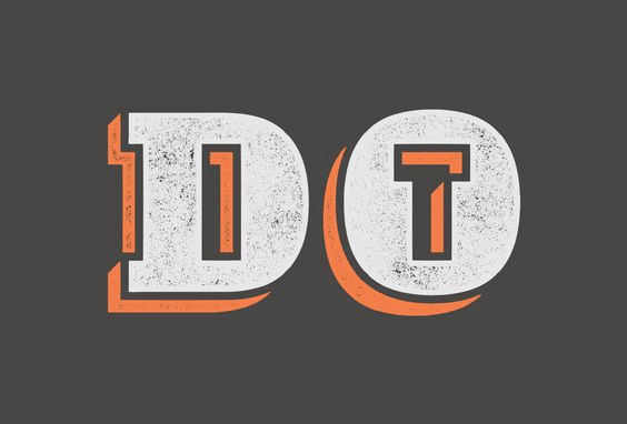
The I almost slips past you, but the T within the negative space of the O really makes it pop.
6. Elektrik
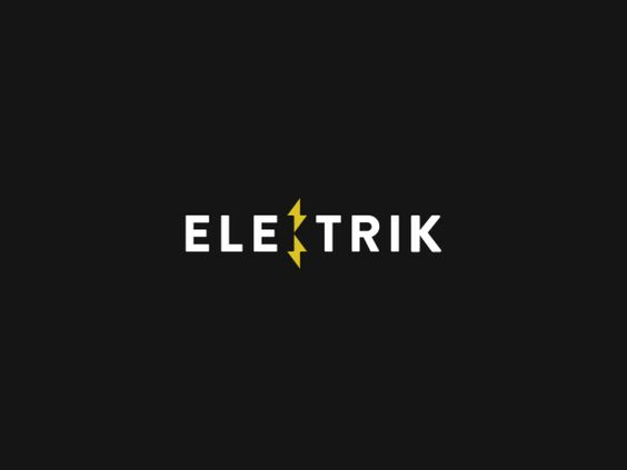
Similar to the shift logo, this one uses the negative space between two lightning bolts to form the letter K.
7. SE
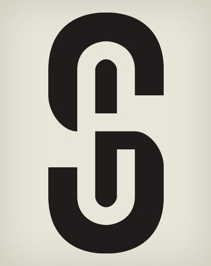
By Andrei Pasternak
This one is both clever and executed quite well. I really like the consistency in the thickness of the entire S.
8. Key
![]()
I particularly like how the E in this one matches the style of the other letters, as if they’re all cut from the same font.
9. One
By Maurizio Pagnozzi via Behance
It takes very careful execution to get a design concept like this right with line thickness and whatnot. Great design!
10. Open Door
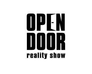
This one plays with perspective a bit to depict an open door within a letter E. Very imaginative.
11. Puzzle Piece
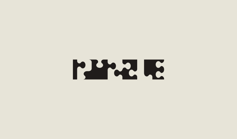
Here’s some negative space typography of my own — the letters in “puzzle” comprised of puzzle pieces, some of which utilize the negative space. I actually came up with this design somewhat by mistake when I was creating a logo for a client’s escape room. I was experimenting with the possibility of using puzzle pieces to make the name, then realized I could easily spell “puzzle” with them.
12. S1
![]()
It looks like the 1 is intertwined with the S. Nicely done.
13. Unity
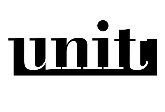
The alternating between positive and negative space in the letters is just brilliant.
14. Up
![]()
A very simple “up” with an arrow forming a letter U and the P appearing within the negative space.
15. USB

Quite a clever depiction of an isometric USB plug comprised of the USB letters, but with the B being the negative space.
16. 63 Logo Design
![]()
Here’s another design of my own. This, much like the puzzle logo, was also discovered somewhat by mistake when designing something for a client. It got a lot of traction on Instagram when I posted last year. I’ve since sold the design.
Learn To Master The SoftwareGain a complete understanding of your favorite design apps with my comprehensive collection of video courses. Each course grants access to our private community where you can ask questions and get help when needed.
|
||||||||||||||||||||||||||||||||


Great Sir
Wow! This is clever.
Beautiful pieces.