My 11 Favorite Font Pairings for Logo Design
My 11 Favorite Font Pairings for Logo Design https://logosbynick.com/wp-content/uploads/2019/04/logo-font-pairings-1024x602.jpg 1024 602 Nick Saporito https://secure.gravatar.com/avatar/8e31bf392f0ba8850f29a1a2e833cdd020909bfd44613c7e222072c40e031c34?s=96&d=mm&r=gOne of the more challenging aspects of designing logos is finding a nice font to pair with them, and things get a little trickier when pairing multiple fonts together. Sometimes fonts don’t pair well with each other, and finding fonts that do can be a frustrating process. In this post I’m going to share 11 of my favorite logo font pairings that I’ve discovered over the past 8 years that I’ve been designing logos.
What Makes A Great Font Pairing?
Pairing logo fonts together becomes a lot easier once you know what to look for. There’s two main thing I look for in paired fonts…
- Line Consistency: This isn’t a steadfast rule, but fonts generally play well with each other when their weight/line thickness is consistent. It makes for a more fluid and unified look. Things get messy the more disparity their is between the weights of the fonts.
- Contrasting Style: I’ve found that fonts don’t pair very well with each other if they’re both overtly illustrative or decorative. If one font is decorative, then the other should be more basic and subtle. There needs to be a hierarchy where there’s a primary and secondary reach for the viewer’s attention. You don’t want multiple fonts fighting with each other for attention. This is something I talked about a bit in my post about logo design mistakes to avoid.
That said, here are some logo font pairings that complement each other quite well in my opinion.
Logo Font Pairings
1. Acre + Allura
![]()
Font 1: Acre
Font 2: Allura
These fonts work well together for a nice, contrasting look. You’ll need to manually adjust the sizes of each though in order to make the line weights consistent with each other.
2. Ayres + Prof. Jorge
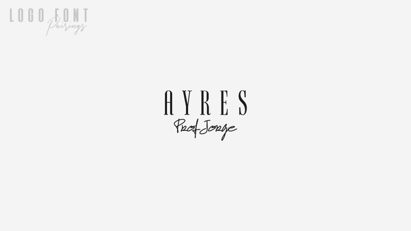
Font 1: Ayres
Font 2: Prof. Jorge
This pairing is a little risky because of how decorative each font is, but I think they strike a nice art deco sort of balance together.
3. Caviar Dreams + Shorelines Script
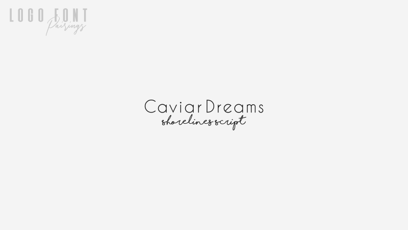
Font 1: Caviar Dreams
Font 2: Shorelines Script
I love it when a sans serif and a script font can pair well with each other. It can make for a really distinct look in a logo design. The line weight consistency between these two is what really sells it.
4. Com4t + Liberation Serif
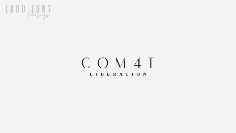
Font 1: Com4t
Font 2: Liberation Serif
These two fonts make for an expensive, luxurious sort of look when pair together.
5. Dynalight + Acre
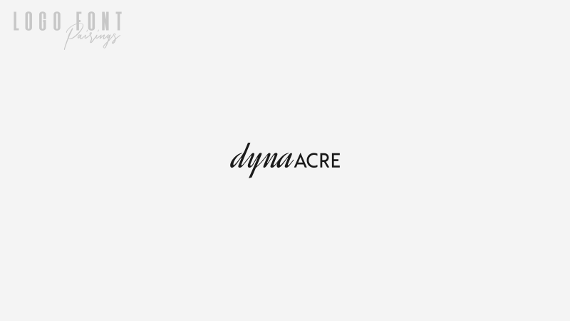
Font 1: Dynalight
Font 2: Acre
Another combination of a sans font and a script font — a longtime favorite of mine.
6. Lato Black + Lato Regular
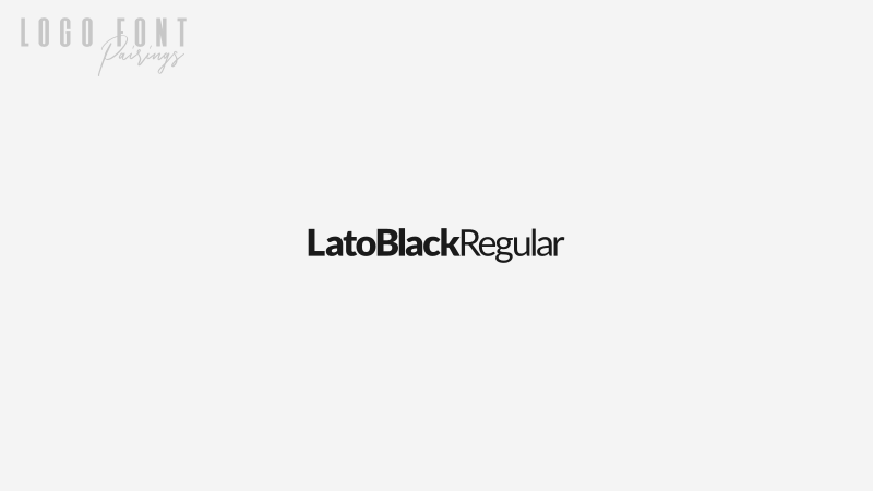
Font: Lato
Is it cheating if I reference two fonts from the same family? One thing I love to do when designing logos is separate words with different weights. It adds for a nice bit of character, and the Lato font family has a casual sort of appeal that’s really fitting when that’s the context you’re designing a logo for.
7. League Gothic + Montserrat
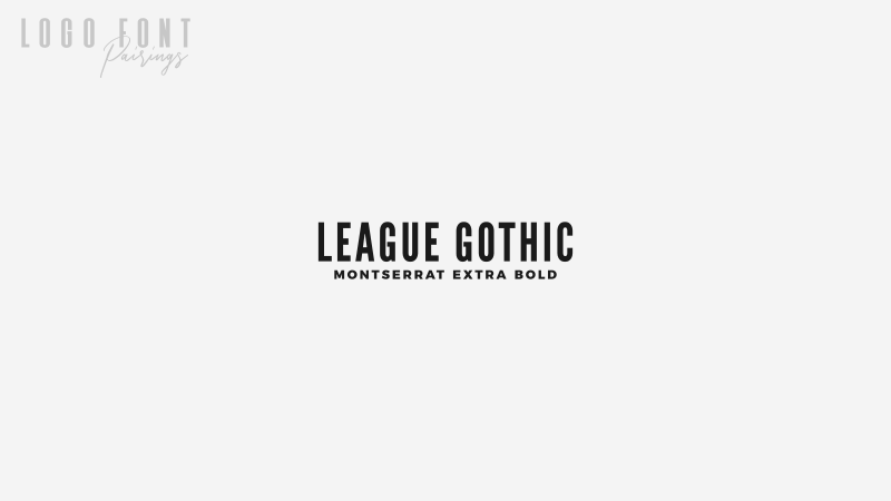
Font 1: League Gothic
Font 2: Montserrat
My adoration of both League Gothic and Montserrat is no big secret. I regularly use them for the header graphics of my blog posts, YouTube thumbnails, and have even referenced them in many of my tutorials. They’re both classic fonts that I think will age gracefully.
8. Microgramma + Avant Garde
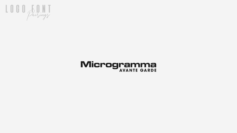
Font 1: Microgramma
Font 2: Avant Garde
Here’s a couple of classic premium fonts that contrast well with each other. Microgramma has a classic technological look that has somehow lasted through generations, and Avant Garde is a clean sans font that I prefer over Helvetica. I prefer it so much that I used it for the Logos By Nick logo.
9. Montserrat
Font: Montserrat
Another pairing from within the same family. Montserrat has to be the best 100% free sans font that comes in a useful variety of different weights.
10. Free Serif + Tex Gyre Adventor
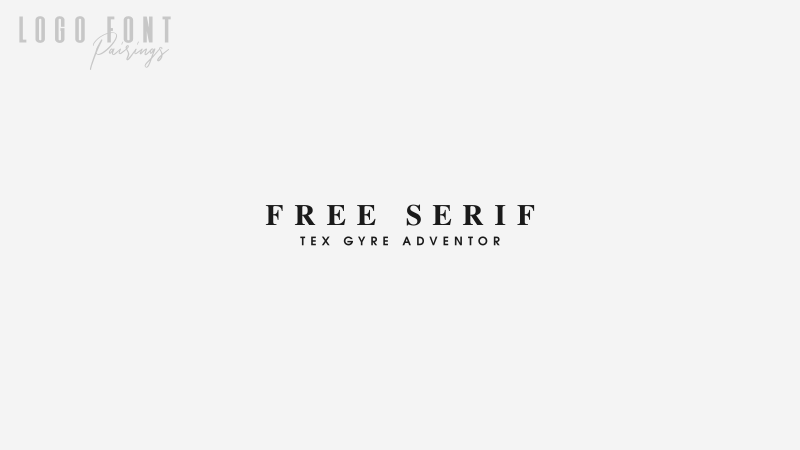
Font 1: Free Serif
Font 2: Tex Gyre Adventor
I can’t wrap this post up without first including a nice serif logo font pairing. Free Serif is a longtime favorite of mine, and it pairs nicely with a very clean and simple sans font like Tex Gyre Adventor.
11. Serrona + Serrona Script
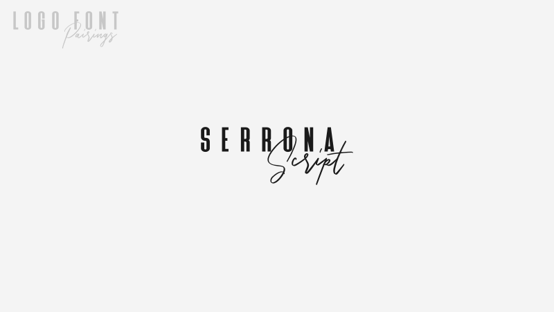
Font: Serrona
I’ll cap this post off with a recent discovery — the Serrona font family. This is actually a premium font I found of Creative Market that was designed specifically to be paired together. I’ve been having a lot of fun with this one since discovering it.
Become A Master of Inkscape!
Want to learn more about how Inkscape works? Check out the Inkscape Master Class – a comprehensive series of over 50 videos where I go over every tool, feature and function in Inkscape and explain what it is, how it works, and why it’s useful.
|


Learn To Master The SoftwareGain a complete understanding of your favorite design apps with my comprehensive collection of video courses. Each course grants access to our private community where you can ask questions and get help when needed.
|
||||||||||||||||||||||||||||||||


You might also like

18 comments
-
-
Nick
Hi Derek, not off the top of my head, sorry. I would try going to Dafont and selecting script fonts, then filter the results by 100% free for commercial use.
-
-
Timi lewu
This is THE MOST HELPFUL font pairing article I’ve seen this year. Thanks a lot this was very help. I’m definitely doing these in my next projects
-
-
belkacemi
Hello Nick
Please my question If you allow it is :
are all these fonts free ? and can we use them for t shirt texts?
Thanks
-
-
AnneMarie
This is super helpful. Thank you, Nick. I’ve never run across a blog article where someone has paired fonts like this. Hope my new logo turns out as cool as those above!
-
-
Scot Cowdrey
These are Great Ideas and Excellent fonts. I credit you for MOST of my fonts – Thank You again, Nick.
-
Peter van Nunen
These are great examples Nick. Great post, thank you for putting in the effort to show case your creativity with typefaces.
-
RBST
I don’t know about 1, 2, 3 , and 5.
#11 is really good.
But, the combination of ALL CAPS and script doesn’t always work just because you’re tying to mix x-heights.
I think if you’re combing Serif and Script, then the script or serif should completely outweigh the supporting text rather than be somewhere in the mid because the character heights match. That’s just an opinion based on first impressions.
Maybe it works depending on the words chosen. But, #2 isn’t happening unless that’s the person’s exact signature. Even then, the kerning feels extremely tight on the script. It could be a matter of hierarchy. But, the script in itself detracts just because it’s more flowery and is wanting for attention.
I do like Serif/Script combos in general. But, designers a lot of times try to give them the same visual and hierarchical weight. It just doesn’t always work…
-
Bill Lee
This “their” wants to be a “there”:
more disparity their is between the weights of the fontsSorry if I’m being a grammar nazi!! 🙂
(Pls feel free to delete this comment!)
-
-
-
-
-
-
Derek Hammerstein
Hi Nick – thanks for all of your info!
I was wondering if you know of any alternatives to Shorelines Script that would fit in its place with Caviar Dreams since it is not free for commercial use.
Thank you!