Common Logo Design Mistakes To Avoid
Common Logo Design Mistakes To Avoid https://logosbynick.com/wp-content/uploads/2017/01/common-logo-design-mistakes-header.png 850 500 Nick Saporito Nick Saporito https://secure.gravatar.com/avatar/8e31bf392f0ba8850f29a1a2e833cdd020909bfd44613c7e222072c40e031c34?s=96&d=mm&r=gLogo design can be tricky. A logo is meant to be a unique symbol that an audience can identify a brand with. Often times we tend to over-think it and make needless mistakes though. In this post I’ll be going over common logo design mistakes and how to avoid them.
Too Literal
The number one sign of an amateur logo is a literal depiction.
A while back I had a client explain to me that he sells luggage, and in his own words, “I need people to know that I sell luggage by looking at the logo.”
The problem with that approach is that it leads to logo designs that are too literal. It would be like Nike putting a logo of a shoe on their shoes.

Nike knows that it’s not the logo’s job to tell people what they sell. That’s what their advertising and marketing materials exist for. Commercials, websites, social media posts, banner ads, print ads, etc. are all responsible for communicating the message; not the logo. The logo itself is just meant to be a relevant and unique symbol that your audience can identify you with.
A professional logo design will suggest an idea rather than literally depicting it. This means that instead of putting a logo of a shoe on your running shoes, you use an abstract “swoosh” mark that conceptualizes movement.
Too Much Detail
Another common trap that both clients and designers fall into is making the logo too detailed and elaborate. I even made this mistake myself in the past.
The problem with a logo having too much detail is that at some point, the logo will need to be scaled down to small sizes. When you scale down a design with lots of fine details, it tends to disappear, or at the very least become unrecognizable.

What I find to be a good rule of thumb is scaling the design down to 16×16 pixels, as that’s the size of the standard favicon. If your logo won’t work as a website favicon, or won’t be recognizable as a social media profile picture on a small mobile device, it probably needs to be re-worked.

Another way in which a logo becomes too detailed is by including contact information — website, phone, email, etc.
As previously mentioned, it’s not the logo’s job to advertise stuff; it’s just meant to be a relevant and unique symbol that people can identify a brand with. It doesn’t need to include contact info. Wherever the logo is being used, the contact information will likely be nearby, and in all the places the viewer would normally expect to find it.
Business cards, social media profiles, brochures, etc. all have designated areas for contact information. Cramming it into the logo as well creates a chaotic and disorganized look.
Too Color Dependent
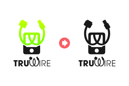
A logo should always be designed in black & white first, then have colors and gradients added later. If not, you run the risk of destroying the logo’s versatility by creating it in such a way that it relies on its colors.
Ideally, a logo should work well in color, printed in black & white, when embroidered onto a shirt, when cut into a sign for the side of a building, etc. When a logo’s design relies too much on its colors it becomes more difficult to use in many ways.
If a logo can’t be stripped down to just black & white, it probably isn’t a very good logo. It’s okay to use colors and gradients, but make sure to use them in such a way that the design itself doesn’t rely on them and that each element of the design has some kind of element that separates it from the rest of the design.

Too Many Fonts
A logo should ideally use just one or two fonts at the very most. If not, you might end up with something like this…

When you use too many fonts, they all fight for attention. The point of graphic design is to enhance communication; not disrupt it.
Using 1 distinct font for the main, prominent word(s) and another more subtle font for secondary word(s) is always good practice.

…And Many More
This is just a small handful of common mistakes I decided to touch on today. If you’re interested in learning more about the ingredients of a great logo, I would suggest checking out my logo design ebook where I go over these mistakes in more detail, along with many others to avoid.
Learn To Master The SoftwareGain a complete understanding of your favorite design apps with my comprehensive collection of video courses. Each course grants access to our private community where you can ask questions and get help when needed.
|
||||||||||||||||||||||||||||||||
Nick Saporito
Hi, I'm Nick— a Philadelphia-based graphic designer with over 10 years of experience. Each year millions of users learn how to use design software to express their creativity using my tutorials here and on YouTube.
All stories by: Nick Saporito


RAndom Student
Thank you. This was very useful.