Custom Text Treatment for Logo Designs using Inkscape
Custom Text Treatment for Logo Designs using Inkscape https://logosbynick.com/wp-content/uploads/2020/05/custom-text-inkscape.jpg 800 470 Nick Saporito https://secure.gravatar.com/avatar/8e31bf392f0ba8850f29a1a2e833cdd020909bfd44613c7e222072c40e031c34?s=96&d=mm&r=gIn this tutorial I’ll be demonstrating how you can use Inkscape to give your logo designs a custom text treatment where the letters overlap each other. This can make your logo designs look more personalized than they would if you just used a stock font as-is.
This lesson will also introduce a new feature from Inkscape 1.0, which is the Offset live path effect, so make sure to download version 1.0 before continuing on with this tutorial. You can learn more about some of the new features in another video I made about it.
Custom Text Treatment for Logos
The following is a brief overview of the steps taken to create a custom text treatment for logo designs. For complete step-by-step instructions, please watch the video tutorial at the top of the page.
The first thing we’re going to do is generate some text on the canvas. For this demonstration I’m using the word “exact” in all caps and in the Microgramma font. You can use whichever font you’d like though.

Next, we’re going to convert the text to paths, bring the opacity down, and manually adjust the spacing between each letter. This is otherwise known as kerning.
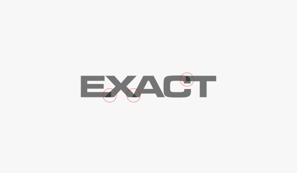
Notice the areas circled in red where the letters overlap. I manually extended the letter E and letter T so that they reached out into their neighboring letters. This is to ensure that I’ll be able to get that flush cutoff look I’m going for. This is explained in more detail in the video.
Now we’re going to use the new Offset path effect. Create a duplicate of one of your letters, make it green (or any other contrasting color.)
Open up the Path Effects menu (control + shift + 7) and select your green duplicate. Click the plus sign to add a new path effect then select Offset from the list, then click add. This will bring up the setting menu for the path effect.
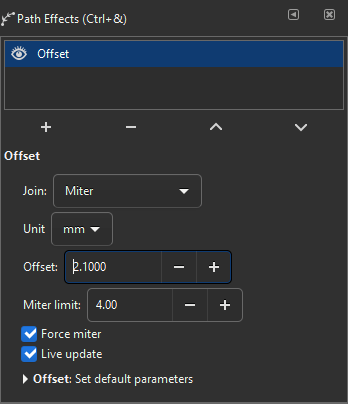
Manually add an offset to your duplicated copy of the letter by clicking the plus symbol next to Offset.

In this example, I will now take the offset letter X and subtract it from the letters E and A using the Difference path operation.

As you can see, the effect has been applied to those letters. All you have to do now is repeat this process on the rest of the letters.

And with that we are finished! We have successfully added a custom text treatment to our logo’s text, which helps it look more personalized.
If you have any questions please leave a comment below. As always, thanks for watching!
Learn To Master The SoftwareGain a complete understanding of your favorite design apps with my comprehensive collection of video courses. Each course grants access to our private community where you can ask questions and get help when needed.
|
||||||||||||||||||||||||||||||||


Anonymous
hi brother,
I’d like to add two different colours to a text or an object, on both half of the text or object,( two seperate colours, not gradient).
Is there any single click option or editing option available in inkscape?
Except splitting the object or text into two, and providing them different colours.