Best Logo Sizes for All Applications | 2019 Design Guidelines
Best Logo Sizes for All Applications | 2019 Design Guidelines https://logosbynick.com/wp-content/uploads/2019/05/best-logo-size-1024x602.jpg 1024 602 Nick Saporito Nick Saporito https://secure.gravatar.com/avatar/8e31bf392f0ba8850f29a1a2e833cdd020909bfd44613c7e222072c40e031c34?s=96&d=mm&r=gIn this post I’ll be going over some guidelines for determining the best logo size to use when preparing logo files.
| The best logo size depends on the context it’s used in, but I’ve found that 1280 px is a good universal fit that covers most applications, with the larger dimension being 1280 px and the smaller dimension being less than 1280 px. |
Why 1,280 Pixels Is The Best Logo Size
I always prepare logo files at 1280 px because it strikes a good balance between size and resolution.
It’s Not Too Big
I used to prepare logo files at a size of 1,920 pixels, however some of my clients started complaining that they were having trouble uploading their logos to their websites using software like WordPress, which has a maximum file upload size of 2MB. It’s not uncommon for a logo rendered at 1920 px to exceed 2MB in size, and WordPress is certainly not the only platform with such limitations.
It’s Not Too Small
On the flip side, you don’t want to render the logo too small either — like at 512 px for example — because although the logo will work fine on a website, it’s not a high enough resolution to be printed on a brochure or t shirt.
1,280 pixels is a high enough resolution for most branding applications, but it’s not to big that it’ll make for unmanageable file sizes.
What About Vector Copies?

Vector graphics can be scaled infinitely without quality loss
The correct solution is to produce the logo in true vector format so it can be sized to fit each unique context appropriately. I always provide vector files for my clients (you can read more about my procedure for preparing logo files for clients here,) but you have to remember that most clients have no clue what to do with a vector file.
It’s good for them to have a copy on hand in case you (or another designer) need to work with it down the line, but most vector formats can’t be uploaded directly to the web to be used as a profile picture or website logo. Vector files are editable source files that are intended to be handled by designers using design software. What clients need more than anything is a usable raster format that they can upload to websites, social media, and print-on-demand services right out of the box, and in my experience, 1,280 pixels is the best logo size to provide in that format.
Guidelines For Sizing Logos
Here’s some things to keep in mind when preparing logo files.
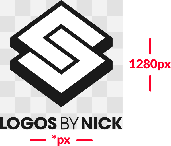
Make The Larger Dimension 1,280 Pixels
When producing finalized logo files, make sure that the larger of the two dimensions is 1280 px, meaning the smaller dimension will be less than 1280 px.
This means that for horizontally-oriented logos, the width will be 1280 and the height will be whatever it has to be to accommodate the proportions.

For vertically-oriented logos, the height will be 1280 and the width will be whatever it has to be.
Consider Adding Some Padding Around The Edges
In the examples depicted above, the logo runs to the edges of the document. However, you might want to consider rendering the icon versions of the logo — as well as vertically-oriented versions — in a symmetrical square with some padding around the edges to account for the round mask that gets applied to profile pictures once uploaded to social media. This is something I started doing recently.
Sites like Facebook, Instagram, and Twitter apply a round mask to whatever image you upload to use as your profile picture. This means that your profile picture ends up being round and anything outside of that circle will be cut out. I suspect this is just a trend that will eventually die out, but it’s here for the time being and we need to account for it when preparing logo files for clients.
The best logo size for this format is still 1,280 pixels, but what I like to do is make the actual design a little smaller than 1280 so that there’s roughly 200 px of empty padding going around it. This will ensure that the logo will still be visible after the circular portion is cropped out.
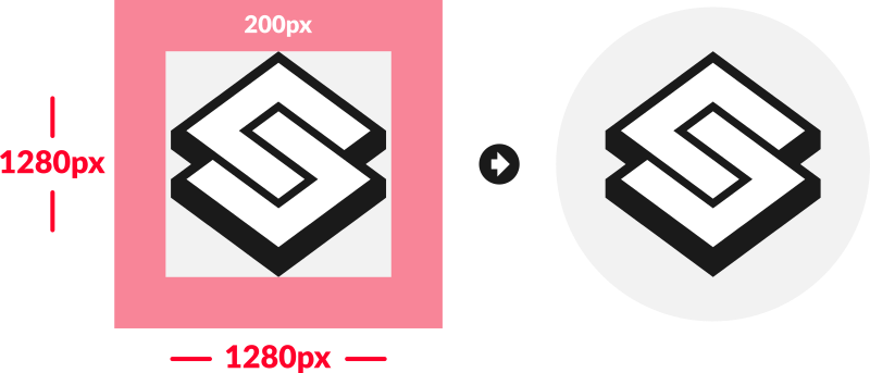
Like I mentioned previously though, this should only apply to vertically-oriented logos and standalone icons that would typically be uploaded for use as profile pictures and logos on various platforms. I wouldn’t recommend adding padding around a horizontally-oriented logo because it’ll likely cause problems in most of the contexts that a horizontally-oriented logo would be used, like on website headers and email signatures. The extra padding would throw off the alignment of the logo in relation to the other design elements.
Learn To Master The SoftwareGain a complete understanding of your favorite design apps with my comprehensive collection of video courses. Each course grants access to our private community where you can ask questions and get help when needed.
|
||||||||||||||||||||||||||||||||
Nick Saporito
Hi, I'm Nick— a Philadelphia-based graphic designer with over 10 years of experience. Each year millions of users learn how to use design software to express their creativity using my tutorials here and on YouTube.
All stories by: Nick SaporitoYou might also like
16 comments
-
-
-
Nick
That’s a good question, but unfortunately I wouldn’t know unless I saw the design. The best thing you can do is render at that size (200 x 50). If it’s still not legible then it may be a problem with the design itself. Sometimes logos are designed in such a way that they don’t scale down very well.
-
Shane
Thanks for the quick response. Generally speaking, should I ask that they create the vector file in the highest DPI possible and then render the 200×50 png in a higher DPI than what they’re giving me? They’ve been mentioning 96, would they get a better result rendering it higher? I’m interfacing with marketing team members but I think they then go talk to an external design agency so I’m not sure if the team I’m talking to really knows the technical aspects either.
-
Nick
DPI affects print quality more than anything, so I don’t think it would have much relevance for a PNG image used on a digital display. I would think the DPI is irrelevant as long as it’s the correct size.
-
-
-
-
Kevin
Thank you from France,
I’m currently trying to make a logo for my cousin website and it helped a lot. ( the dimension was the first question I’ve asked to myself before getting into it.)
You make thing easy to understand.
Kevin
-
-
Sandi Holland
Hi Nick: I had started following you on YT and joined your website too. I think you’re a great teacher and marketer. I was enjoying learning Inkscape. I went elsewhere because I finished out my Affinity suite with Designer and Publisher. You know Affinity programs you buy outright, not like PhotoShop subscriptions. I had Photo when I started following you and was on the fence about buying Designer for a long time. Just wanted you to know what happened to one of your new followers. The Creative Rover. I was Imagine Go Create and Artsy Craftery Studio at YT. Take care.
-
Nick
Hi Sandi, glad you’re having a good experience with the Affinity software. I’ve started using it myself recently and there’s a lot about it I like. I’ll be posting a lot of Affinity content in 2021.
-
-
Whimsy
Hey Nick,
Thanks for this article, it was exactly the info I was looking for but can I ask another question? When creating the logo in a document would we choose to create the document res for print (300) or for the web (72). Would it be just one option and the export in both formats if we are passing on the logo as a jpg/png?-
Nick Saporito
I would just use 72. The only time to use 300 is if you’re going to print that document directly, which is rarely the case. Normally you take the vector logo and place it into another document for print, like a business card design. That document needs to be 300.
-
-
Anonymous
Do we set 1280 on the width and height? When we start the project what do we put in W and H?
-
Nick Saporito
That’s what I usually do. Unless it’s a text-based logo where the width is greater than the height. In that instance set the width to 1,280 and the height to whatever it scales down to proportionately.
-
-
Alice
Gosh, I really don’t know where I’d be without Nick. I’m on his mailing list and I bought his Inkscape course, and I have no regrets!
-
-


Shane
I’m working with some designers to make a company email signature and they want to include a logo that is approximately 200×50. The logo is I believe (not being a designer myself) basically a made up font, a vertical line, some of it is very thin some fairly thick. They tried to ask that I use a very large vector file but that is not supported. The png they are providing is losing a lot of visual quality. What could I ask them to do when exporting the vector file to png to shrink it down and retain the quality?