
Best Colors For Fitness Logo Design
Best Colors For Fitness Logo Design https://logosbynick.com/wp-content/uploads/2018/04/best-colors-for-fitness-logo2-1024x602.jpg 1024 602 Nick Saporito Nick Saporito https://secure.gravatar.com/avatar/8e31bf392f0ba8850f29a1a2e833cdd020909bfd44613c7e222072c40e031c34?s=96&d=mm&r=gIf you’re designing a logo for a fitness brand — or are starting one yourself — one of the first steps (as is with just about any other business) is to get your branding assets in order, which includes your logo and the color(s) you choose to use it with. In this post I’m going to outline my picks for the best colors for fitness logo design.
Logo Color & Psychology
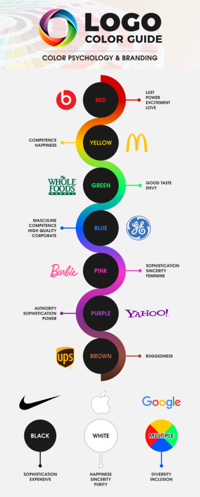
Scientific data suggests that people associate colors with feelings and emotions, meaning the colors you choose to brand yourself with could affect how consumers respond to you.
The following infographic was put together to reflect studies that sought to document how test subjects tend to associate colors with feelings and emotion. As you’ll see in the graphic, I also added some examples of companies who I think personify it quite well.
Source of information: https://en.wikipedia.org/wiki/Color_psychology
Best Colors For Fitness Logo Design
With that taken into consideration, the best colors for fitness logo design would vary depending on what kind of fitness brand we’re designing the logo for.
As you may be aware, there’s many different kinds of fitness businesses. There’s supplement lines, personal trainers, gyms, equipment, fitness apparel, and so on. There’s even subsets of those categories too, so the best approach — as is with every logo project — is to look closely at the kind of business this logo is for to determine what their identity is.
Answer the following questions…
- What makes them unique?
- Who is their target audience?
- How do they want to be perceived by their target audience?
Here’s some examples of the kinds of fitness brands I’d use for each color in the infograhic…
Red

I’d use red if I were designing a logo for a fitness apparel brand. I think red branding could really help bring out feelings of power and excitement in a commodity like clothing.
Yellow
Since competence is associated with yellow, it could work well for an accomplished brand that specializes in something specific, like Gold’s Gym does.
Green
Green works great for a health and nutrition brand whose focus is on nature, homeopathy, plant-based dieting, veganism, and so on. I don’t know if that accurately describes Herbalife, but “natural” is certainly what they’re going for, and they’re using green.
Blue
Since blue is a masculine color, I’d only use blue for fitness logos that target men specifically. Supplements for bodybuilders and contest prep coaches immediately come to mind, but this could also work for equipment and apparel that targets men.
Pink
Pink is the obvious feminine shade, so I wouldn’t hesitate to use it if I were creating a logo for a spinning or yoga class, or anything else that targets women as their primary demographic.
Purple
If I were targeting the general population with a friendly gym atmosphere that doesn’t make newcomers feel unwelcome, I’d use purple. Maybe not though, because Planet Fitness already dominates that space and I wouldn’t want to encroach on their trademark in any way. But you get the idea.
Brown
I think brown would work well for anything with an outdoor sort of theme, like boot camps or the Tough Mudder events.
Color Isn’t Everything
Before I wrap this article up I’d like to emphasize that all of this should be taken with a grain of salt. It is my personal belief that, although color does play a role is human psychology, it is minimal at best, and when it comes to branding, the relationship you build with your target audience is ultimately going to determine how they perceive your logo; not vice verse.
For example, when I see the Apple logo, I automatically associate it with hip, edgy technology, and it’s not because the logo uses some kind of voodoo design magic — it’s because Apple has successfully branded themselves as such with their advertising and sleek product design.
Color matters, don’t get me wrong, but it isn’t something you should lose sleep over.
Learn To Master The SoftwareGain a complete understanding of your favorite design apps with my comprehensive collection of video courses. Each course grants access to our private community where you can ask questions and get help when needed.
|
||||||||||||||||||||||||||||||||
- Post Tags:
- Branding
- Posted In:
- Branding
- Color Palettes
Nick Saporito
Hi, I'm Nick— a Philadelphia-based graphic designer with over 10 years of experience. Each year millions of users learn how to use design software to express their creativity using my tutorials here and on YouTube.
All stories by: Nick Saporito




Jaime Taylor
Hello,I would like to customize my soccercise trademark logo