VCubed Logo
Project Details
This design is for a security company whose mission intersects with the concept of a cube (6-sided,) so I used a cube shape with a shield inside of it, then added some abstract motion lines hugging the entire icon to further emphasize security. With the color choice and the wordmark, I thought the entire design tied together quite nicely. This was one of the first logos I ever made professionally, and surprisingly enough it still holds up today. I can't say the same for a lot of my earlier works (when I was inexperienced.)
Recent Entries
-
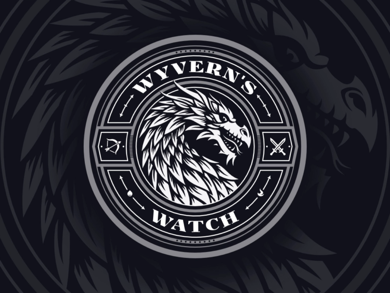
Wyvern’s Watch Emblem Design
An emblem depicting the mythical Wyvern creature -

Assistem
Logo Design for an SOS Device -

Antydote
Letter A Logo for a DJ
Leave a Reply