How To Make Shadow Text In Inkscape | 4-Step Tutorial
How To Make Shadow Text In Inkscape | 4-Step Tutorial https://logosbynick.com/wp-content/uploads/2021/01/make-shadow-text-in-inkscape.png 800 470 Nick Saporito https://secure.gravatar.com/avatar/8e31bf392f0ba8850f29a1a2e833cdd020909bfd44613c7e222072c40e031c34?s=96&d=mm&r=gIn this tutorial I’ll be demonstrating how to make shadow text in Inkscape. To do this, we’ll be making use of the Blur and Opacity sliders located in the Fill & Stroke menu. This is a rather simple process that even a first-time user could follow along with. In mere seconds you’ll be able to make your text look as if it’s popping off the page!
Adding a shadow to your text in Inkscape is merely a matter of blurring a duplicate copy of text and positioning it beneath your original text. This makes for a good introductory lesson to the “Edit objects, colors, gradients and strokes” menu in Inkscape, otherwise known as the Fill & Stroke menu.
This menu will be a staple for you as an Inkscape user. After having used Inkscape for over a decade myself, I can say for sure that I use this menu more than any other. Familiarizing yourself with it is essential.
Make Shadow Text In Inkscape
| To make shadow text in Inkscape, create a duplicate copy of your text, lower it beneath the original text, then give it a blur using the Fill & Stroke menu. |
The following steps will guide you through the process of adding some shadows to your text. For a more immersive learning experience, consider checking out the video tutorial I put together:
Continue on to proceed with the written tutorial.
Contents
- Step 1: Create Some Text
- Step 2: Duplicate Your Text
- Step 3: Position Beneath The Original Text
- Step 4: Apply A Blur
Step 1: Create Some Text
The first step — assuming you haven’t done so already — is to generate some text. If you already have text that you’d like to add a shadow to then continue on to step 2.
To generate some text, grab the Text tool (keyboard shortcut: t) and click on the canvas to get a blinking cursor, then go ahead and type out a word or two.
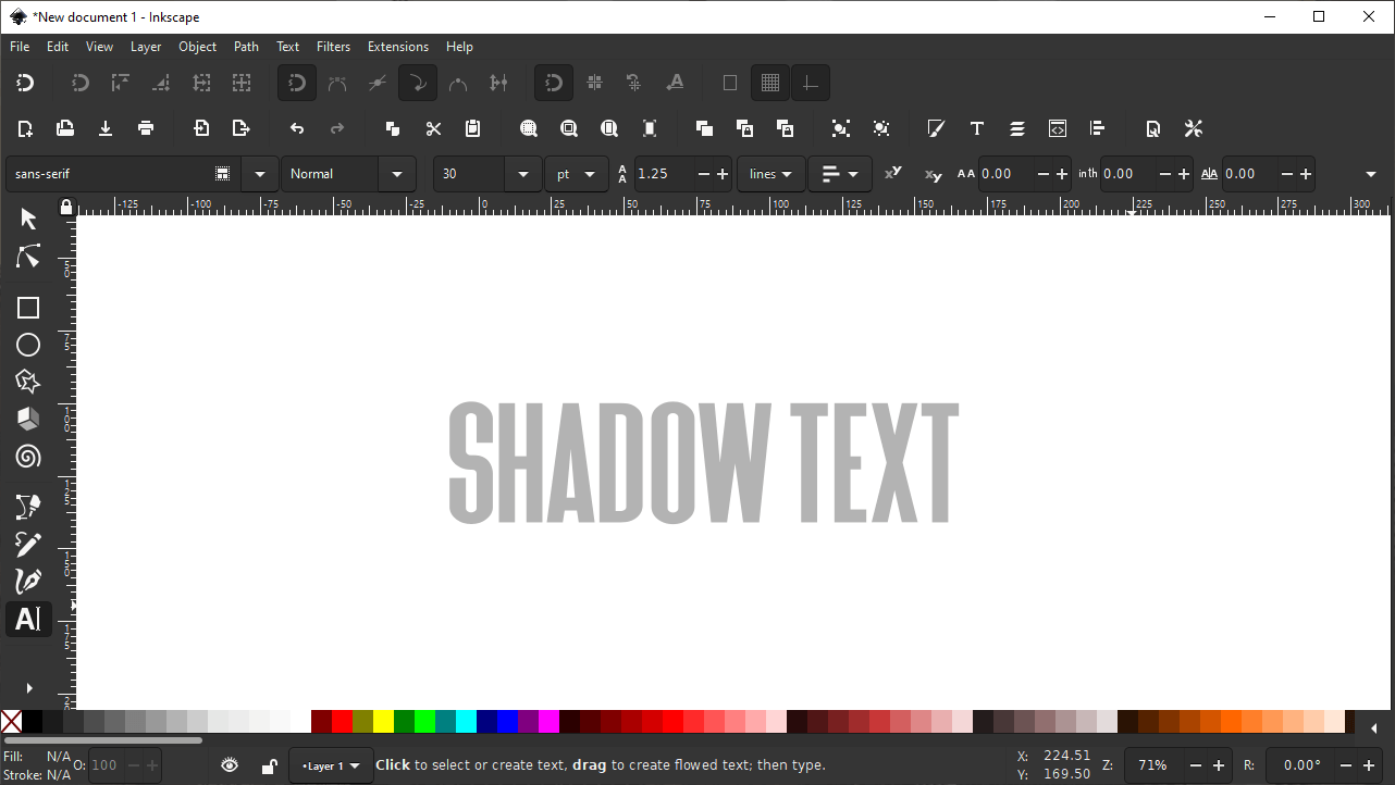
A heavier weight font works best because the shadow will be more visible.
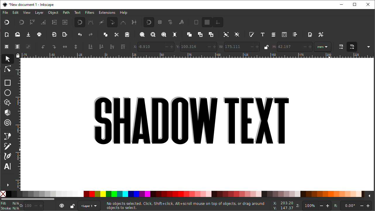
In order to get the best result, it is recommended that you use a bold or heavy weight font. This will make it easy to see the shadow that is created. (However, that’s not to say that this process can’t work on thinner text. It mostly certainly can.)
It is also recommended that you change the color of the text from black to anything else — preferably a lighter shade. The shadow we’ll be applying to the text will be black, so if the text is also black then it won’t be distinguishable.
Step 2: Duplicate Your Text
Once you have your text in place, it’s time to create a duplicate copy of your text. This duplicate copy is what will be used to create your shadow.
To duplicate your text, first grab the Select tool by using the menu interface on the side of the screen.
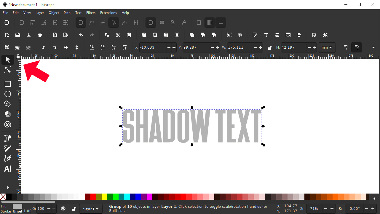
The Select tool is the first tool in the top of the list, represented by an arrow icon.
With the Select tool, click on your text to select it, then right-click it and select Duplicate from the dropdown. Alternatively, you can simply press control + d on your keyboard to duplicate the text.
Once the text has been duplicated, fill it with black using the color palette at the bottom of the screen.
The color palette is located at the bottom of your screen.
It’s important that your duplicate copy is black as that will be the color used to make it look like a shadow.
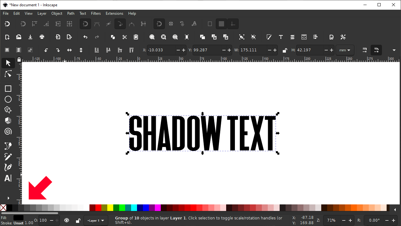
Step 3: Position Beneath The Original Text
Considering that this copy of the text will represent the shadow, we’ll have to position it beneath the original text.
Before doing so, it would be a good idea to move is down and to the right slightly in order to give it a slight offset.
Move the text to give it a slight offset.
This lack of balance and symmetry will make the shadow look more realistic and less like it was computer generated.
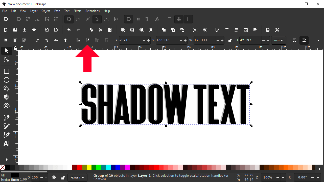
To position the duplicate copy of the text beneath the original text, make sure it’s selected and click the button in the menu bar that reads “lower selection one step” when you hover your cursor over it.
Hovering your cursor over the icon will populate a text label indicating what the tool does.
Alternatively, you can simply press the Page Down key on your keyboard instead. This will lower the black copy beneath the original copy:
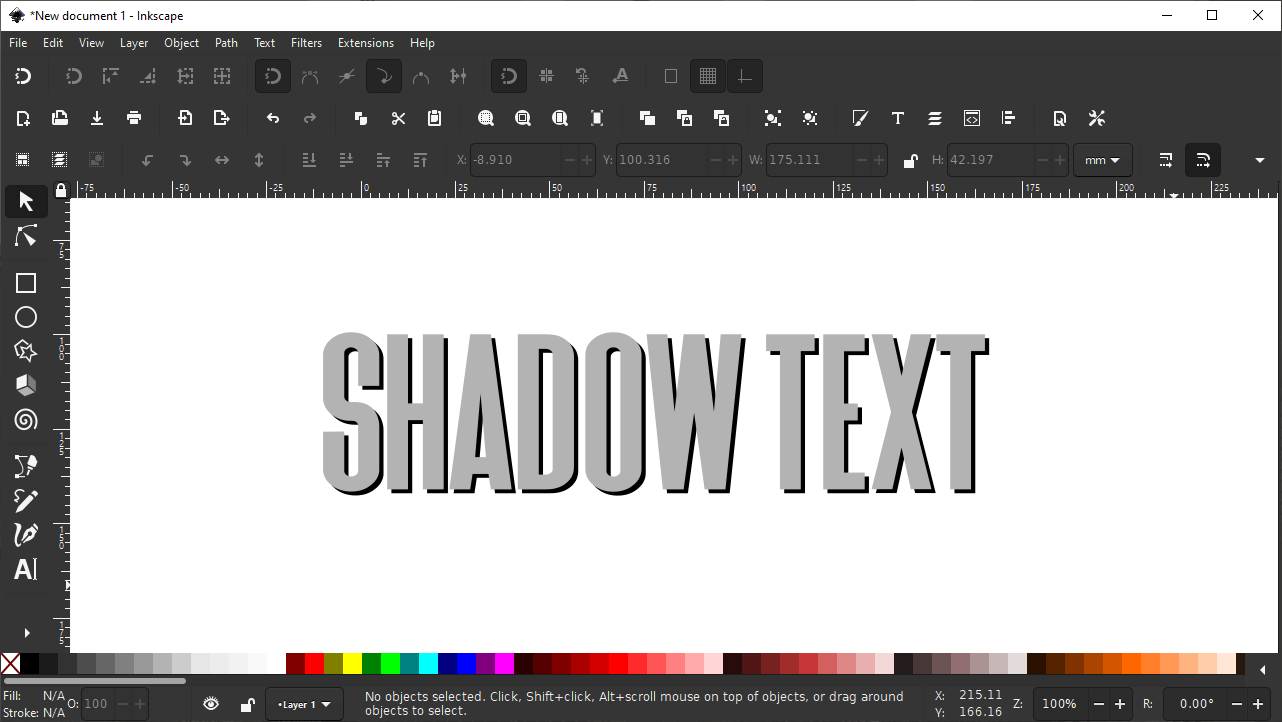
After lowering the duplicate copy, the text is already beginning to have a rudimentary drop shadow.
As you can probably see by now, it’s already starting to look like shadow text.
Step 4: Apply A Blur
This step is where the magic happens!
To make shadow text in Inkscape, we have to make the shadow look and behave like an actual shadow. Or in other words, we have to make the text look like a soft obstruction of the light source in front of it.
As you may know, shadows typically don’t have hard edges. Therefore, we’ll have to blur the edges of the duplicate text to give it a soft look that represents an actual shadow.
To blur the text, open up the Fill & Stroke menu using the icon in the top menu bar, or by pressing control + shift + f on your keyboard.
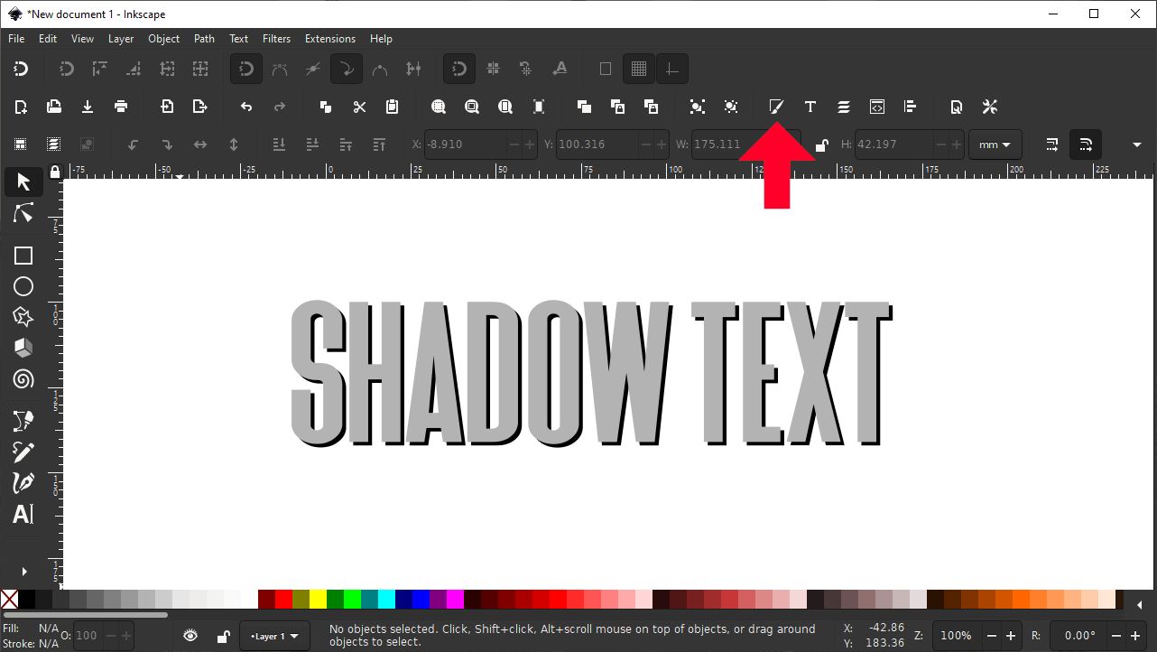
Click the icon in the menu bar to open the Fill & Stroke menu.
Once opened, the following menu should populate to the right of your screen:
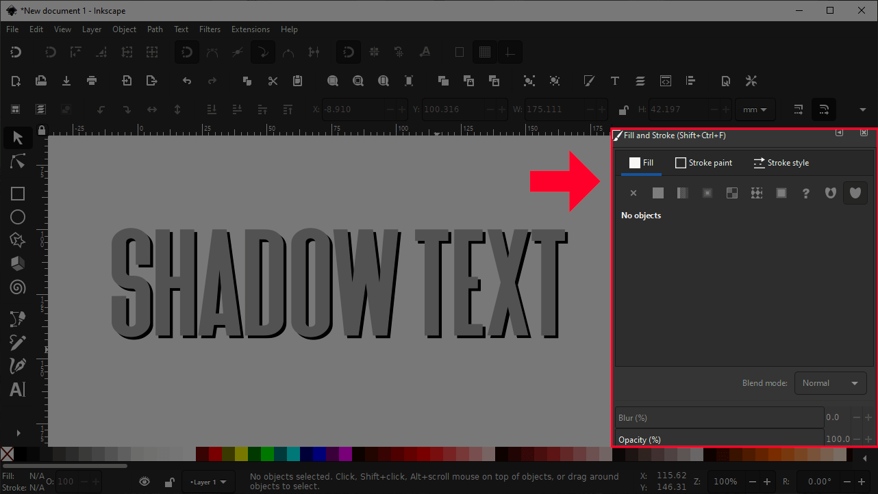
The menu will open up to the right of your screen.
Make sure that you still have your duplicate text selected, then use the Blur slider to soften the edges of it.
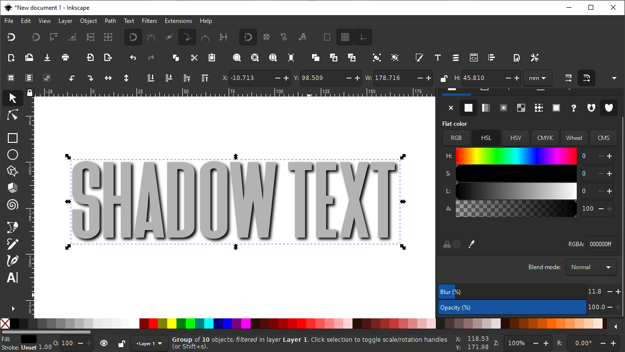
The Blur slider will soften the edges of the shadow text, making it look more like an actual shadow.
The degree to which you should blur your text depends entirely on the size of the text object, the weight of your font, the contrast between the foreground and background, and your own personal taste. Use your best judgement to apply a blur percentage that you find visually appealing.
Next, use the Opacity slider to reduce the visibility of your shadow ever so slightly.
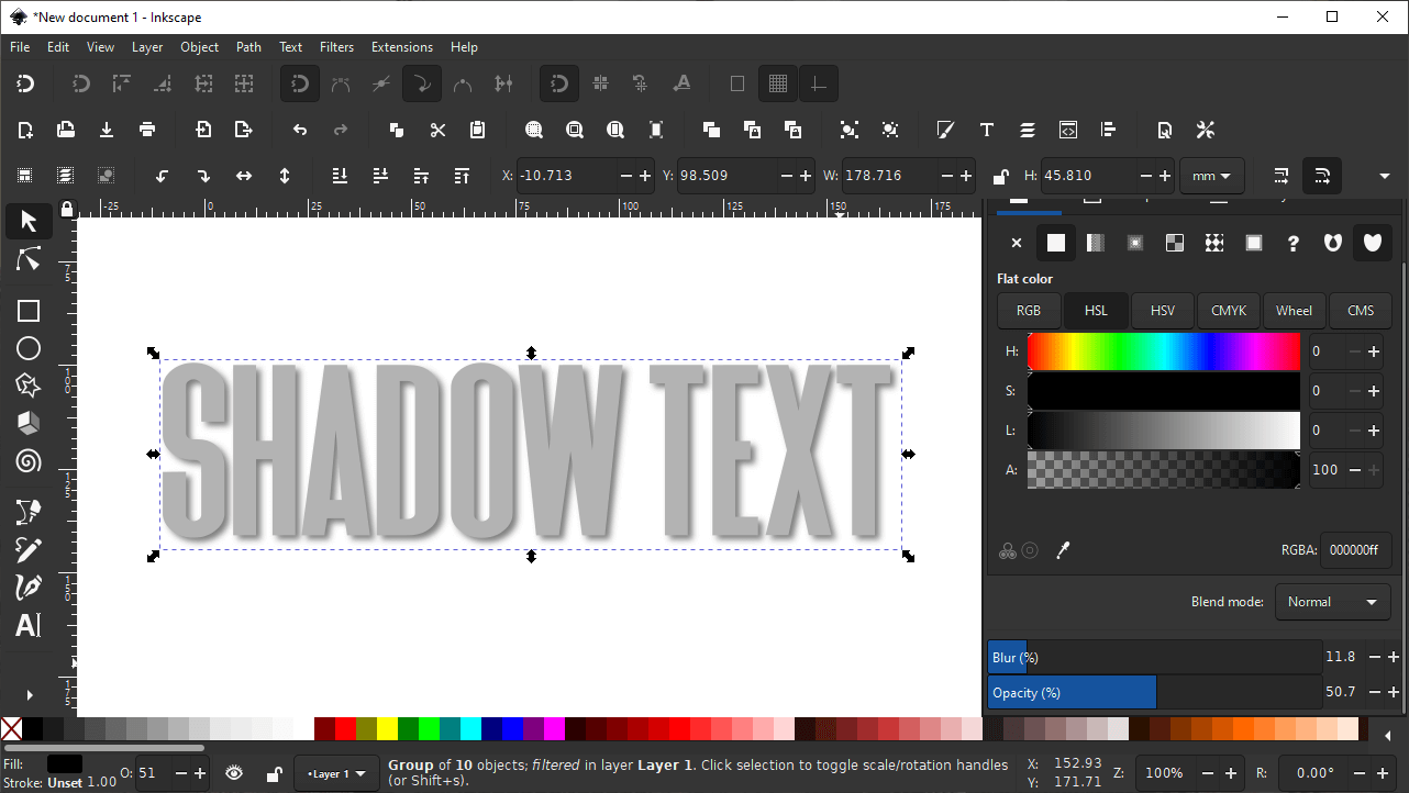
Reducing the opacity can help make it look more subtle.
This will make it so that the whatever color or pattern your background contains will show through the shadow to some degree. This helps us make shadow text in Inkscape that looks realistic and like it’s part of the image.
Like we did with the blur, use your own judgment to determine what opacity looks best. This too will be dependent on size, weight, composition, and other variables.
The Finished Design
After completing step 4 your design should be complete. To help see the shadow better, you can temporarily make the text white so that only the shadow is visible. Here’s how that looks:
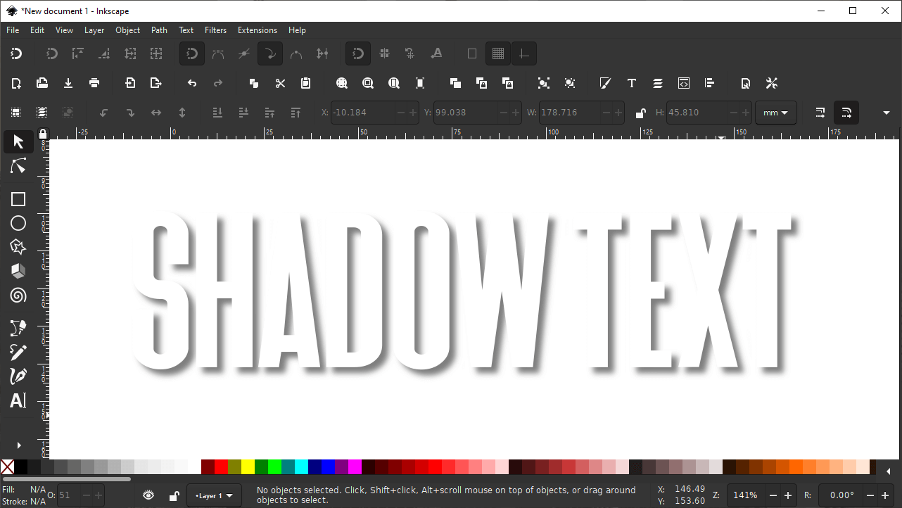
The final design will look as if your text is casting a realistic shadow.
As you can see, the text is casting a shadow onto the background, and because it’s offset slightly and has soft edges, it looks realistic!
This is the same technique that was used to create an infographic design in an older tutorial:
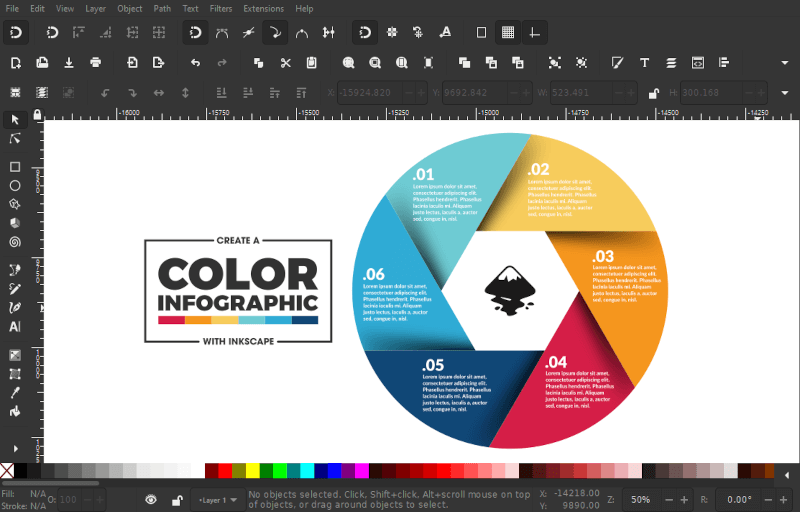
This technique for creating drop shadows can also be used for all design elements — not just text.
Although the shadow wasn’t applied to the text in this design, it was applied to the infographic wheel itself, which adds serration between the parts and makes them look like they’re overlapping each other.
This just goes to show how useful and versatile this technique can be. If you can make shadow text in Inkscape then you can make shadows for virtually any elements of your illustration!
Once you’re happy with your finished design, you can go ahead and export it as a PNG image. However, it is recommended that you save it as an Inkscape SVG first so that you can go back and make edits to the shadow text in the future if need be. Check out my tutorial on saving and exporting with Inkscape if you need instructions on how to do so.
Conclusion
Thanks to some basic features, it’s very easy to make shadow text in Inkscape using blur and opacity settings. And the benefit of using this method to apply shadows to your text is that you have full control over the customization. You can change the size, position, color, opacity, and blur percentage however you’d like. When using filters and presets that are intended to automatically do the same thing, sometimes you aren’t given control over these aspects.
Not only that, but applying your shadows with a manual process like this can warm you up to the usefulness of the Fill & Stroke menu. If you’d like to learn everything there is to know about the fill and stroke menu then consider checking out my master class where I go over all of the tools and features in Inkscape, and explain them in detail. We even have a private community that you can participate in and get help from me any time you want!
If you have any questions, or if any part of this lesson was unclear, simply leave a comment below. As always, thanks for visiting!
Learn To Master The SoftwareGain a complete understanding of your favorite design apps with my comprehensive collection of video courses. Each course grants access to our private community where you can ask questions and get help when needed.
|
||||||||||||||||||||||||||||||||