Dermatologist
Project Details
A wordmark design for a dermatology clinic. I think this design is a good representation of how impactful a simple wordmark logo can be when the fonts are carefully selected, and choosing colors that set the appropriate mood certainly helps. I was quite satisfied with how this design came out (as was the client,) and wanted to showcase it as an example of good typography.
Recent Entries
-
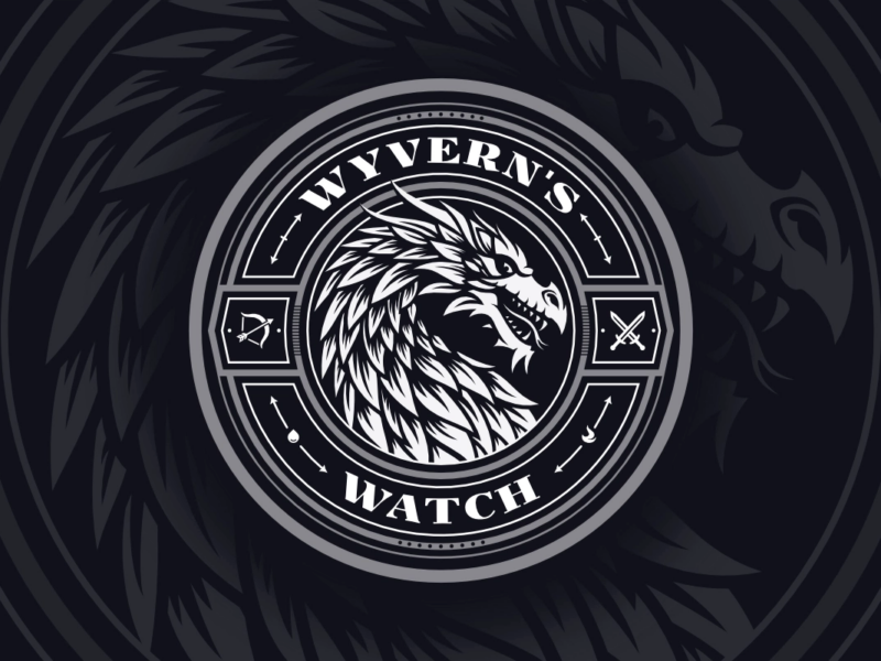
Wyvern’s Watch Emblem Design
An emblem depicting the mythical Wyvern creature -

Assistem
Logo Design for an SOS Device -

Antydote
Letter A Logo for a DJ
6 comments
-
-
Nick Saporito
It depends. Sometimes I use premium fonts that I bought, sometimes I use open fonts that are free for commercial use, and sometimes I design custom lettering for the logo name. I’ve never designed an entire font though.
-
-
-
Iren Ciolac
Well, I want to choose my favourite piece of your portfolio,.. but I simply can’t because every single piece is my favourite.
Wonderful !
-
Wesley
After reading about this design of this logo, I’m just wondering if you buy fonts, design your own fonts or use open fonts in your work. It seems like it would be a tedious job to create fonts from scratch for every logo but I know some companies do use their own, unique fonts. If you create your fonts, do you create the whole alphabet around it or create only the letters you need? I’m obviously not a designer but I’m very interested in learning about it.