BK Photo

Project Details
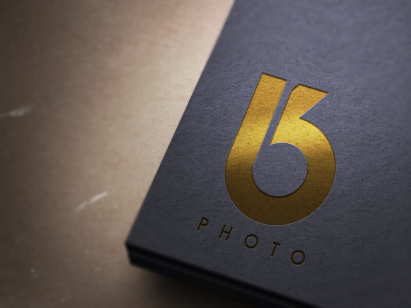
Brandon Kingston, a photographer from the United Kingdom, commissioned me to design a logo for his company, BK Photo. With his logo, Brandon was looking for something simple, sleek and timeless, but also creative and unique, in order to appeal to a higher caliber of clientele. Because of this, I decided it would be idea to avoid cliche concepts like icons of cameras and lenses. Brandon puts a focus on branding himself, so I wanted to design something that reflects himself. The resulting design is a simple but sleek merger between lowercase letters B and K.
Recent Entries
-
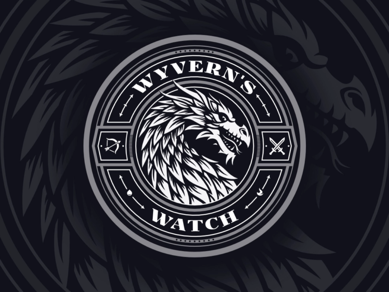
Wyvern’s Watch Emblem Design
An emblem depicting the mythical Wyvern creature -
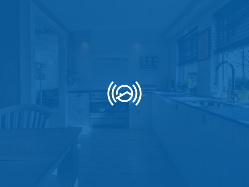
Assistem
Logo Design for an SOS Device -

Antydote
Letter A Logo for a DJ
4 comments
-
-
-
Michael McGowen
I love this logo, Nick. Your use of negative space…very creative. I’m learning about this kind of creative letter combinations. It’s not second nature to me yet. I know that like most creative endeavors, sometimes you just can’t shake an idea, and other times it seems like you have to pour endless energy into finding something worth fleshing out. I’m struggling right now to come up with something for my design studio that uses my initial(s), or the company name McGowen Design Studio. So, m, m+d+s, m+d (then, some incorporate the word studio or the “s”). Please feel free to do a tutorial for a cool “M” or my initials “MEM.” 🙂 I might have to commission you when I have the money to do so. I’m just working on limited funds right now. I’m an avid follower of your blog, and your YouTube work. Thank you for helping us fledgling designers. I’m getting old (58), so I’m definitely trying to maximize my time and focus my creativity.
-
Nick Saporito
Thanks Michael. It takes a lot of time and practice to reach a point where you can not only come up with ideas, but ideas that actually pan out well in the context of a logo. My work was actually pretty horrendous back when I first started, but here I am 5 years in and vastly improved. Good luck with everything! Keep at it.
-
rasindu
hi nick. i want to make logo to photography page in FB can h54r54relp me