24/7 Security
Project Details
A neat and geometrically sound representation of the 24-7 acronym. Being that this design was for a home security service provider, we wanted to make sure the design had a strong, authoritative presence. The sharp angles and Orbitron font did the job nicely, as did this particular shade of red. One thing we wanted to do was avoid the industry cliche of using a shield.
Recent Entries
-
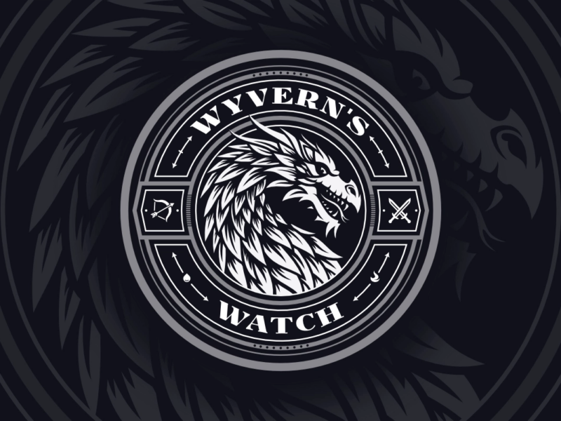
Wyvern’s Watch Emblem Design
An emblem depicting the mythical Wyvern creature -
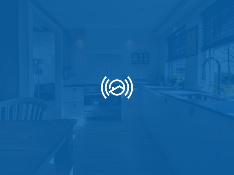
Assistem
Logo Design for an SOS Device -

Antydote
Letter A Logo for a DJ
Leave a Reply