Ski Resort Logo Design
Project Details
This logo was actually designed for a company's annual corporate ski resort to the Alps. It actually serves as more of a monogram, but it can work as a logo as well. As depicted, it's an emblem containing some snowy mountains, pine trees, a ski lift, and a snowboarder catching some air. In the background is a couple of crossed snowboards with a wood texture, and then the text tied in to make the entire thing come together as a unit. This client liked it so much he ended up having the design embroidered onto jackets.
Recent Entries
-
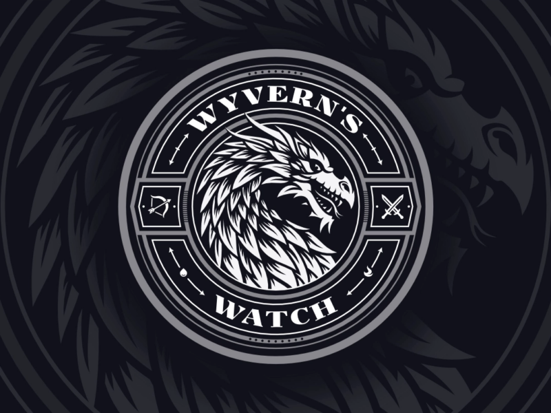
Wyvern’s Watch Emblem Design
An emblem depicting the mythical Wyvern creature -

Assistem
Logo Design for an SOS Device -
Antydote
Letter A Logo for a DJ
2 comments
-
-
Nick Saporito
Yes, I believe that was deliberate though. That’s exactly how the client wanted me to spell it.
-
Eric
Bonjour,
There is a mistake : the name of the ski resort is not LES DEUX APLES but LES DEUX A L P E S . The french word for Alps.
Eric