My New Logo
My New Logo https://logosbynick.com/wp-content/uploads/2025/02/header3-1024x576.png 1024 576 Nick Saporito https://secure.gravatar.com/avatar/8e31bf392f0ba8850f29a1a2e833cdd020909bfd44613c7e222072c40e031c34?s=96&d=mm&r=gMy most recent client is… myself.
It’s been 10 years since I launched LogosByNick.com, and the logo that I initially designed for it is just as old.
The original website and logo design from 2015.
A lot has changed in that time, including the design of the website itself, which has undergone several transformations. So, I figured it was time to update my logo to reflect the evolution of this website and my design style over the years.
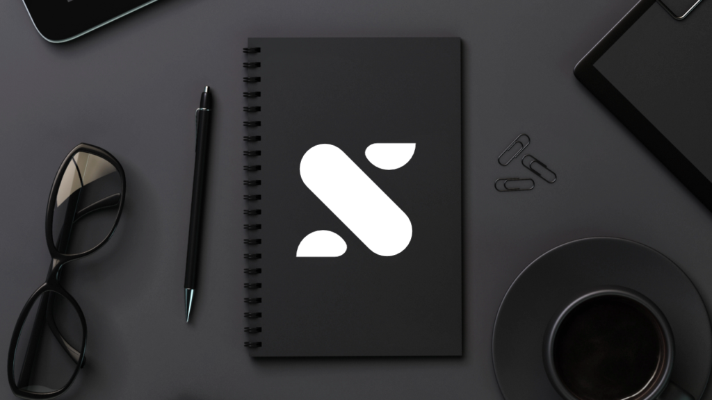
Much like the old one, the new logo is an abstraction of my initials. It’s an N, but it’s also an S…
![]()
Do you see it?
Kind of vague? Hard to make out? Not immediately apparent at first sight?
Good. That’s how I like it. It’s simple but imaginative— traits that I value as a designer.
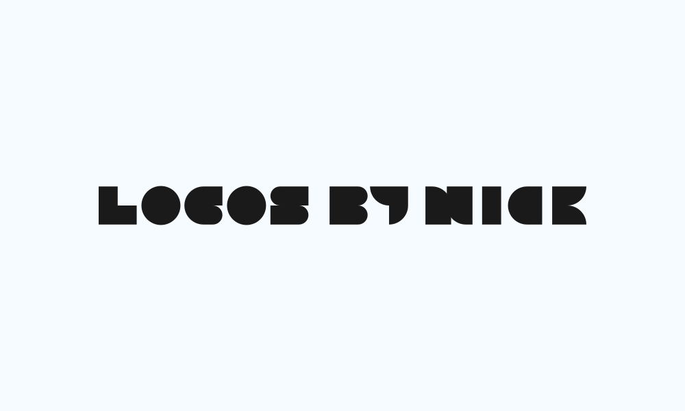
For the type, I paired it with the block letters that I designed a couple of years ago for my Lettermark Bundle:
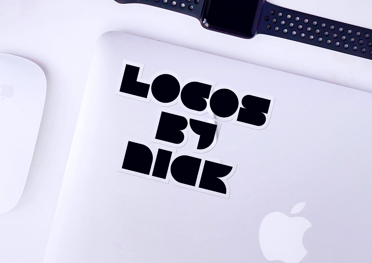
Out with the old, in with the new:
![]()
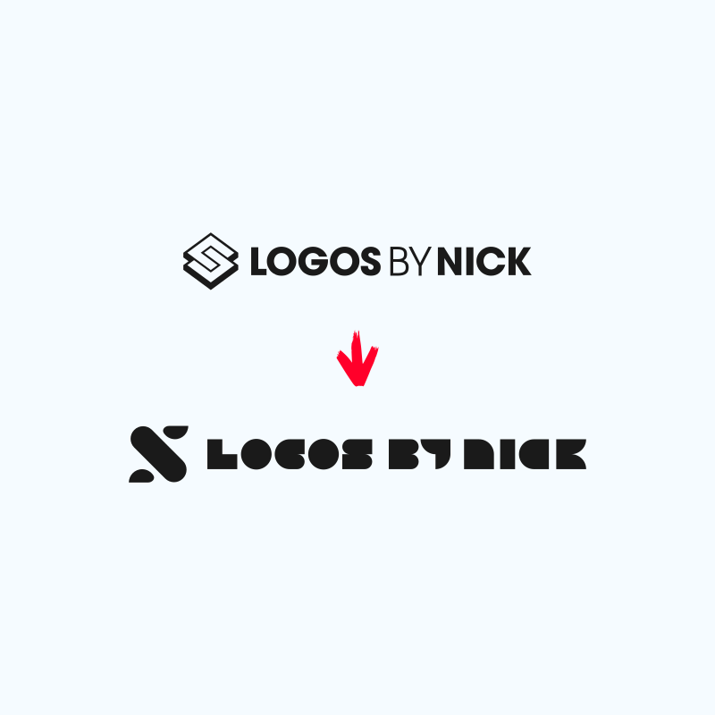
UPDATE 2/19: Revised Wordmark
After asking for feedback on the new logo, a lot of you pointed out several issues with the letter “N” in the name, and now that you’ve mentioned it, I can’t unsee it. So, I’ve made a revision:
This makes the “N” more consistent with the rest of the letters, which are all capitalized. It didn’t make sense for the N to be the only lowercase letter.
This is why I love you guys. Thanks for the feedback!
Learn To Master The SoftwareGain a complete understanding of your favorite design apps with my comprehensive collection of video courses. Each course grants access to our private community where you can ask questions and get help when needed.
|
||||||||||||||||||||||||||||||||


I really like the new logo and it’s uncluttered look (although I agree with Nasra on the letters). I also mourn the loss of the old logo. It made immediate sense (at least in the context of your youtube videos). And after all these years it just had enormous recognition value. It’s only fair to give it a final applause. That said, I totally get the wish for something fresh and updated.
Thanks Vera, losing that recognition factor is the hard part of letting it go.
Hello!
I really admire your work and you have helped me a lot through the years through your videos and courses!
I love your new logo! I am not sure how I feel about a couple of details. I think that N in the written name could easily be mistaken for D. Also, I really like the logo’s abstract and minimal aesthetic! I just noticed that in smaller sizes, such as on your website menu, it appears as if the image has cropped due to different dimensions (because the two “dots” are completely flat from one side). I hope that does make sense.
These are just minor details, overall, the final result is very nice and modern and it definitely suits you!
Thanks Ismini, I see your point about the N. I may have to revise that.
Tricky to interpret. Love your work and thank you for all the goodies.
Just what I was aiming for, thanks Paul.
HI- love your work, but reay don’t like the logo.
Appreciate the feedback, GK. I had to edit out the explicit part, but message received.
Hey,
I like the new logo, dislike the ‘n’. Sorry, something about it just irritates me to no end.
Craig
Thanks for the feedback, Craig. Are you referring to the N in the written name or the N logo itself?
Yes the ‘n’ in the written name. I like the new one, much better.
Hey Nick,
I absolutely love the new logo, it’s simple and smart (even the animation)! It was indeed hard to make out at first, but knowing your name, it immediately clicked. I think the letters look a bit too thick, especially the N and the C, but considering the logo it makes sense. Congratulations on your new logo, and thank you for helping designers becoming better designers 😀
Thanks for the feedback, Nasra!